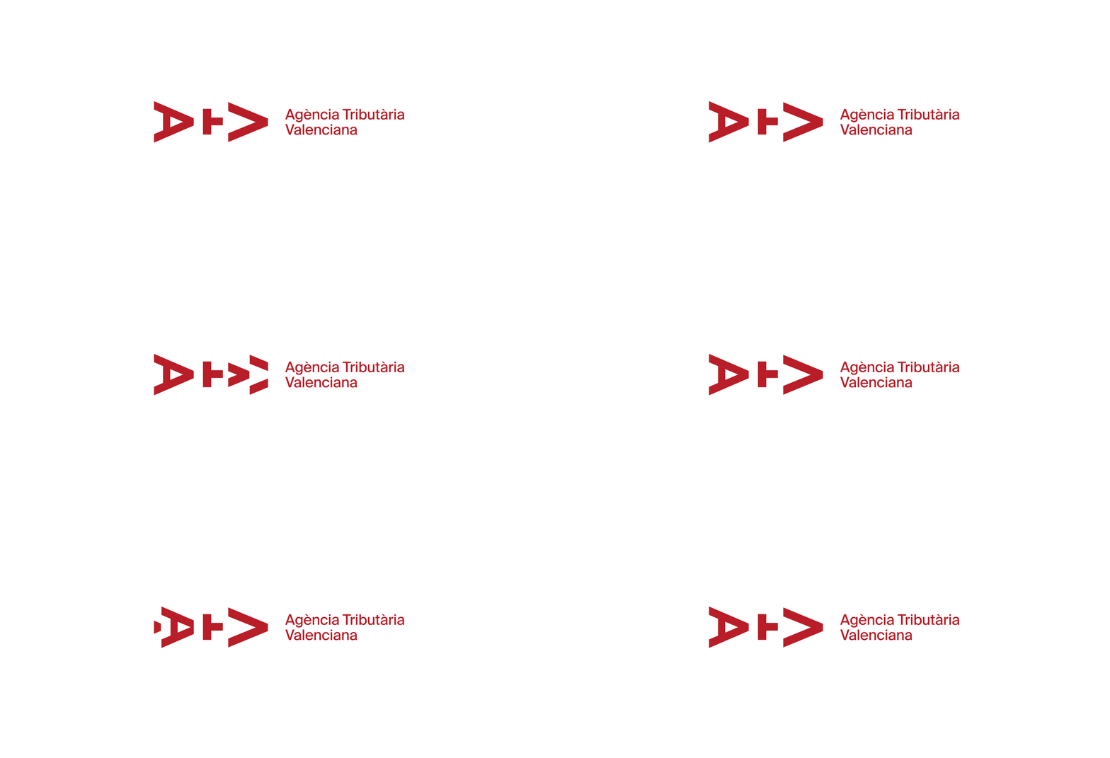
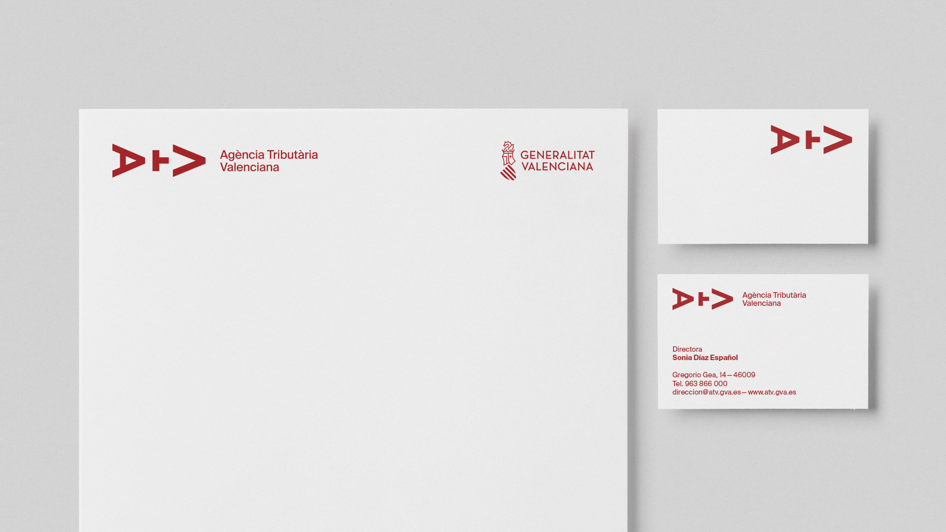
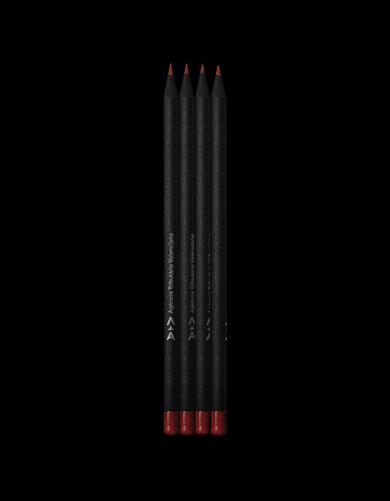
Based on the ideas of progress and improvement, the initials were used as a directional symbol, which is interpreted as a continuous path forward. His abstraction as graphemes, requires the reading of the complete name and not only of its initials, which was an explicit requirement made by the client.
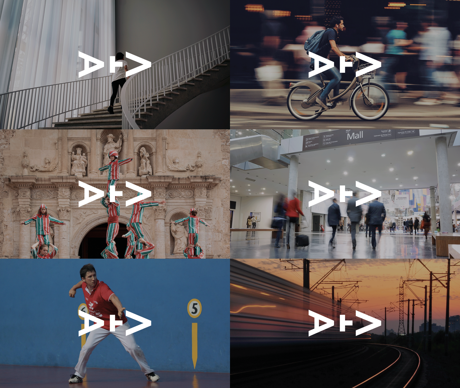
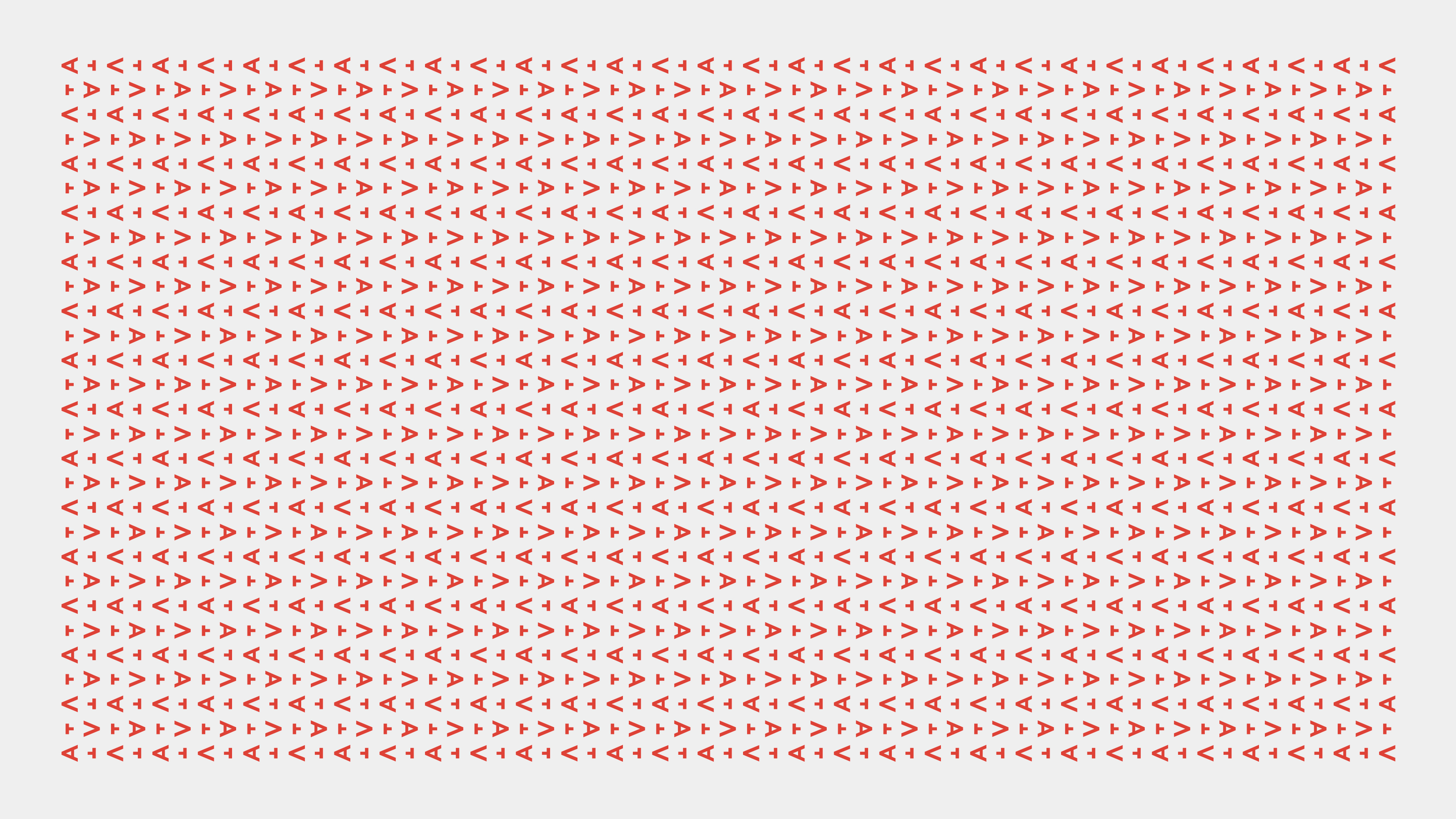
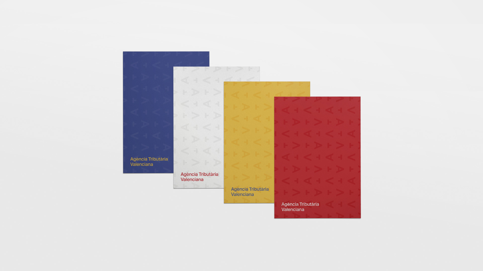
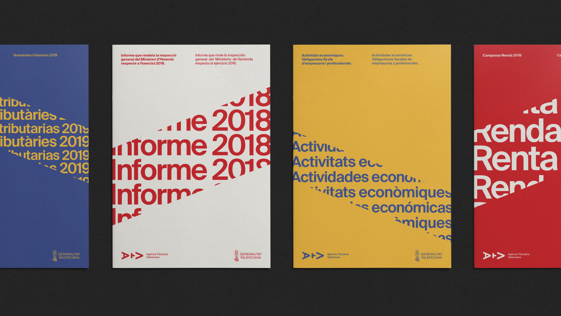
A graphic resource was also developed for its use in occasional pieces, in addition to a collection of covers that playing with the forms of the symbol and corporate typography, manages to increase the differential character of the communication materials of the entity.

