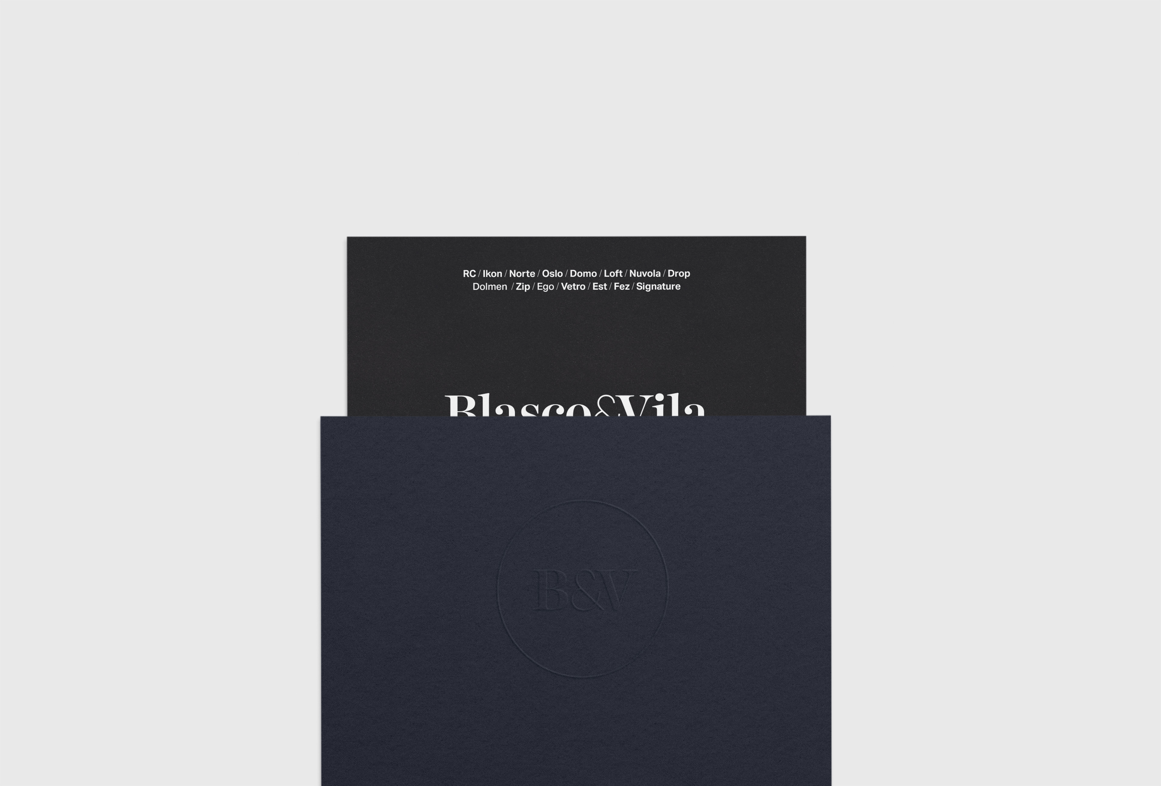
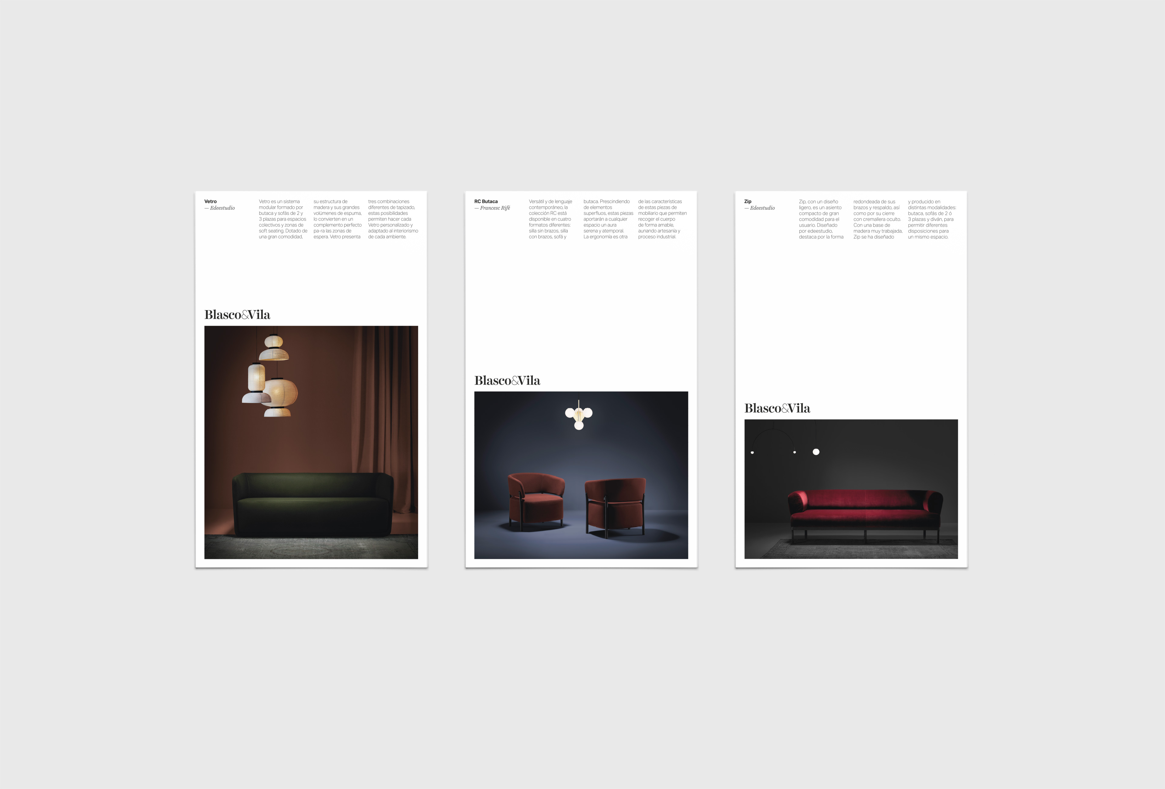
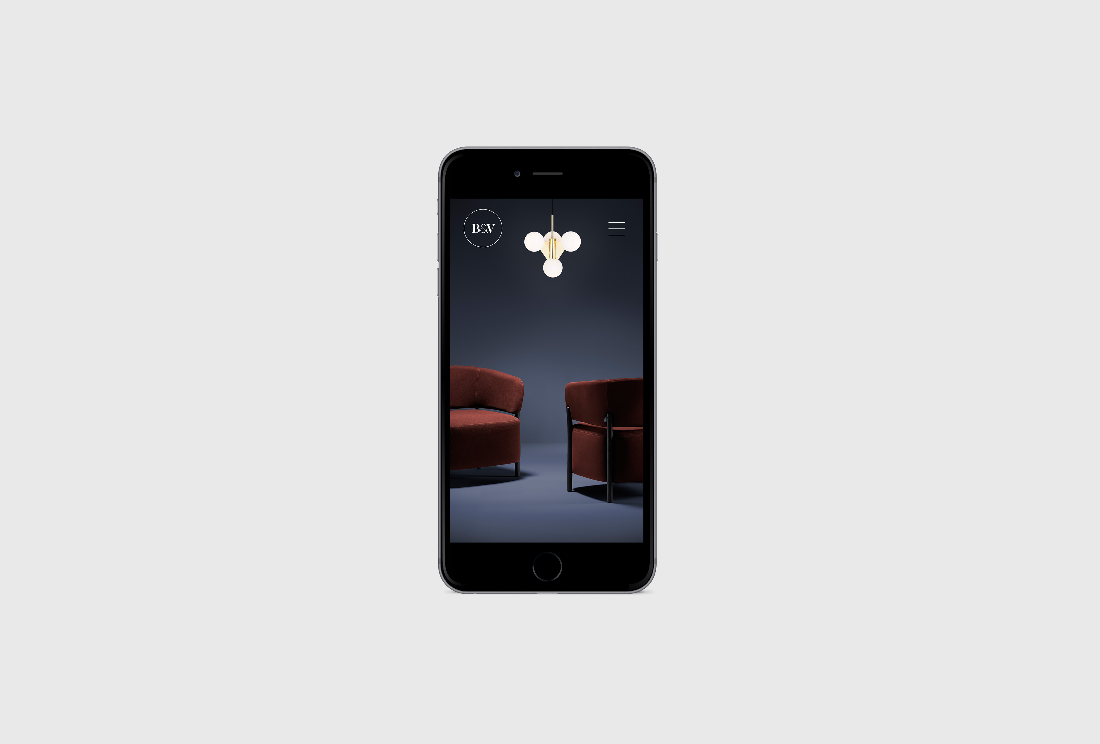
They wanted their logo too look more stylish and smart. Besides the fundamental idea to communicate is the combination of tradition and modernity, a way of working that Blasco&Vila carry in their identity. Otherwise the image renewal required a more precise denomination: a name with more personality and that communicates better some of the company values, but they wanted to keep visible the short version, so it was proposed to solve the content of the initials and maintain the B&V as the main brand abbreviation.
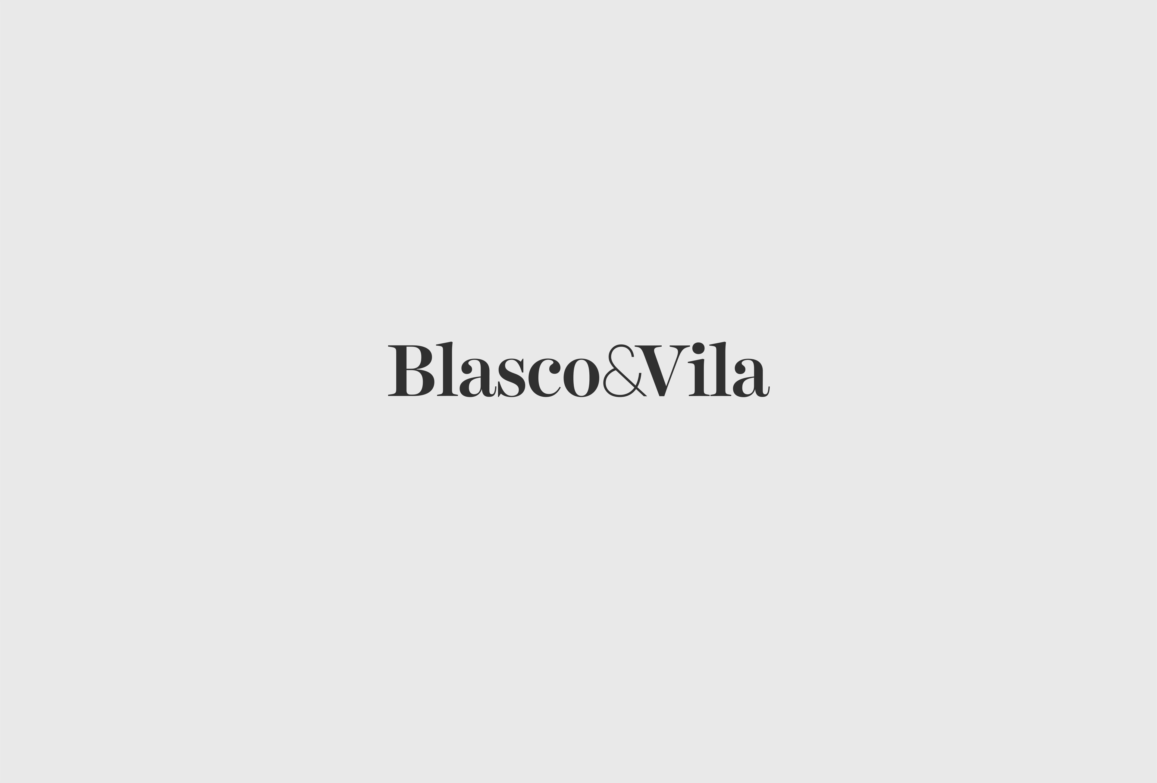
We concluded that a typographic logo should be proposed, complemented by a more powerful visual language, but maintaining a sober and simple style. We opted for a Scottish Roman typography, a style originated in the early nineteenth century, in the search for a very effective and quality design under unfavorable printing conditions. Harriet Series is a typographic family that updates this spirit bringing it closer to new methods and guidelines. One of the key objectives was to downplay the ampersand, a symbol with a lot of visual force capable of minimizing its companions in the abbreviated version of the brand. We designed a personalized ampersand: sans serif, simple, nice shapes and with a cut that makes it even lighter.
The contrast of weights and the opposition between serif and sans typefaces was the solution, formally reflecting the idea of tradition-modernity, as well as achieving a result with the required personality.


