Due to the historical conflict surrounding its toponymy and the recent decision to be called “Castelló,” there was a need to propose a name for the Agenda that would encourage the use of this term and distinguish it from the capital of the province. Thus, “poble” (town) was added to reinforce its identity, and “2030” was included to link it to the program.
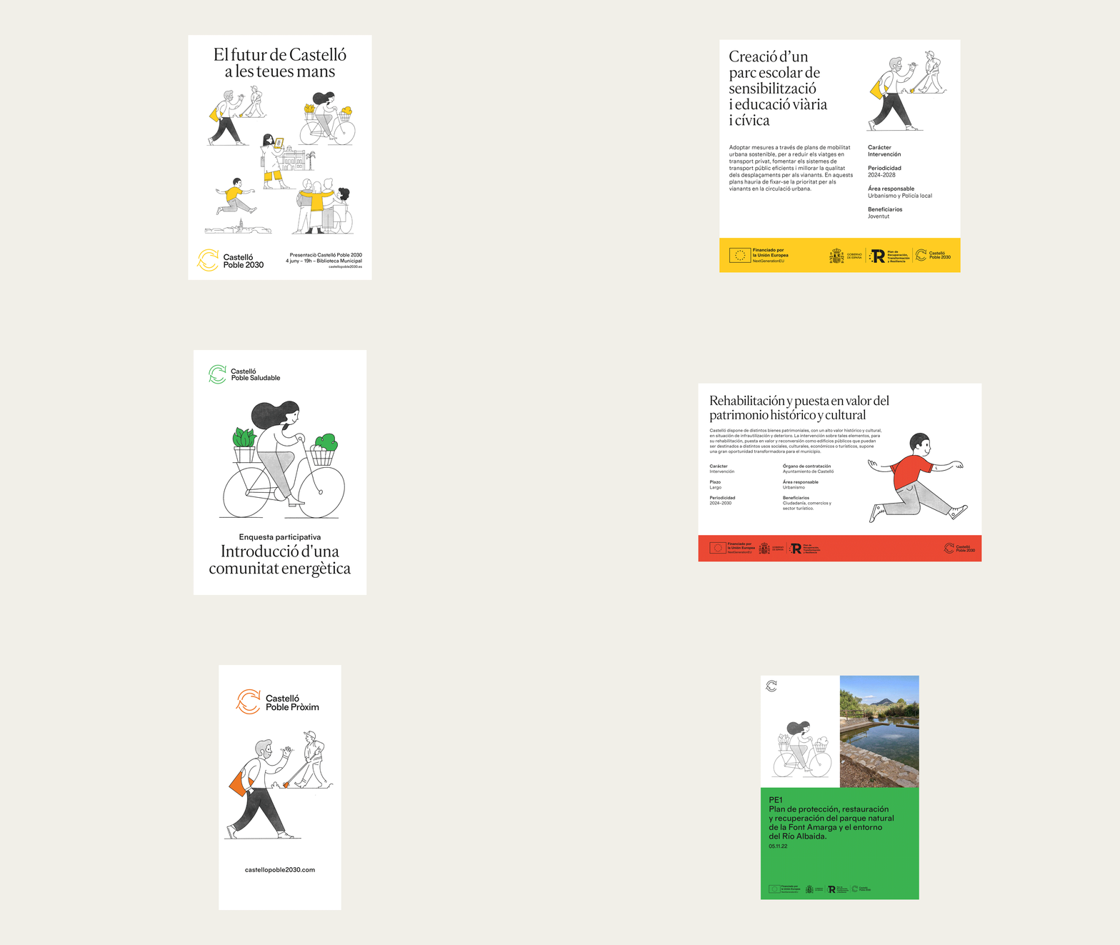
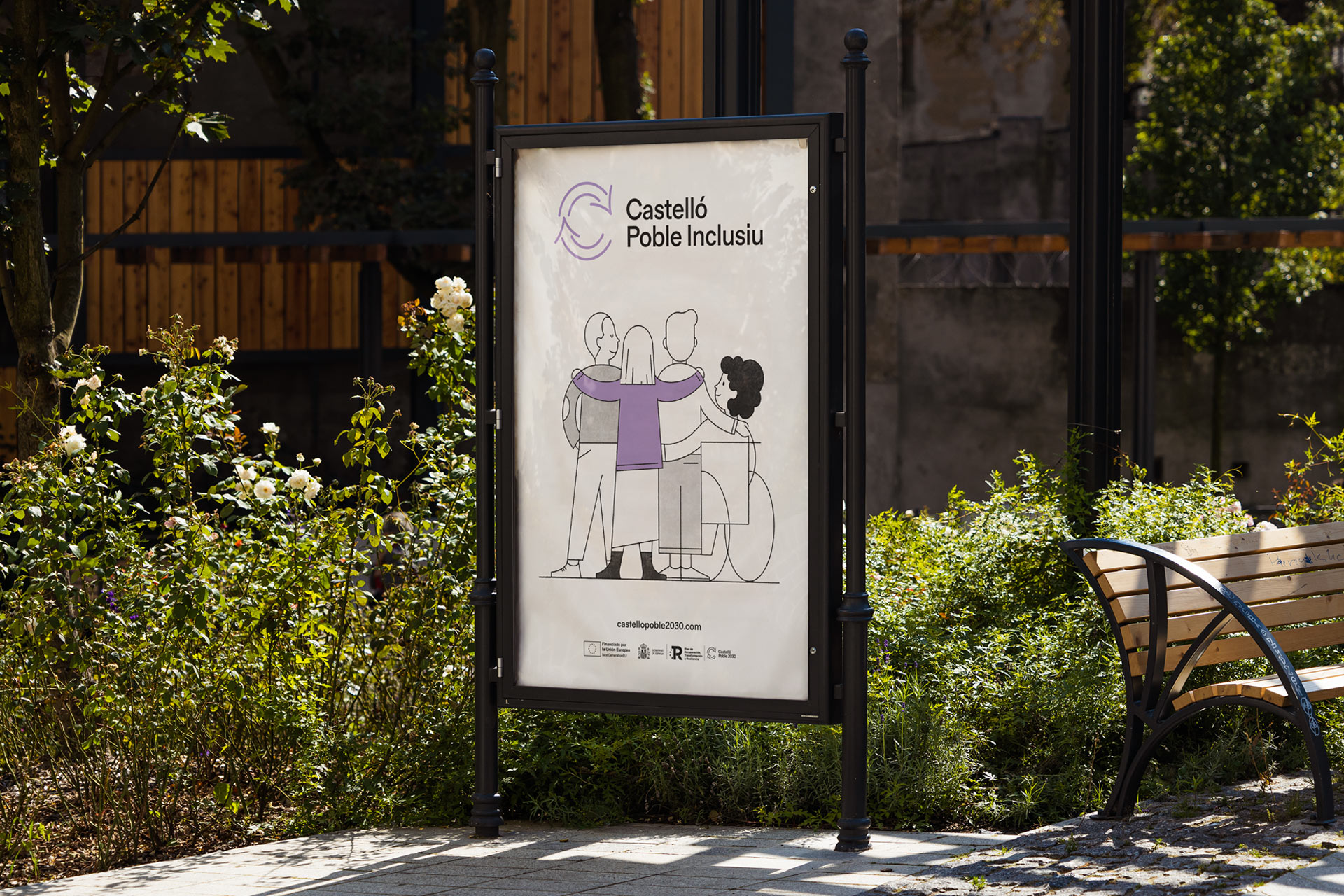
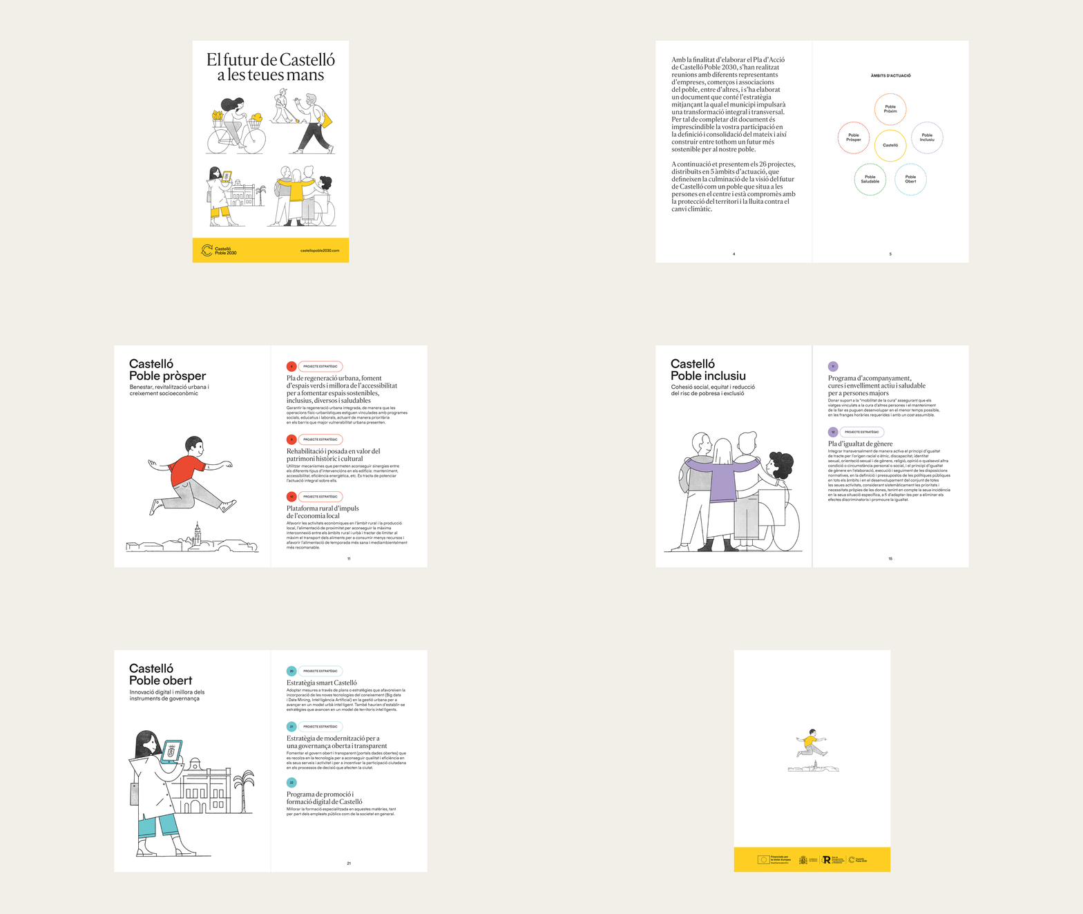
On the other hand, the multitude of concepts related to the Urban Agenda and the UN Sustainable Development Goals require simplification for effective communication. Therefore, five strategic areas have been established that align with the objectives of the Spanish Urban Agenda. This way, the chosen name allows us to replace “2030” with adjectives that define each of these areas: prosperous, healthy, nearby, inclusive, and open.
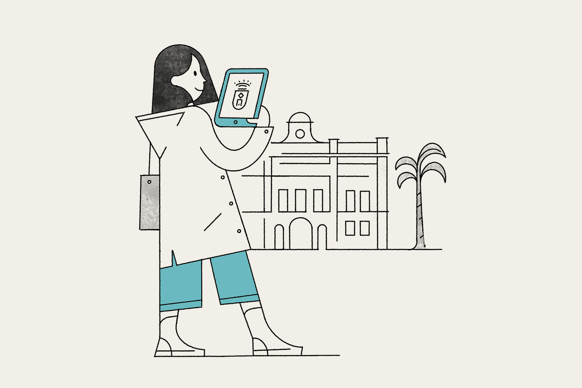
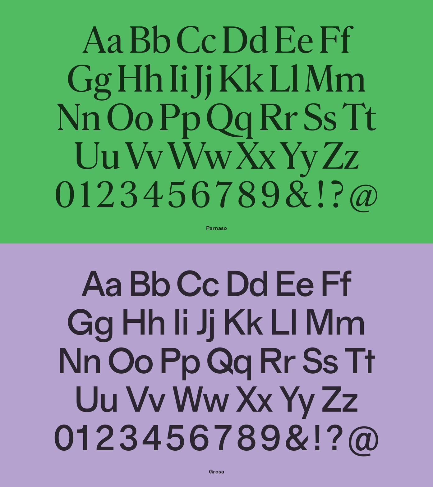
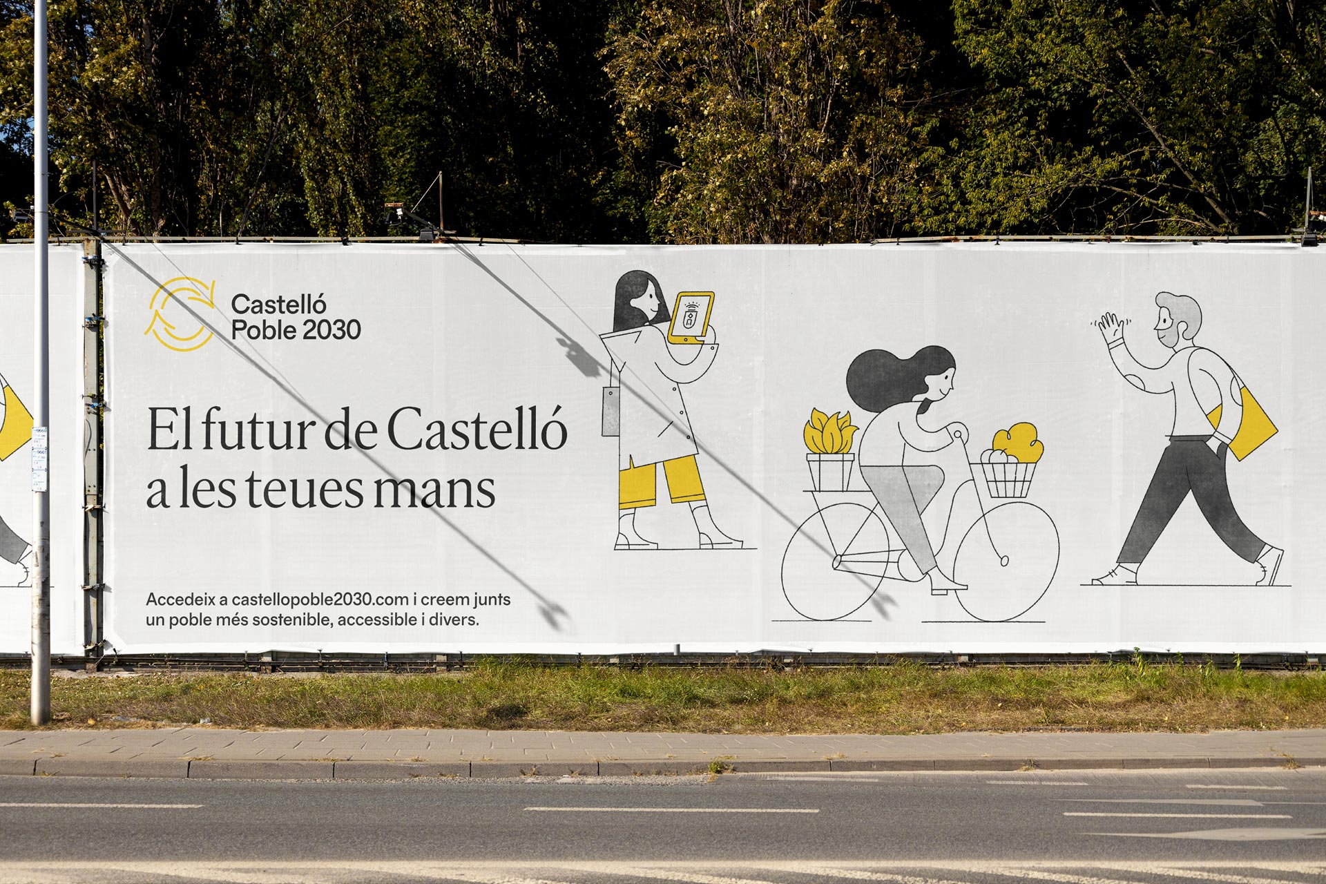
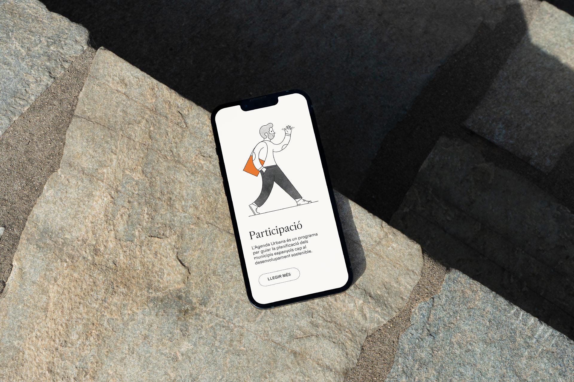
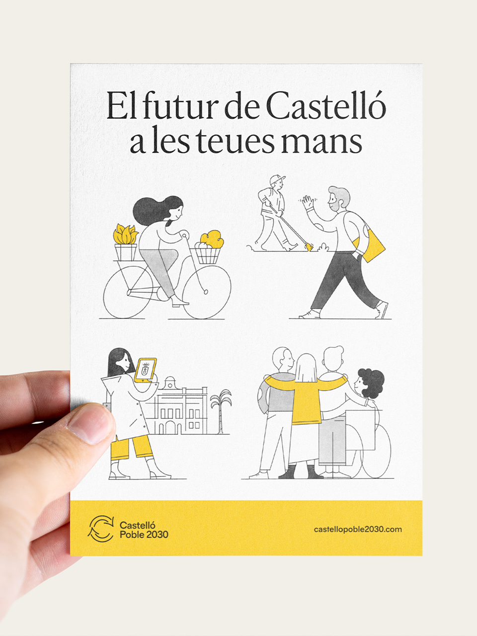
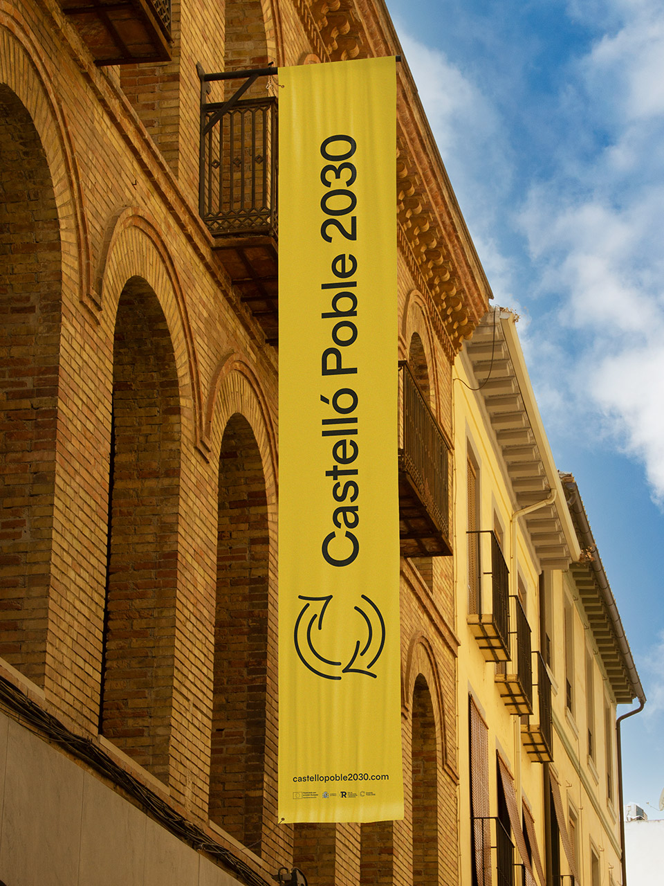
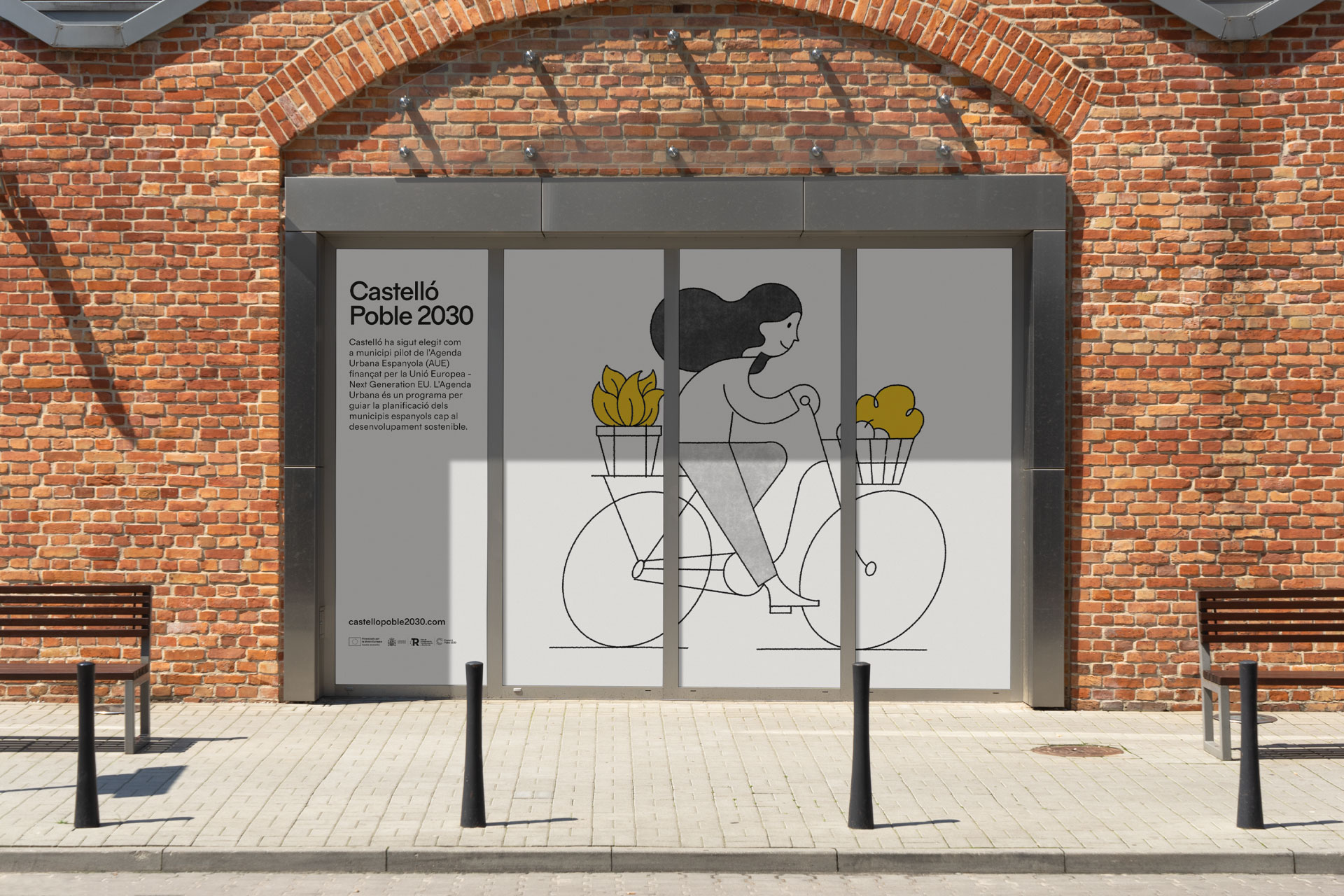
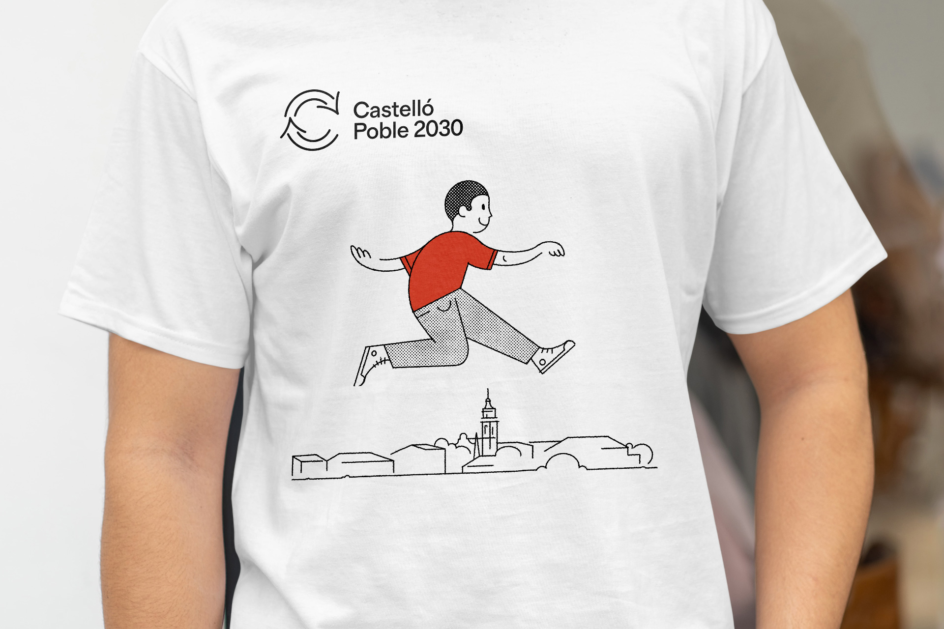
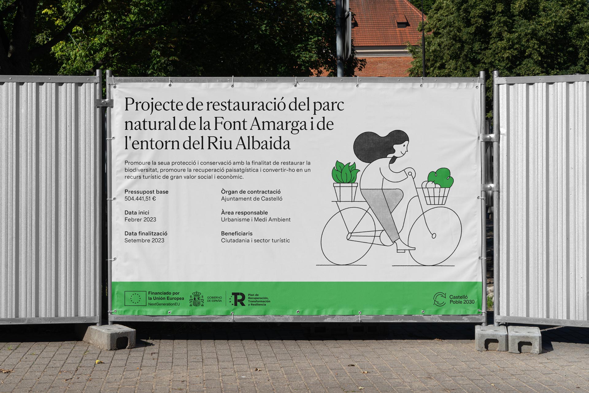
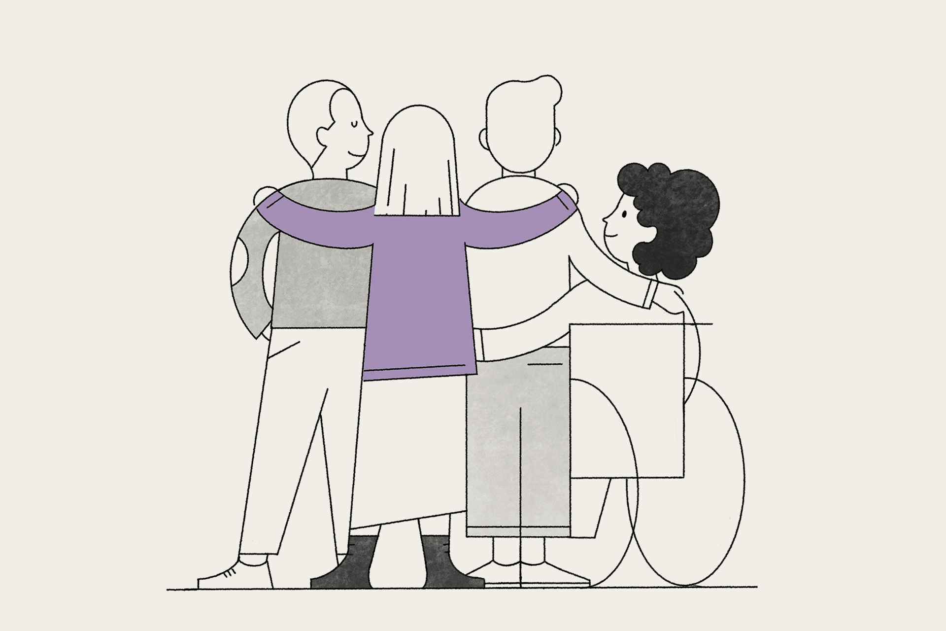
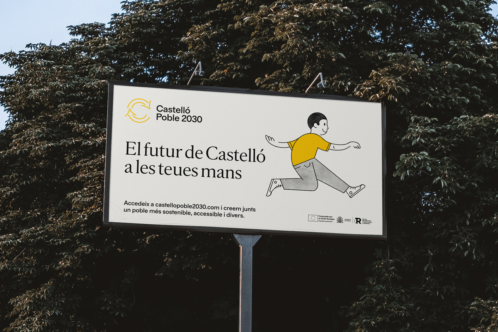
The graphic identity is led by characters representing these areas of action, each assigned a specific color in addition to yellow, which is used for generic communications. The typefaces, with simple and open forms, are familiar and work well across all types of applications and media. Finally, the logo is a straightforward identifier that combines update and recycling icons with the letter C.
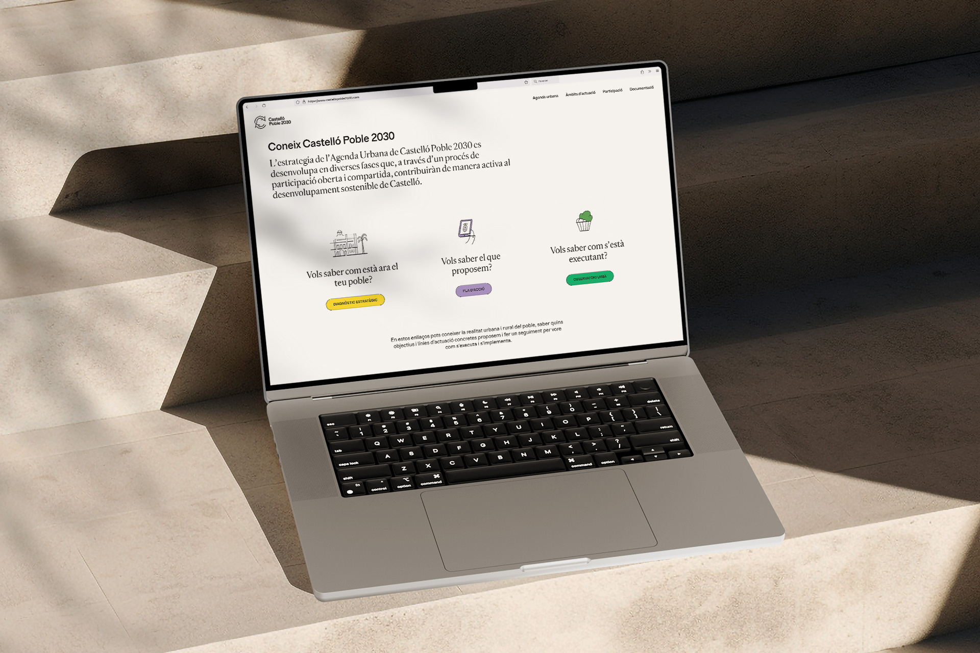
Website: castellopoble2030.com
Illustrations: Josep Navarro
Web design and coding: Mui Studio
Typefaces: Feliciano Type

