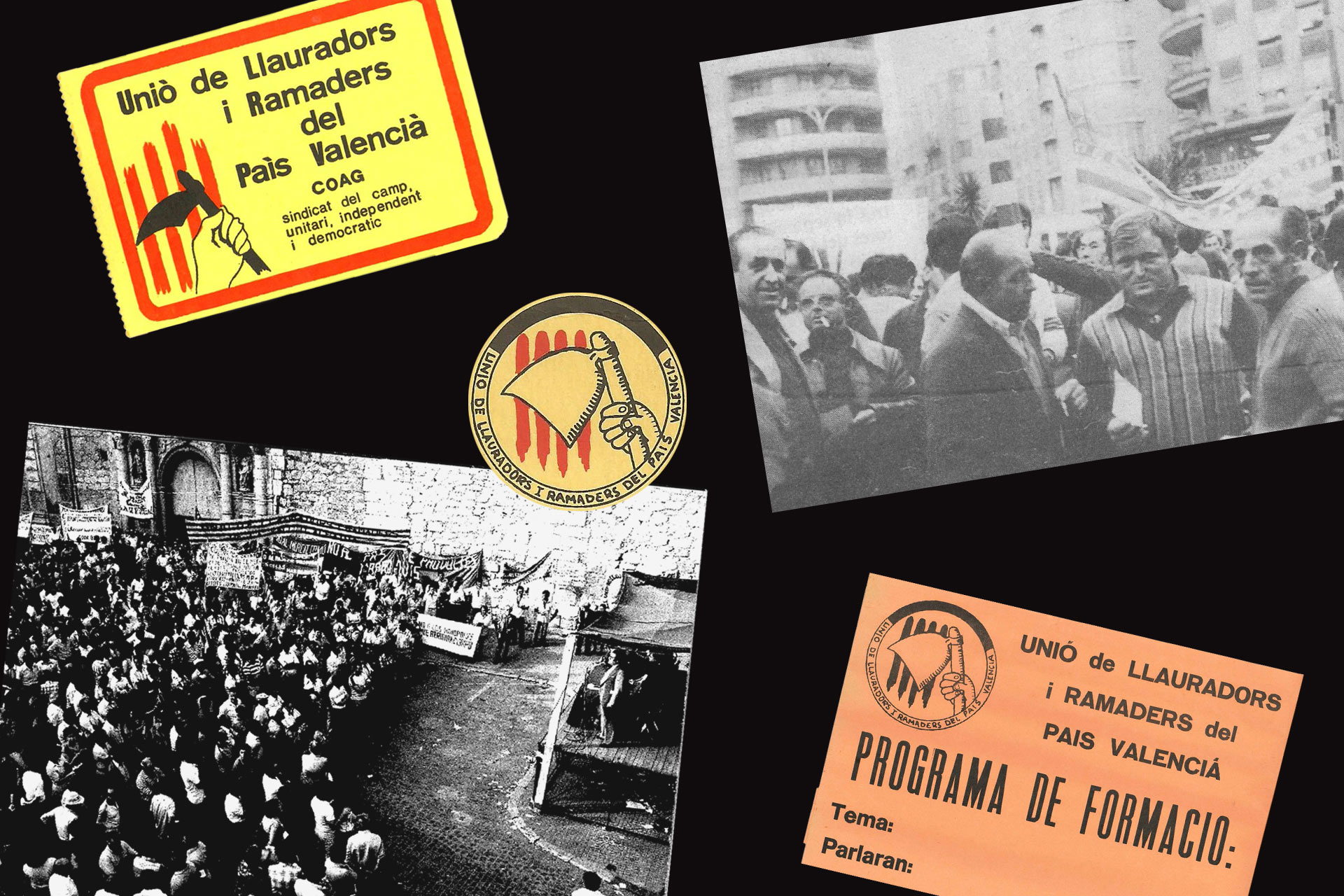
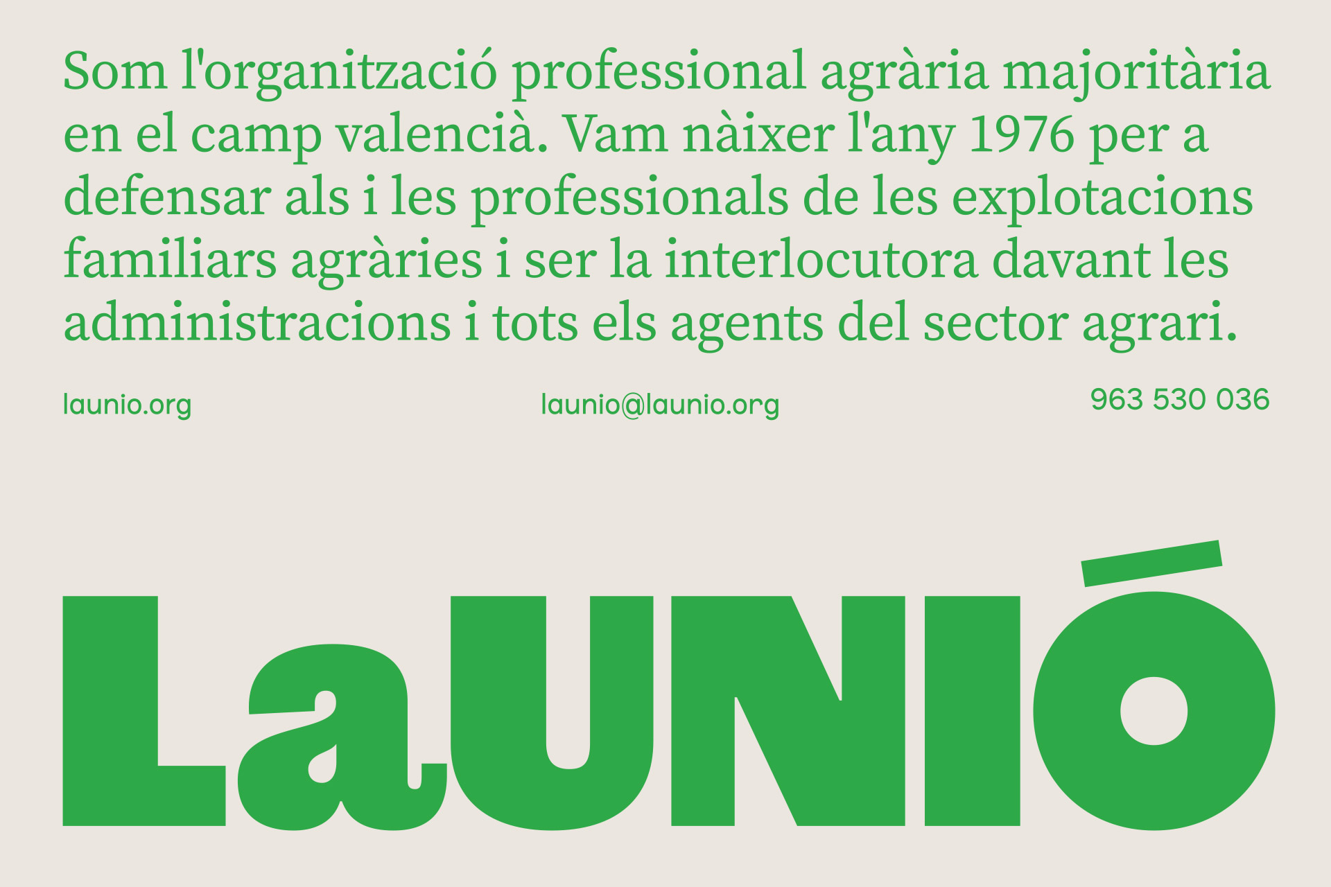
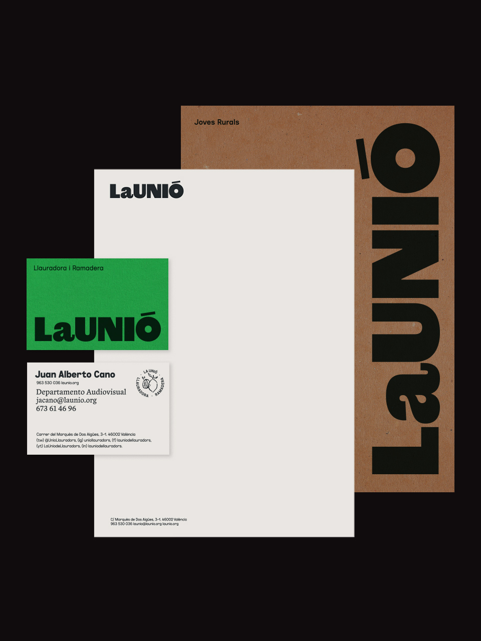
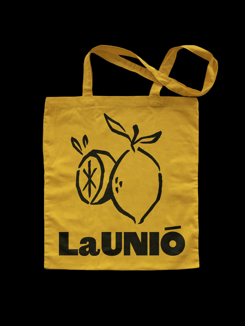
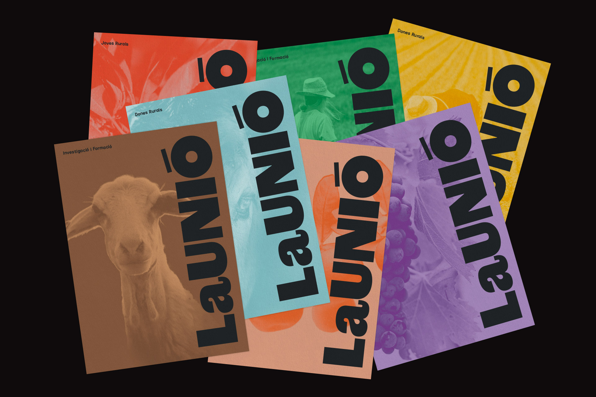
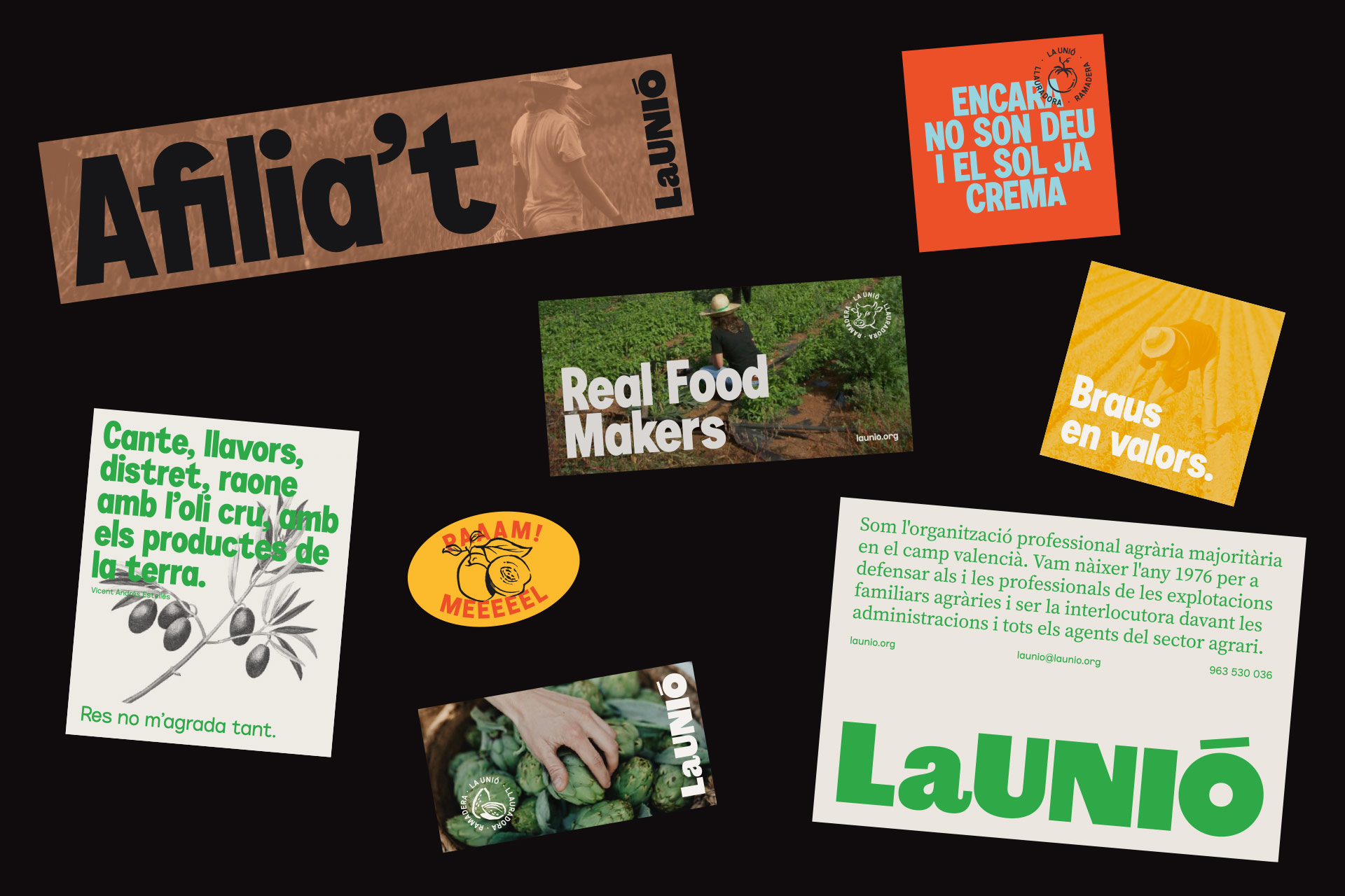
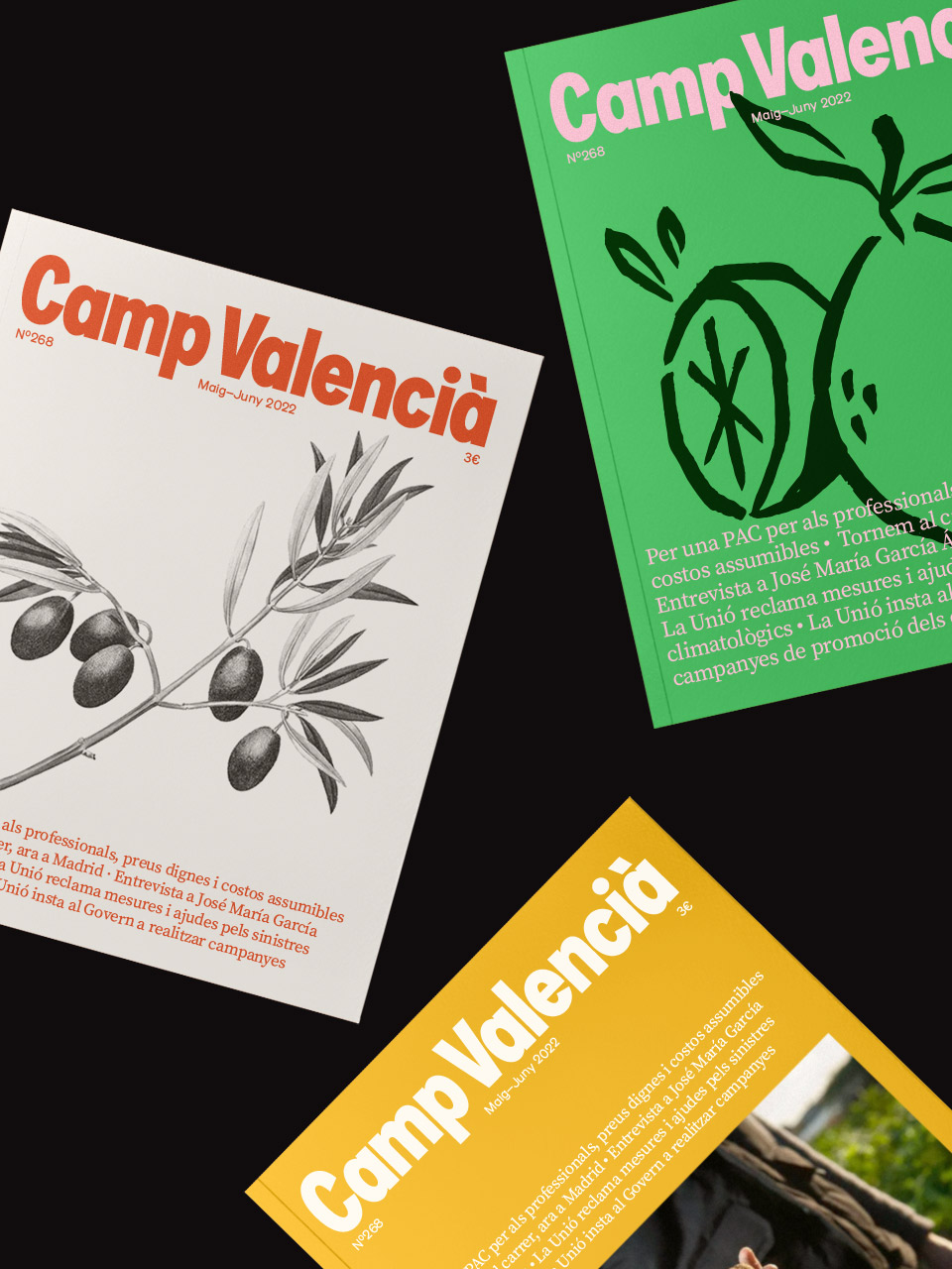
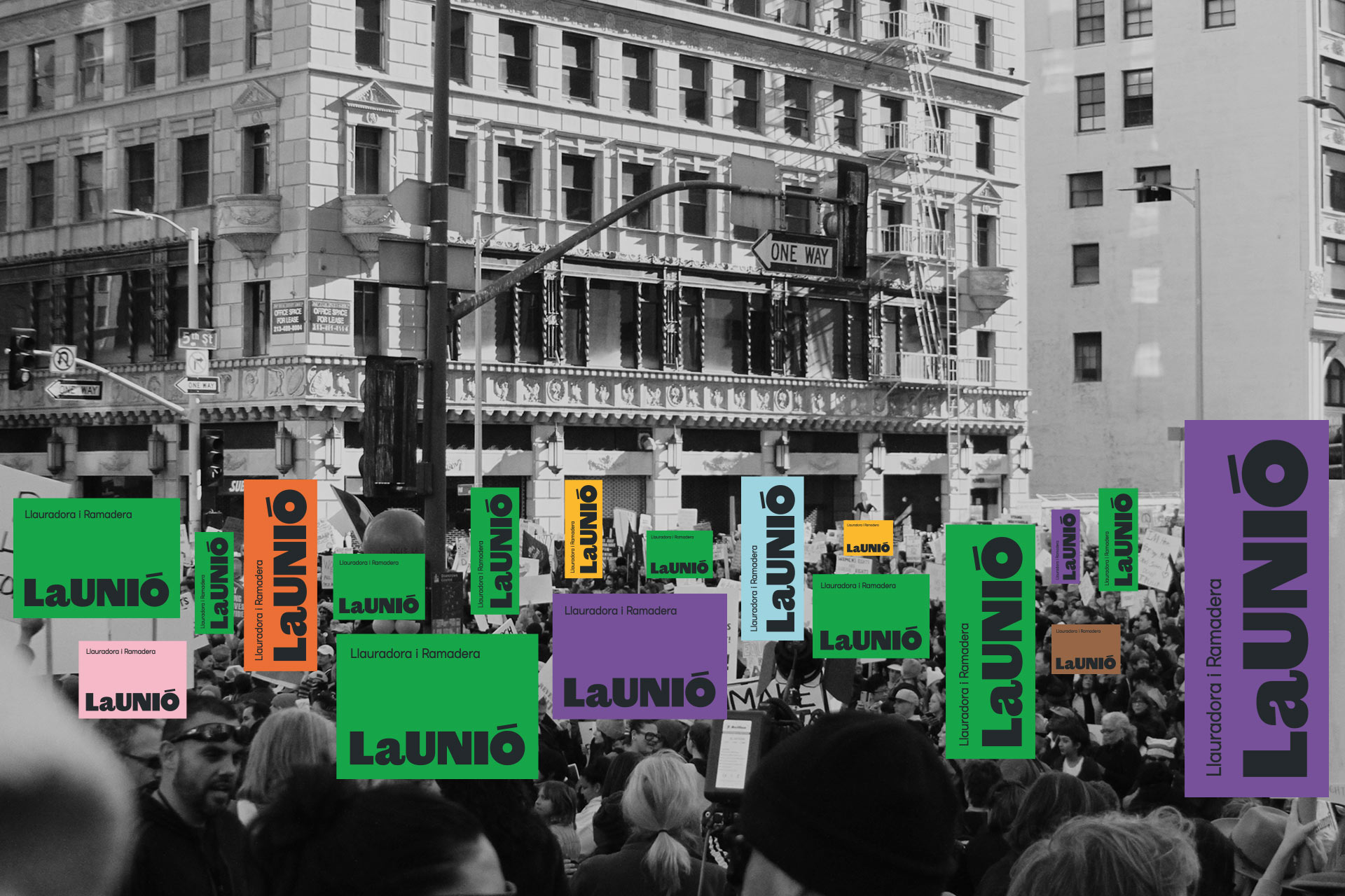
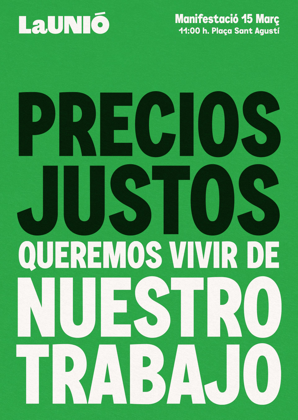
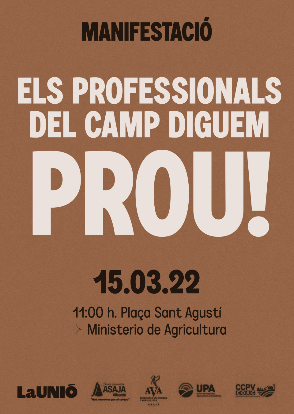
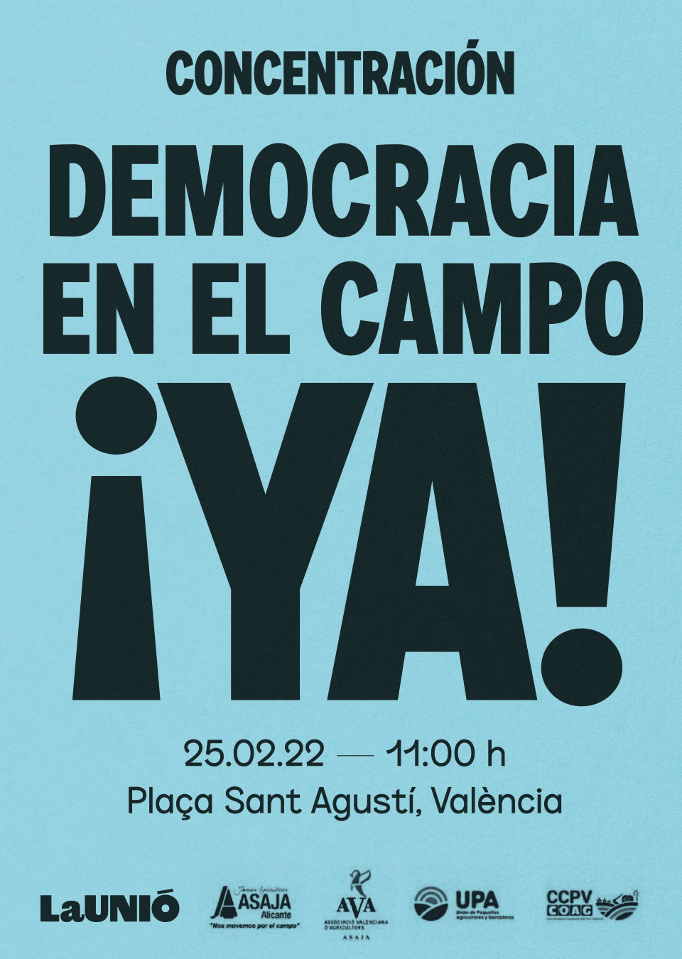
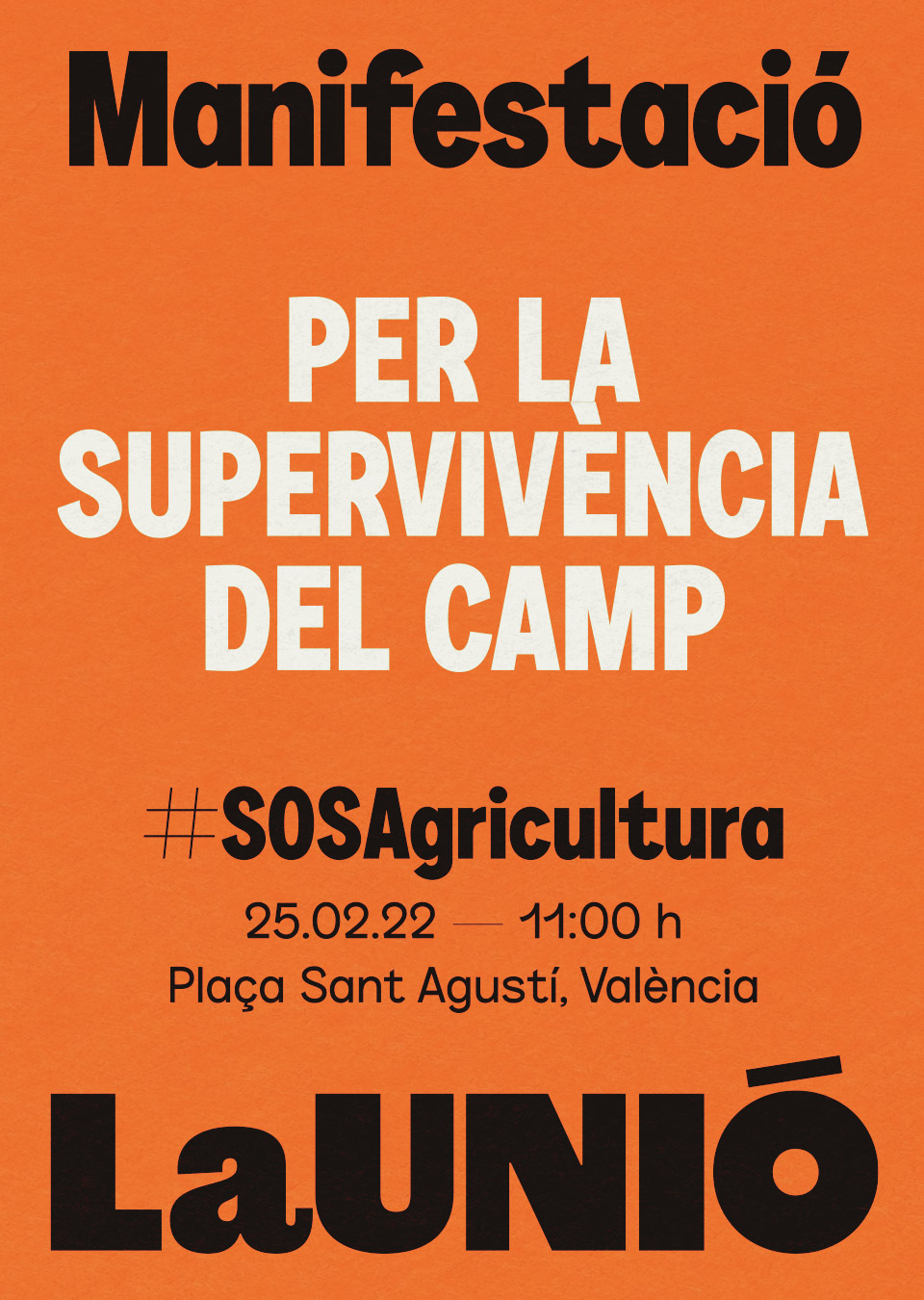
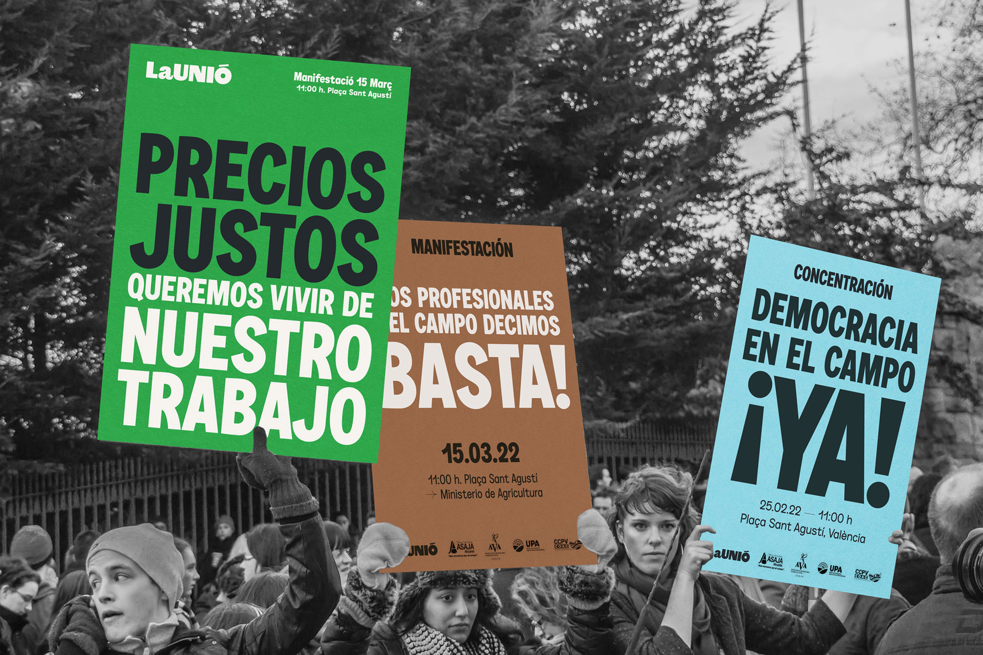
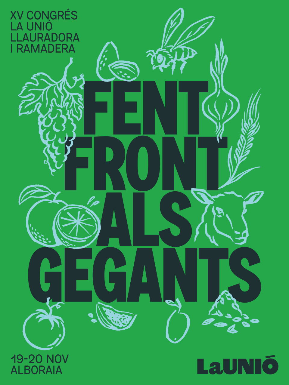
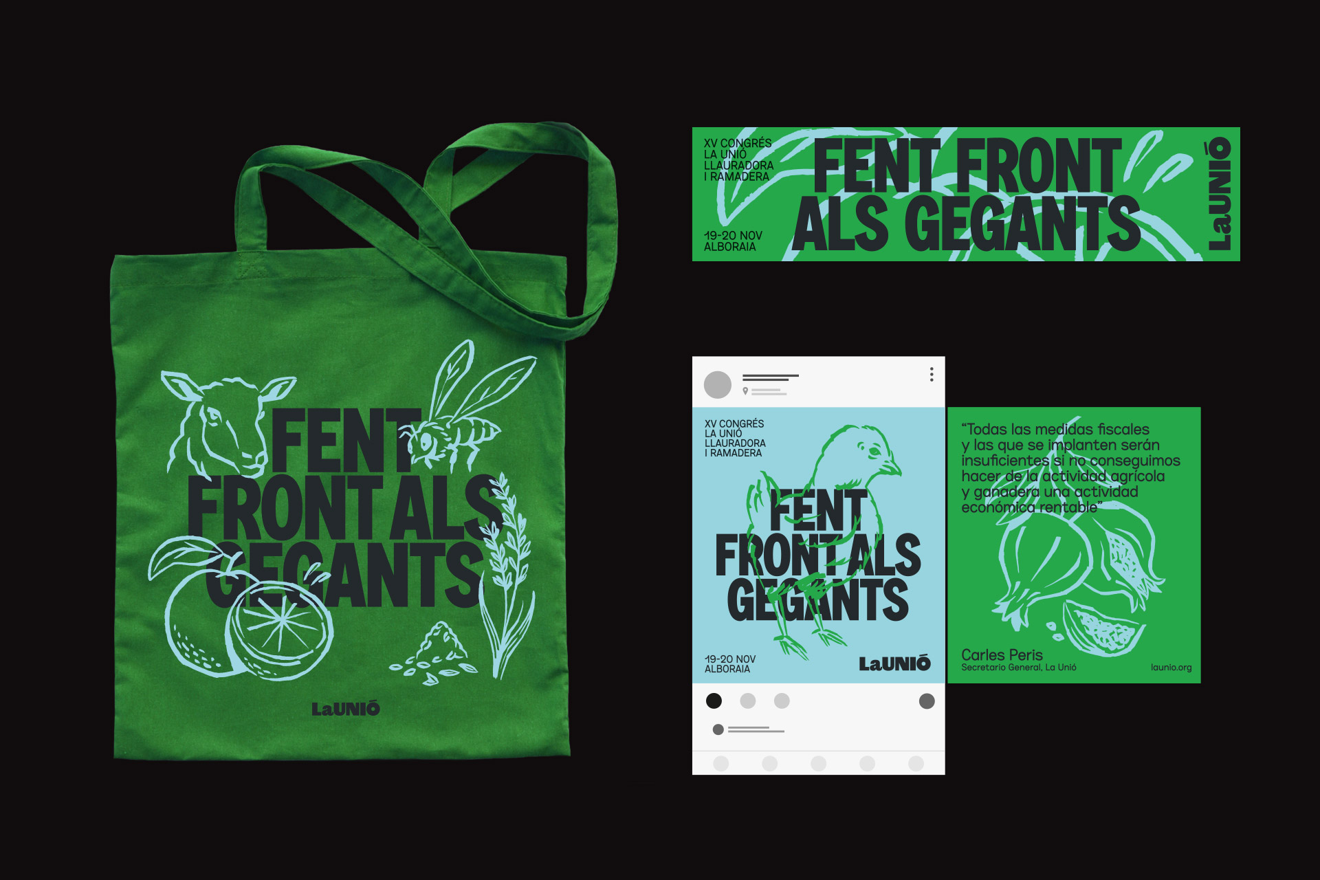
The graphic identity had to reflect the renewed character and values of the organization and try to connect with the new generations. We propose a typographic logo that joints the two words. The typeface, Original Sans links it formally to the trade union imagery. Seeking to enrich the identity and also as a functional element, we added a variant that has the full denomination and associates it to the food quality seals. The main typeface is Zoom Pro which with its imperfect geometric shapes provides freshness and spontaneity and, thanks to the variety of weights and widths, it allows the message to be modulated from some more formal to others more demanding.
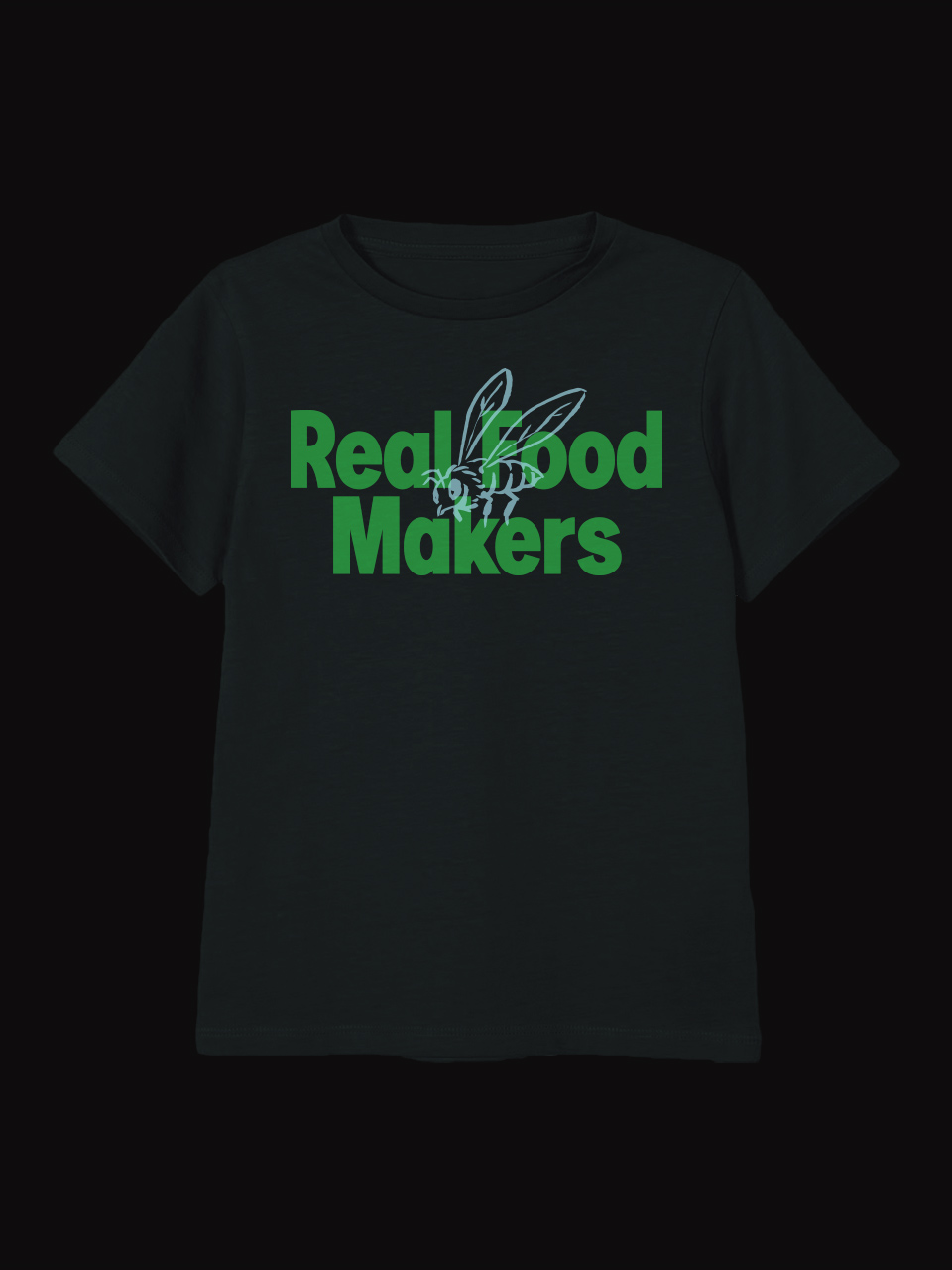
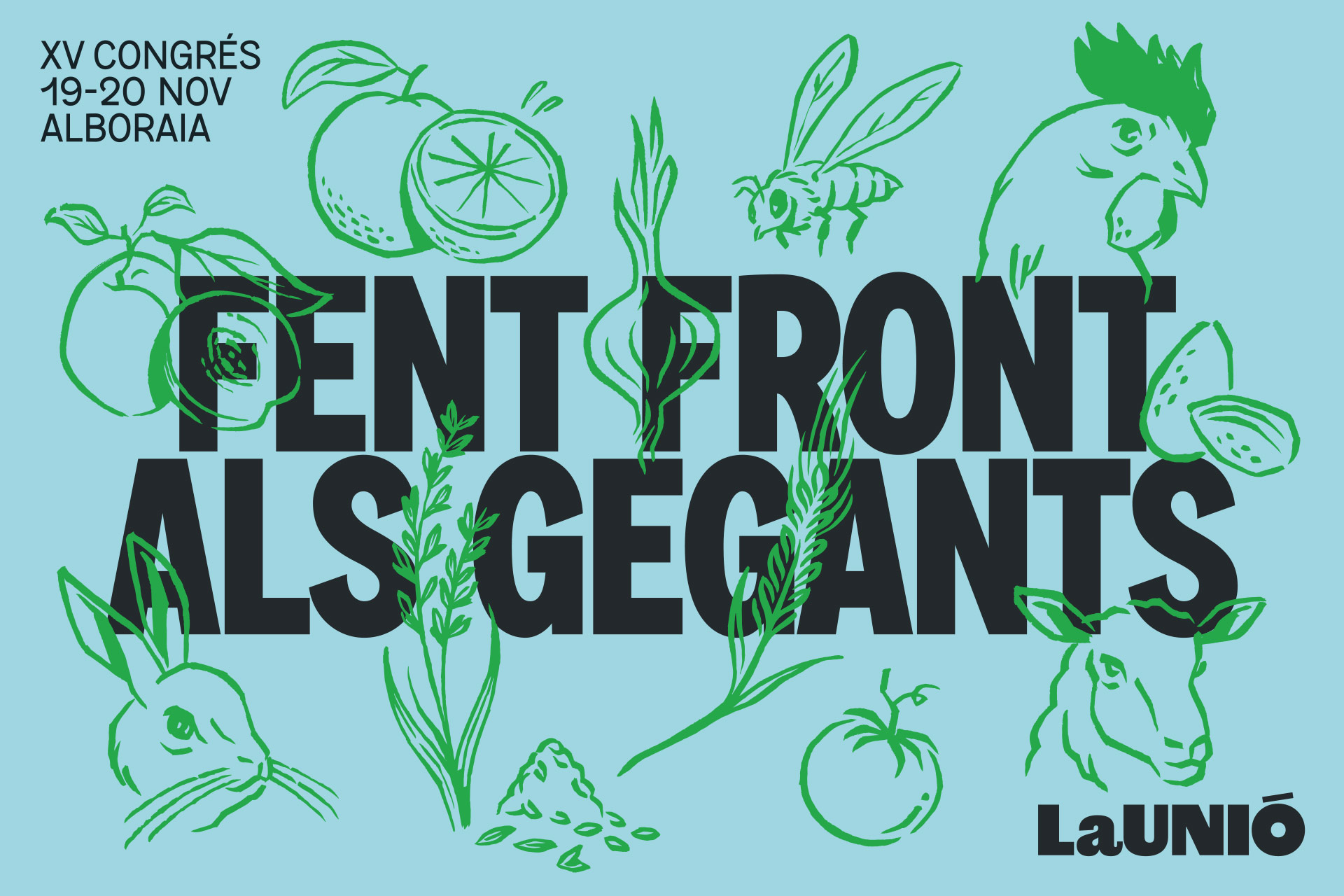
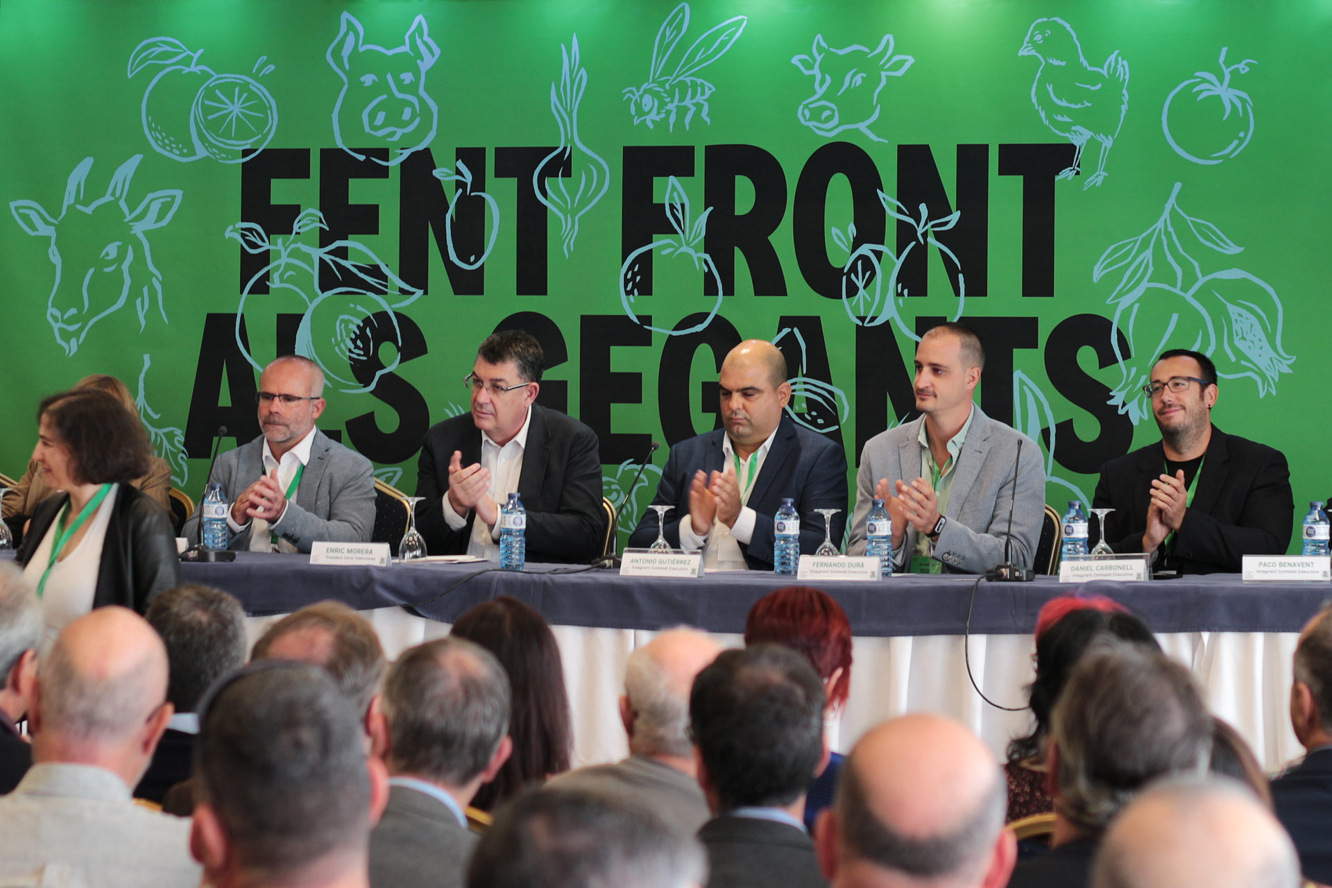
We updated the green color that has represented the organization in recent years with a more powerful and recognizable hue, as well as adding a fresh and vibrant color palette. Finally, we commissioned a collection of illustrations to Luis Demano with the aim of emphasize the nature of the organization and to help with some applications and the brand architecture. They were drawn freehand with a marker, with an accessible but not childish style.
Illustrations: Luis Demano
Typography: Original sans y Zoom Pro

