Falles 2021

Falles 2021

The Fallas 2021 graphic identity, the most important celebration in València, is a tribute to the professionals that make the festival possible: a recognition and a vindication of tradition, motivated by the situation that these artisans are going through.

Fase, estudio de diseño gráfico. Fallas 2021, imagen gráfica. Cartel genérico

Fase, estudio de diseño gráfico. Fallas 2021, imagen gráfica. Inspiración
Fase, estudio de diseño gráfico. Fallas 2021, imagen gráfica. Manos monumento
Fase, estudio de diseño gráfico. Fallas 2021, imagen gráfica. Carteles Fallas 21

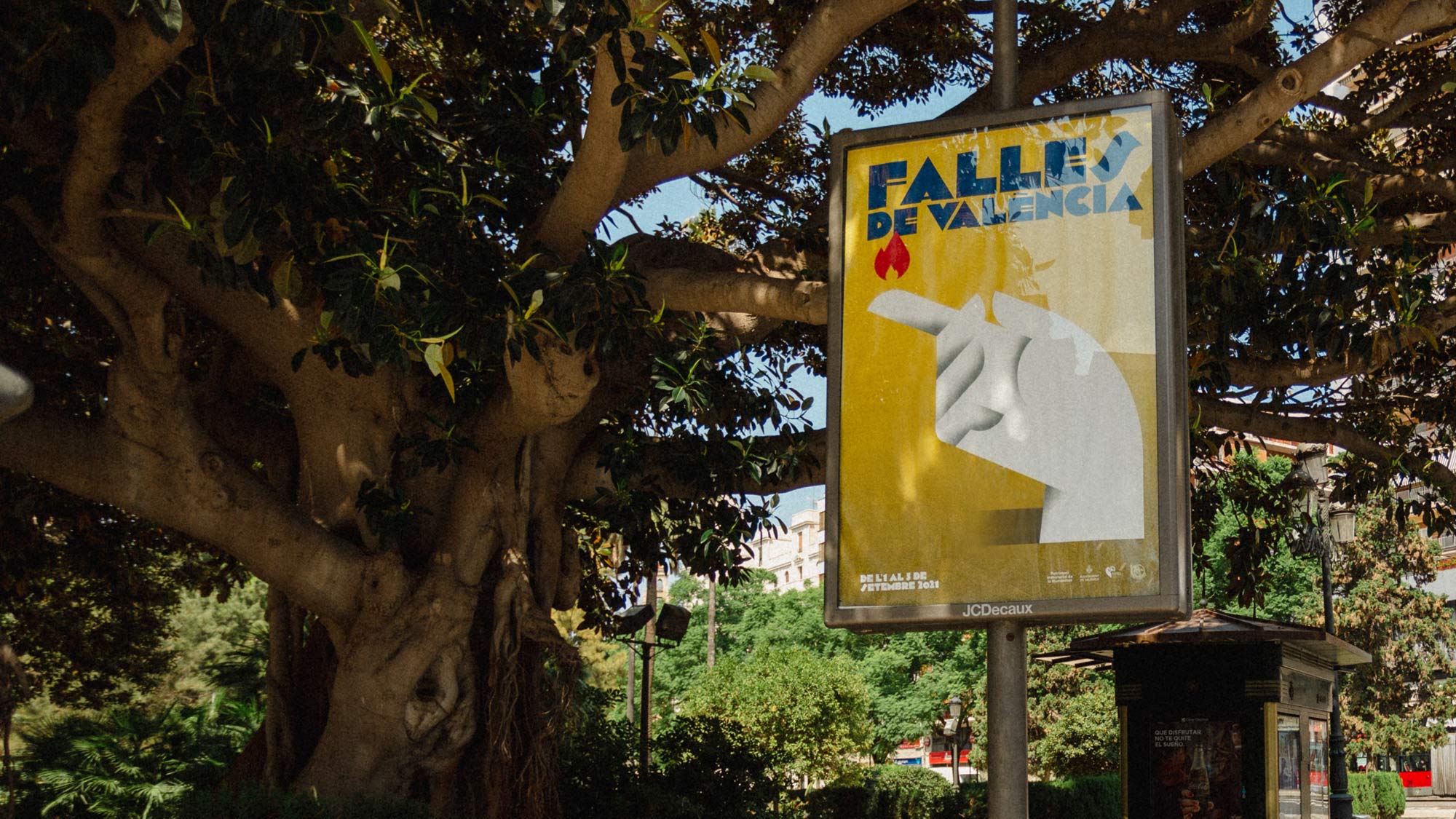
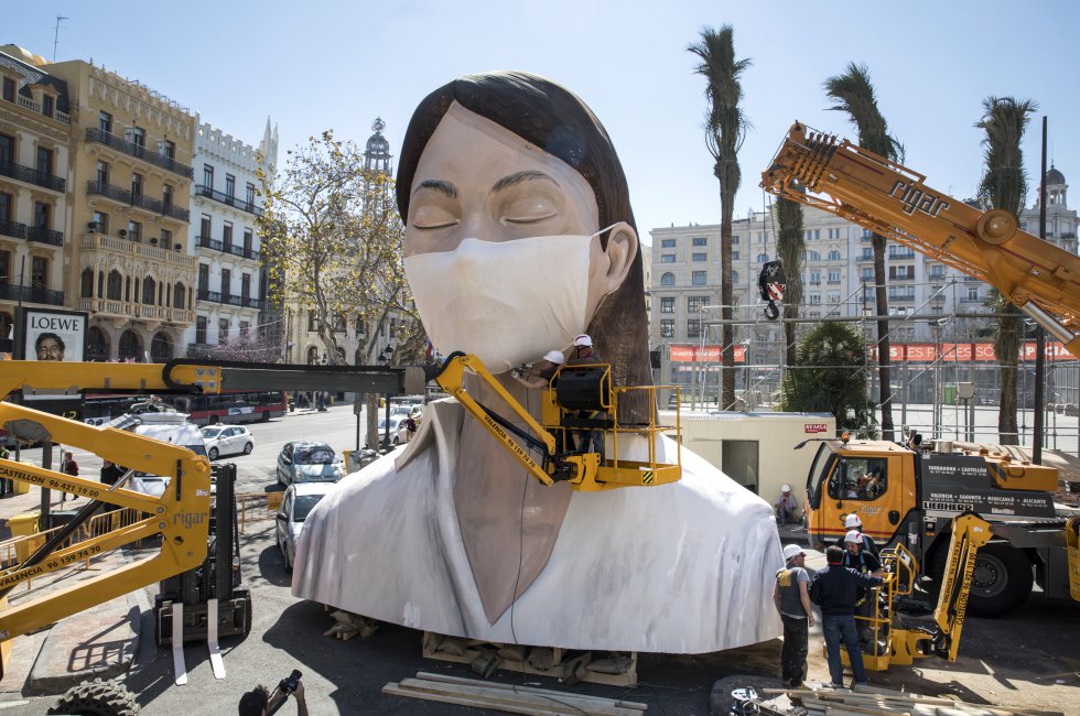
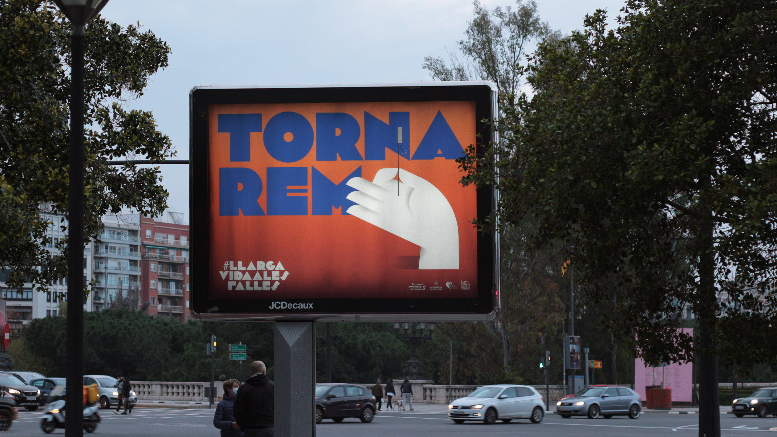
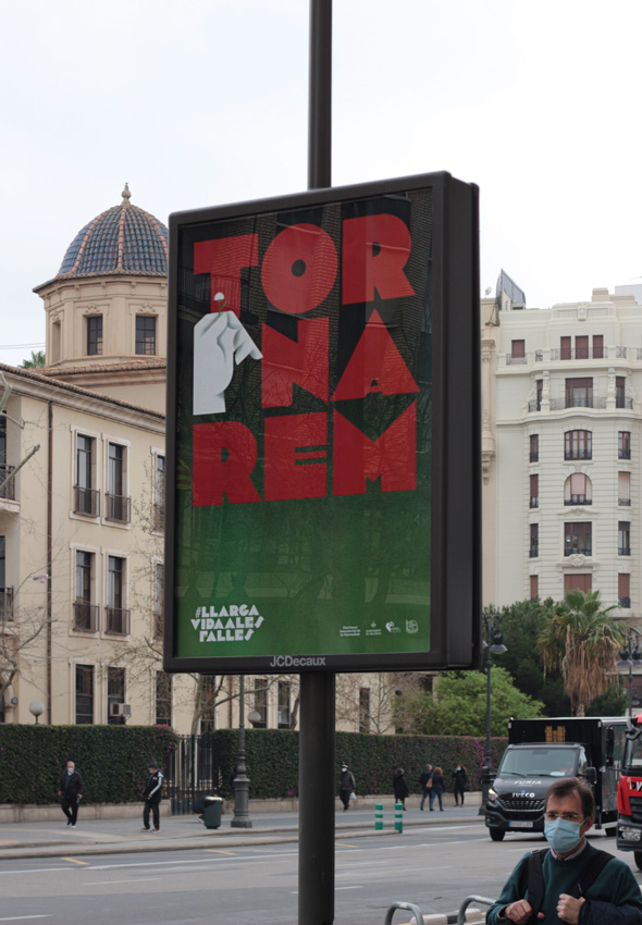
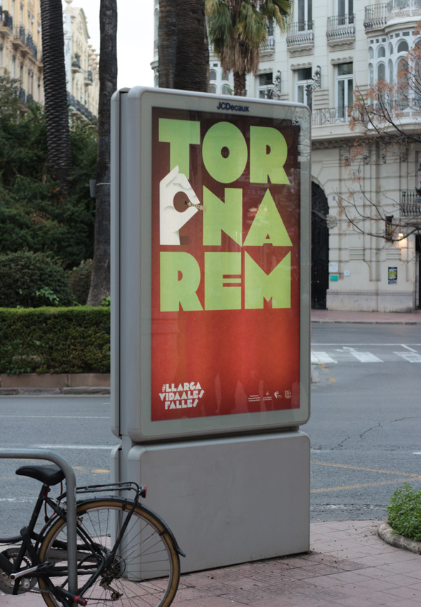
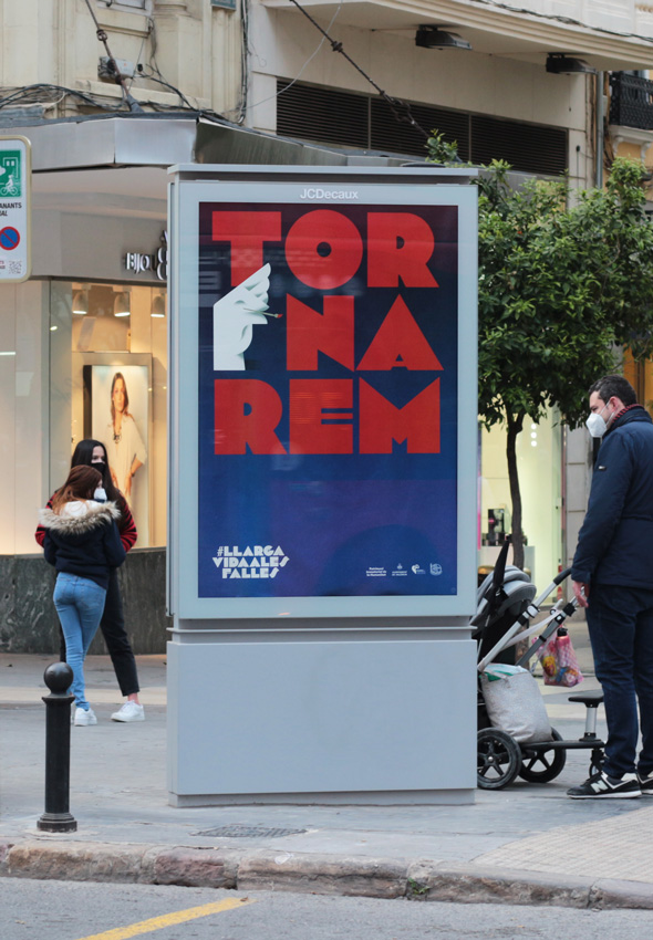
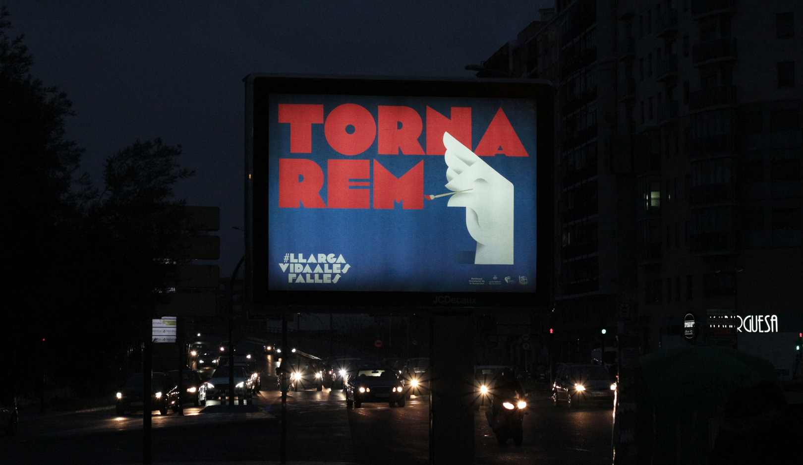
Given the global pandemic situation, the Fallas could not be celebrated on their usual dates and the graphic campaign could not be used as we had designed it. For this reason, the City Council asked us to make an adaptation under the slogan Tornarem (We will return), which would serve as recognition, following the concept of the campaign.

Fase, estudio de diseño gráfico. Fallas 2021, imagen gráfica. Tornarem florista
Fase, estudio de diseño gráfico. Fallas 2021, imagen gráfica. Tornarem músico
Fase, estudio de diseño gráfico. Fallas 2021, imagen gráfica. Tornarem artista fallero
Fase, estudio de diseño gráfico. Fallas 2021, imagen gráfica. Tornarem indumentarista
Fase, estudio de diseño gráfico. Fallas 2021, imagen gráfica. Tornarem pirotécnico
Fase, estudio de diseño gráfico. Fallas 2021, imagen gráfica. Tornarem genérico
Fase, estudio de diseño gráfico. Fallas 2021, imagen gráfica. Tornarem artista fallero

Thanks to the arrival of the vaccine, the responsible governments allowed to celebrate the Fallas as well as other local festivities. The Junta Central Fallera decided to convene them in the first week of September and finally, the official graphic campaign could be seen in the streets of Valencia.

Fase, estudio de diseño gráfico. Fallas 2021, imagen gráfica. Cartel florista
Fase, estudio de diseño gráfico. Fallas 2021, imagen gráfica. Cartel indumentarista


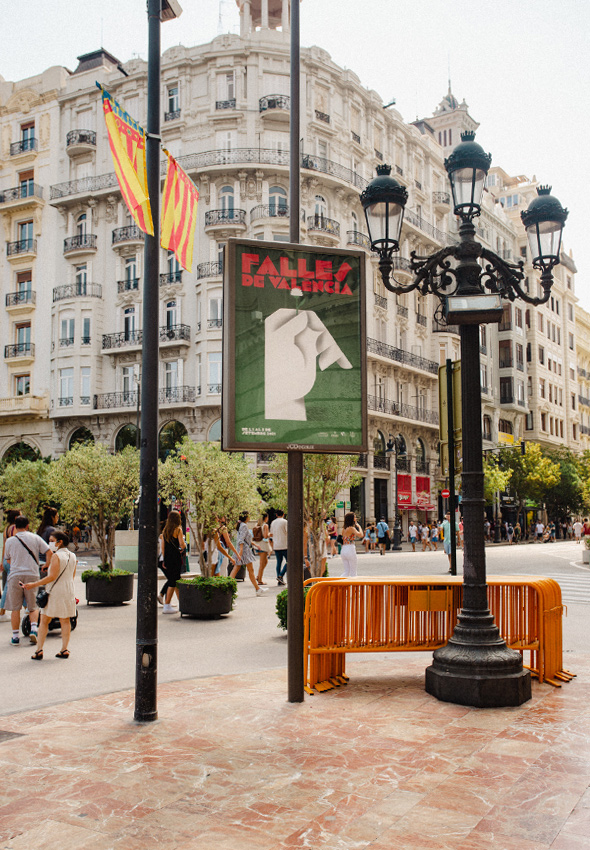
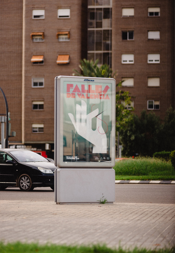
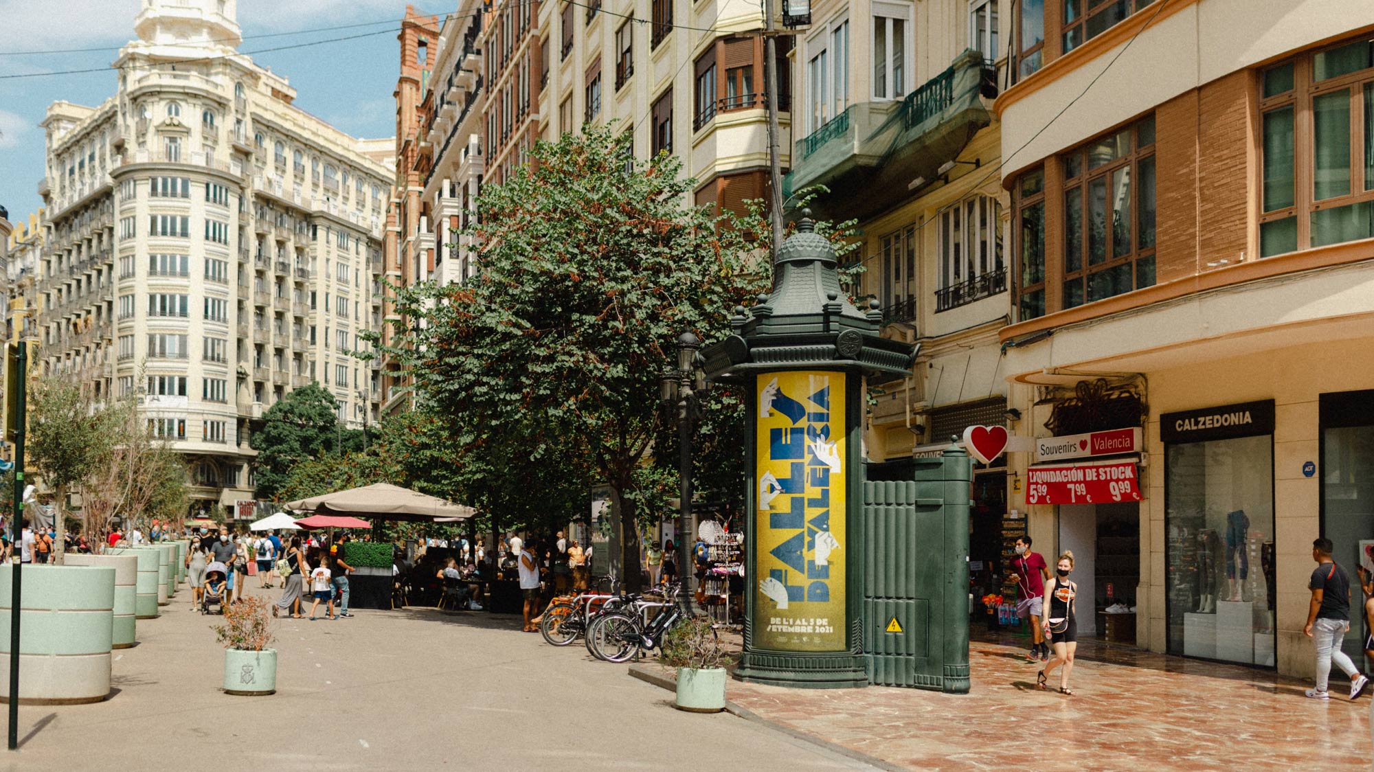
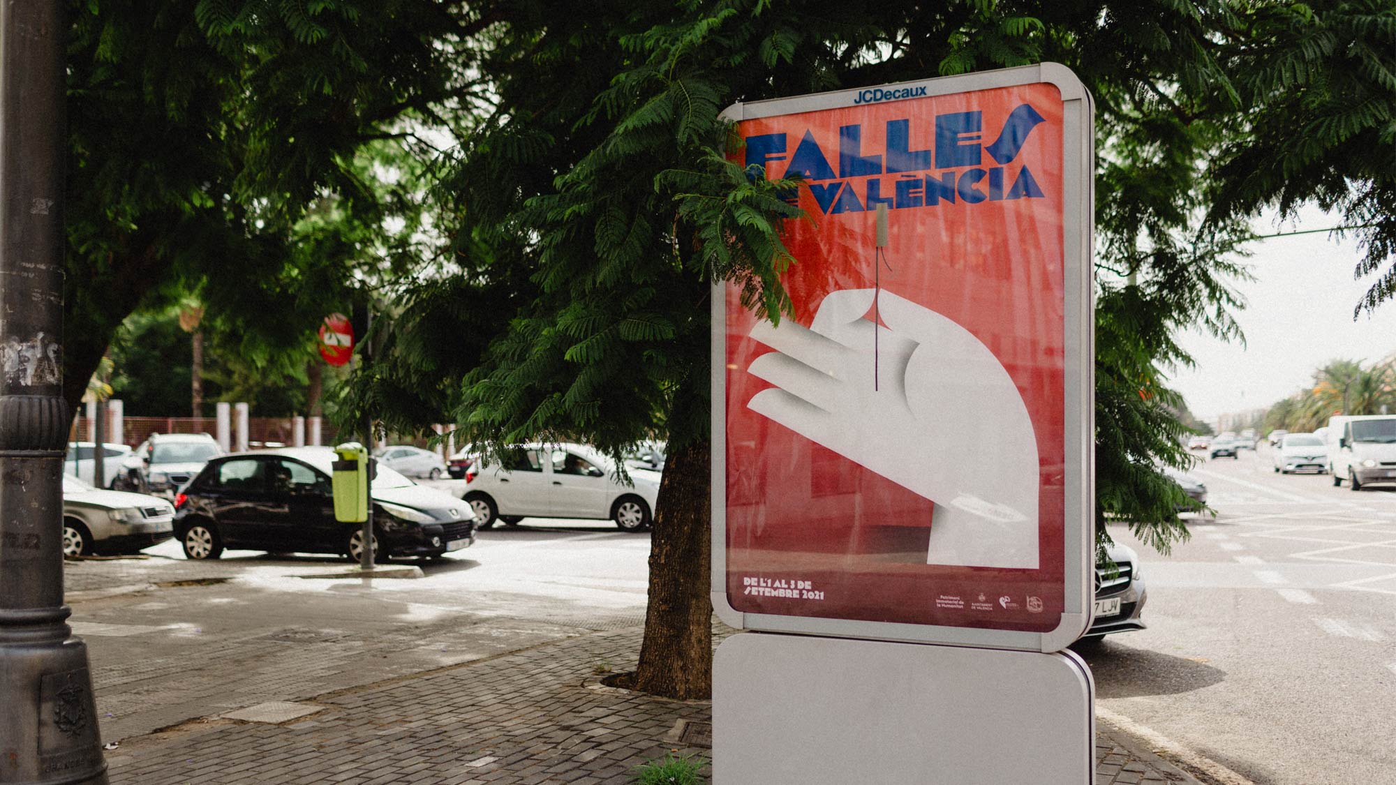
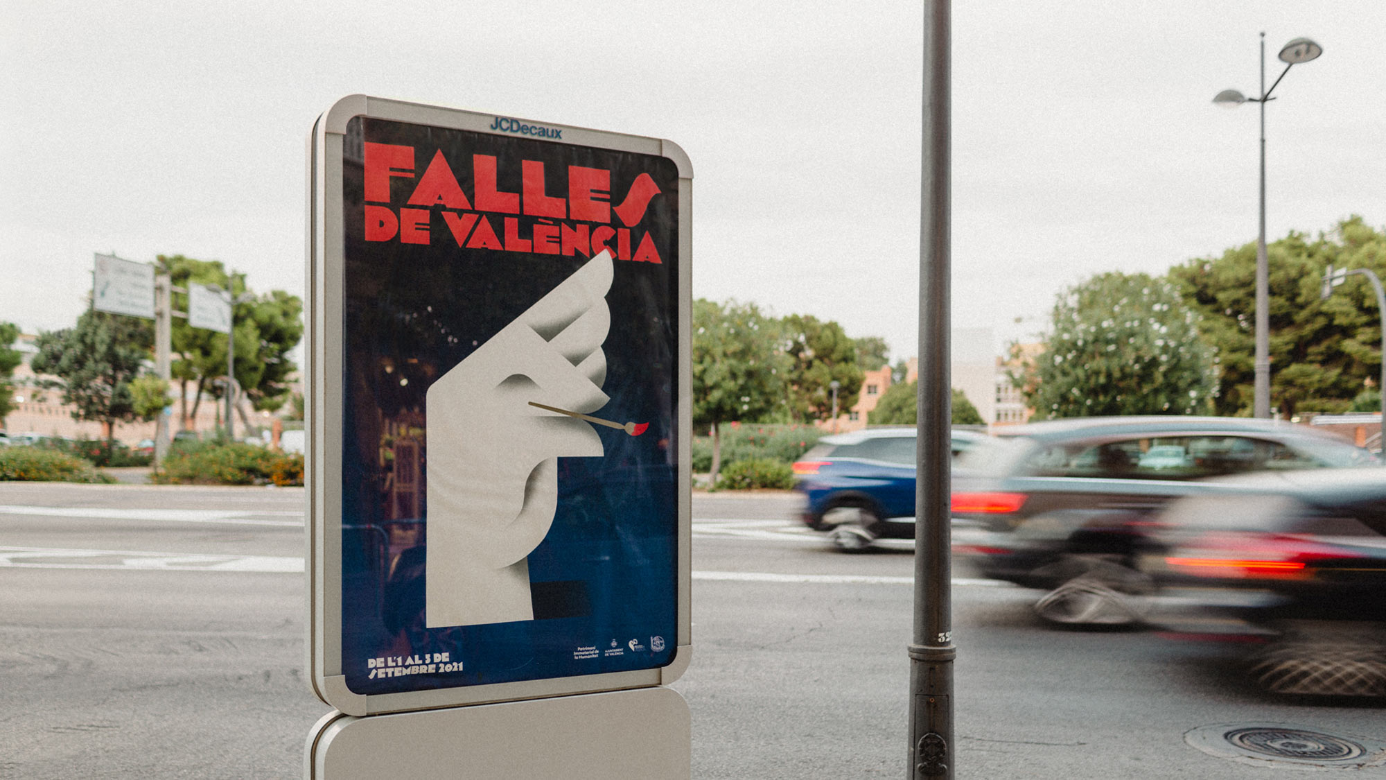
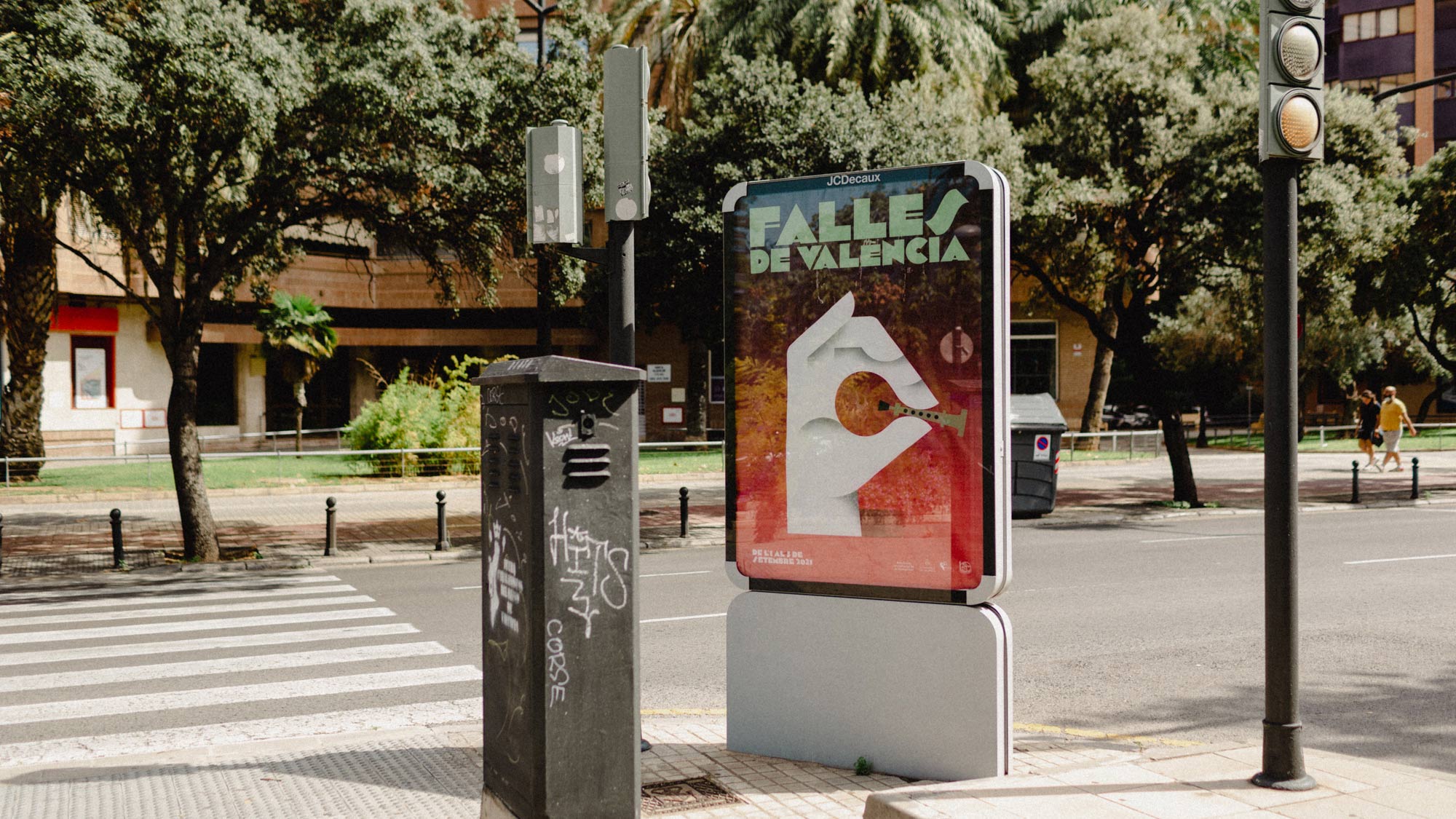
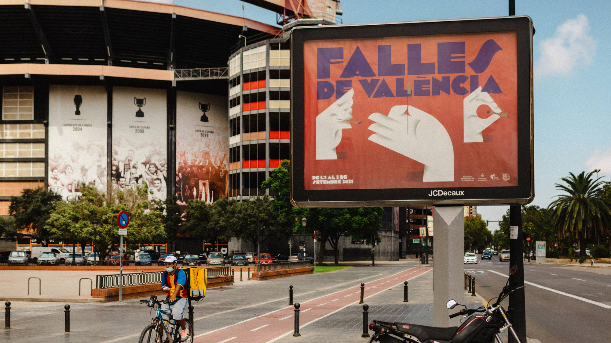
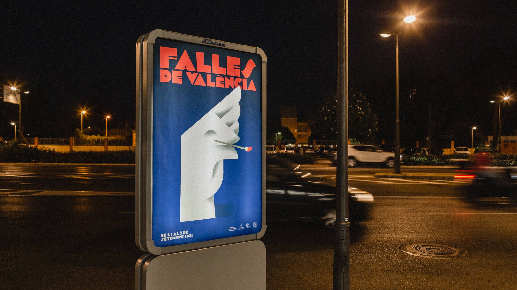
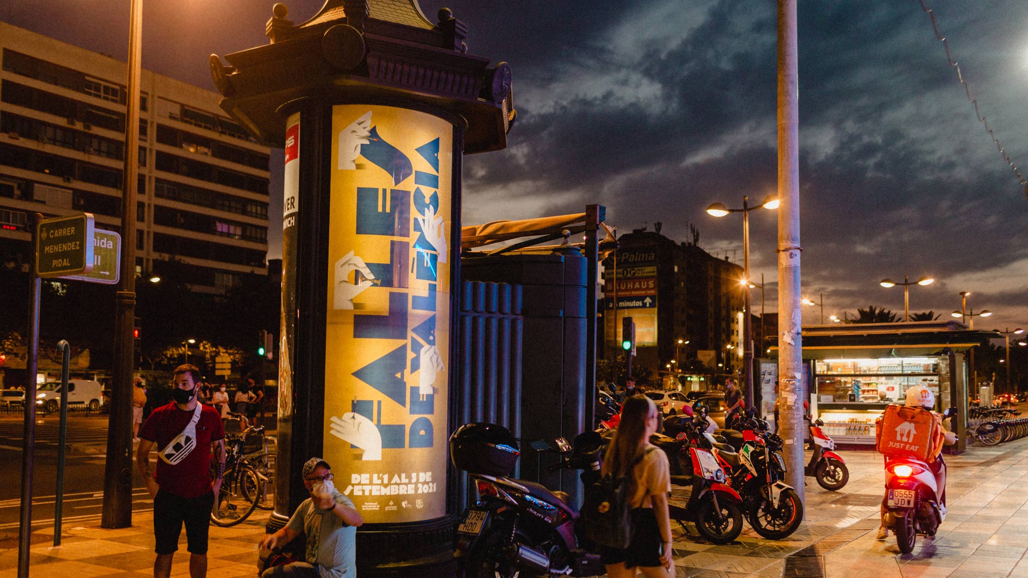
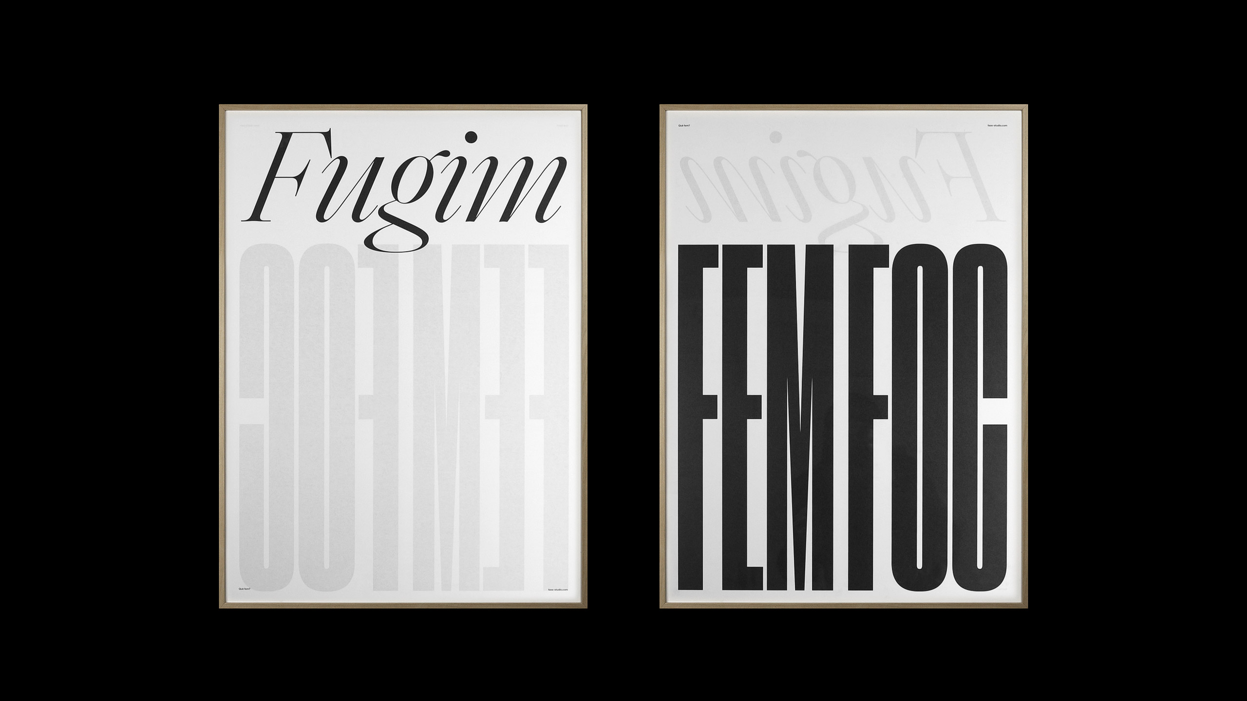
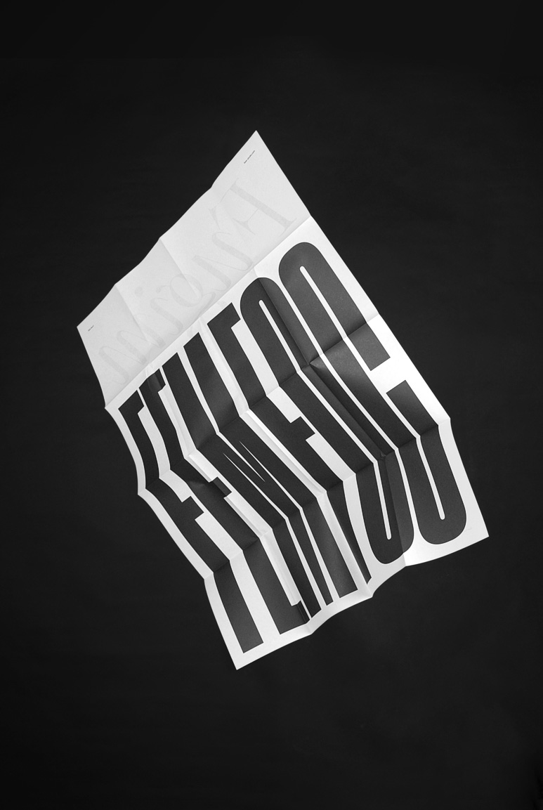
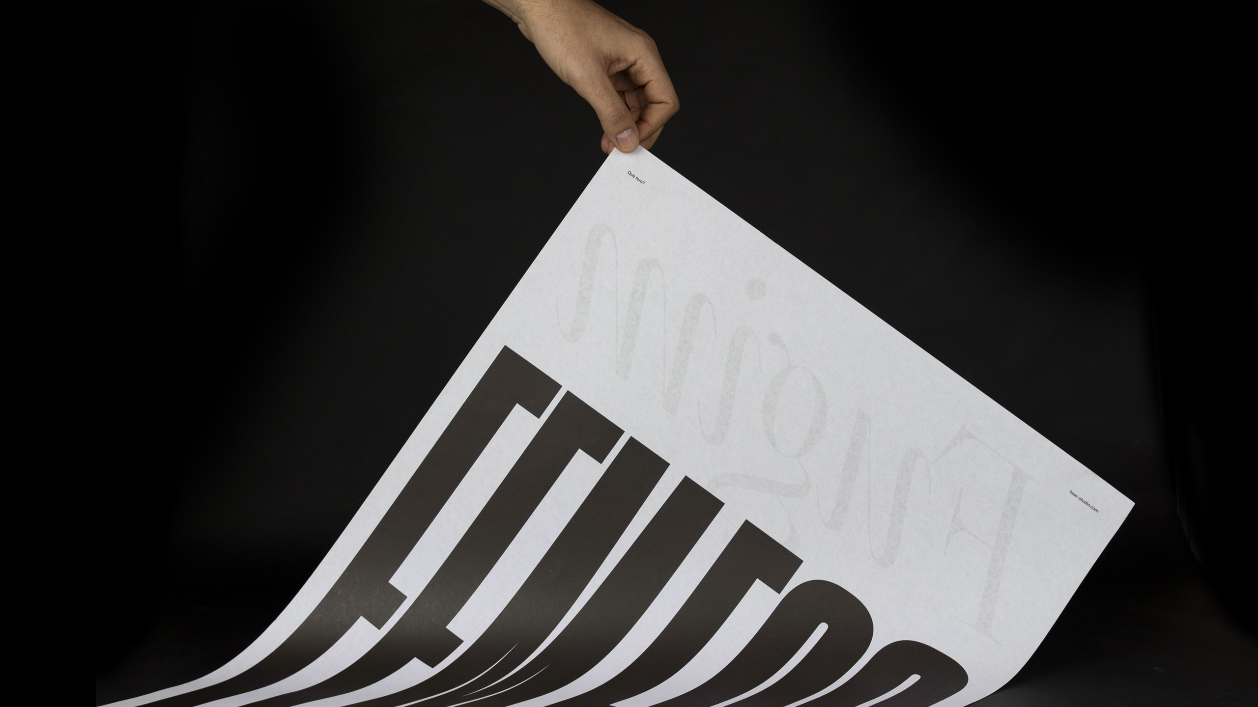
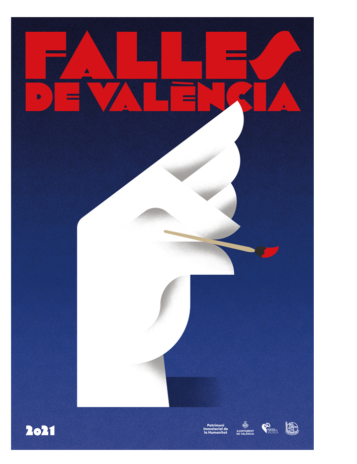
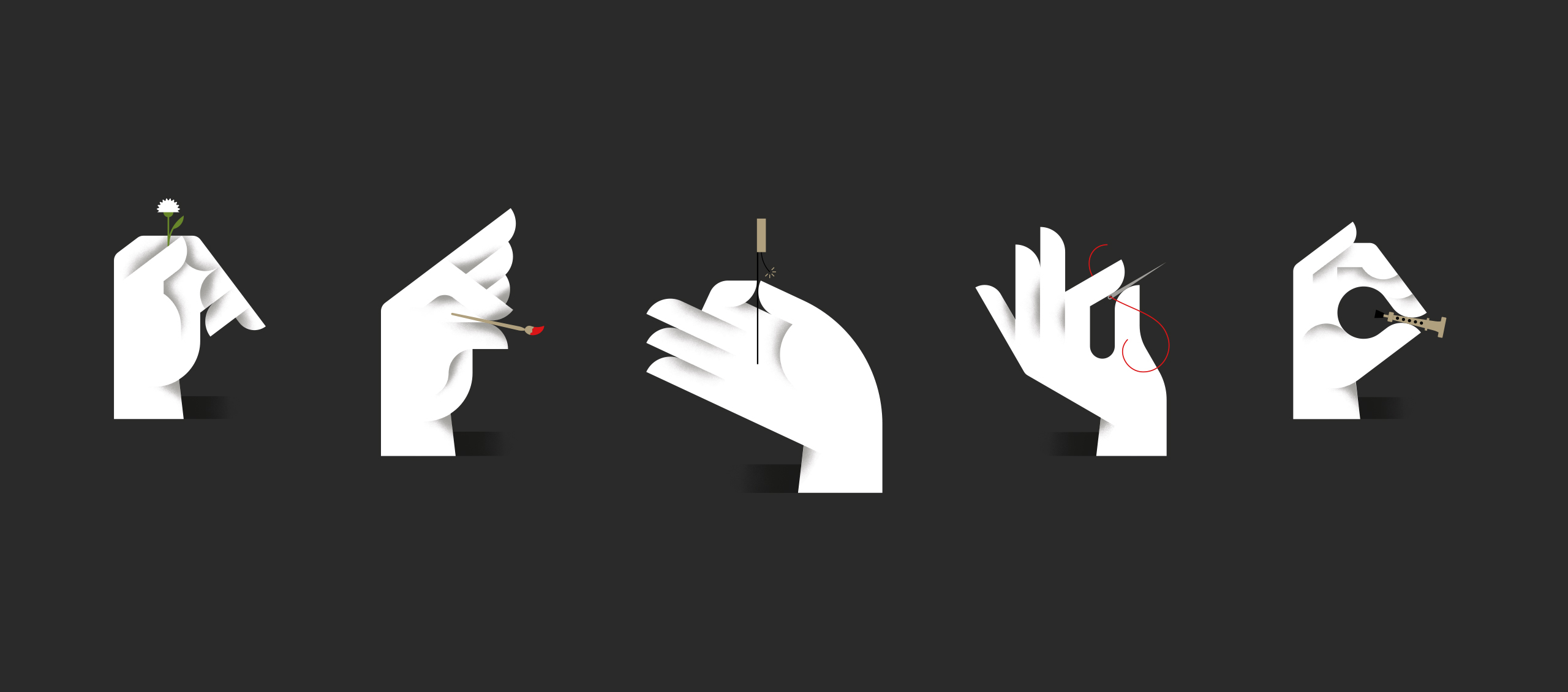
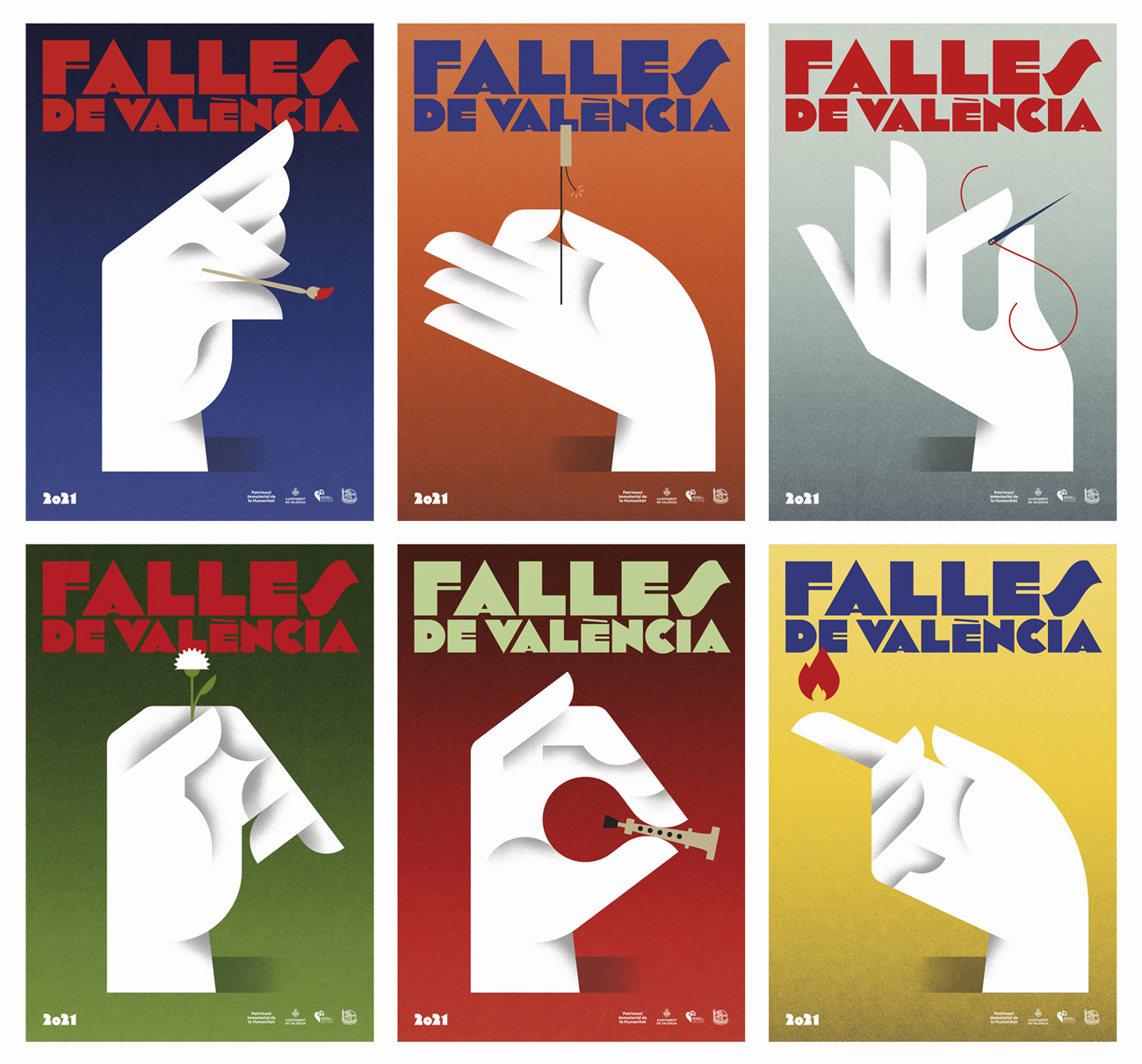
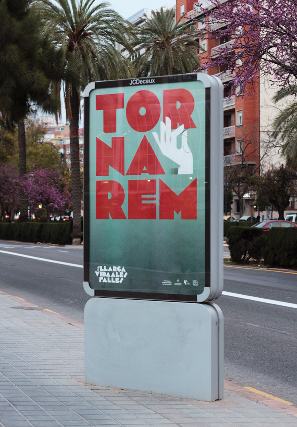
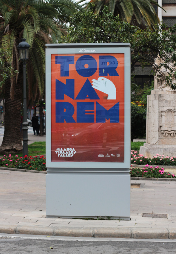
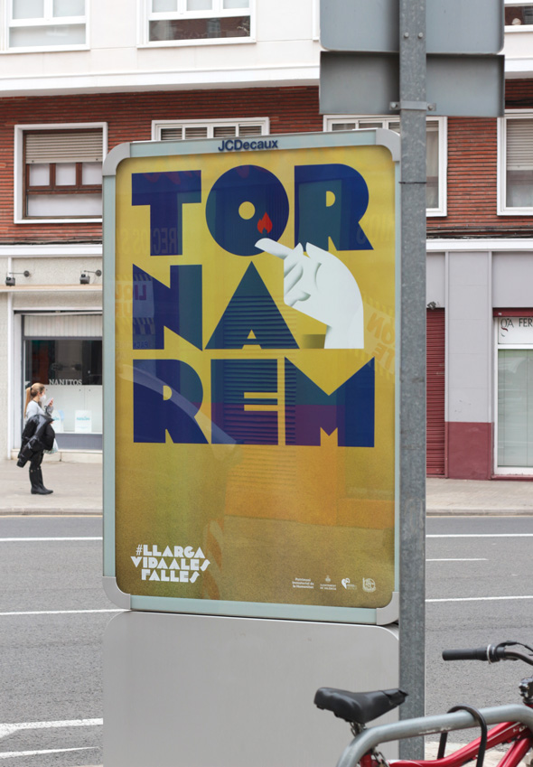
The campaign is made up of a total of six posters: five posters for five professions (fallas artist, pyrotechnic, dressmaker, musician and florist) without which we Valencians would not be able to understand our party par excellence. To these, we add a generic poster that contains the global essence of the campaign, and that extends the recognition to all those professions that, in one way or another, contribute to the celebration of everything related to the Fallas, since that we are aware that parties are made possible by an almost endless number of professionals from many different disciplines. In the posters, the hands of the artisans and artists are the protagonists. For this reason, we oversize the proportions and give those hands the character of a Fallas monument, above their “tools” and the party itself.

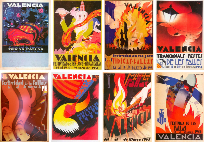
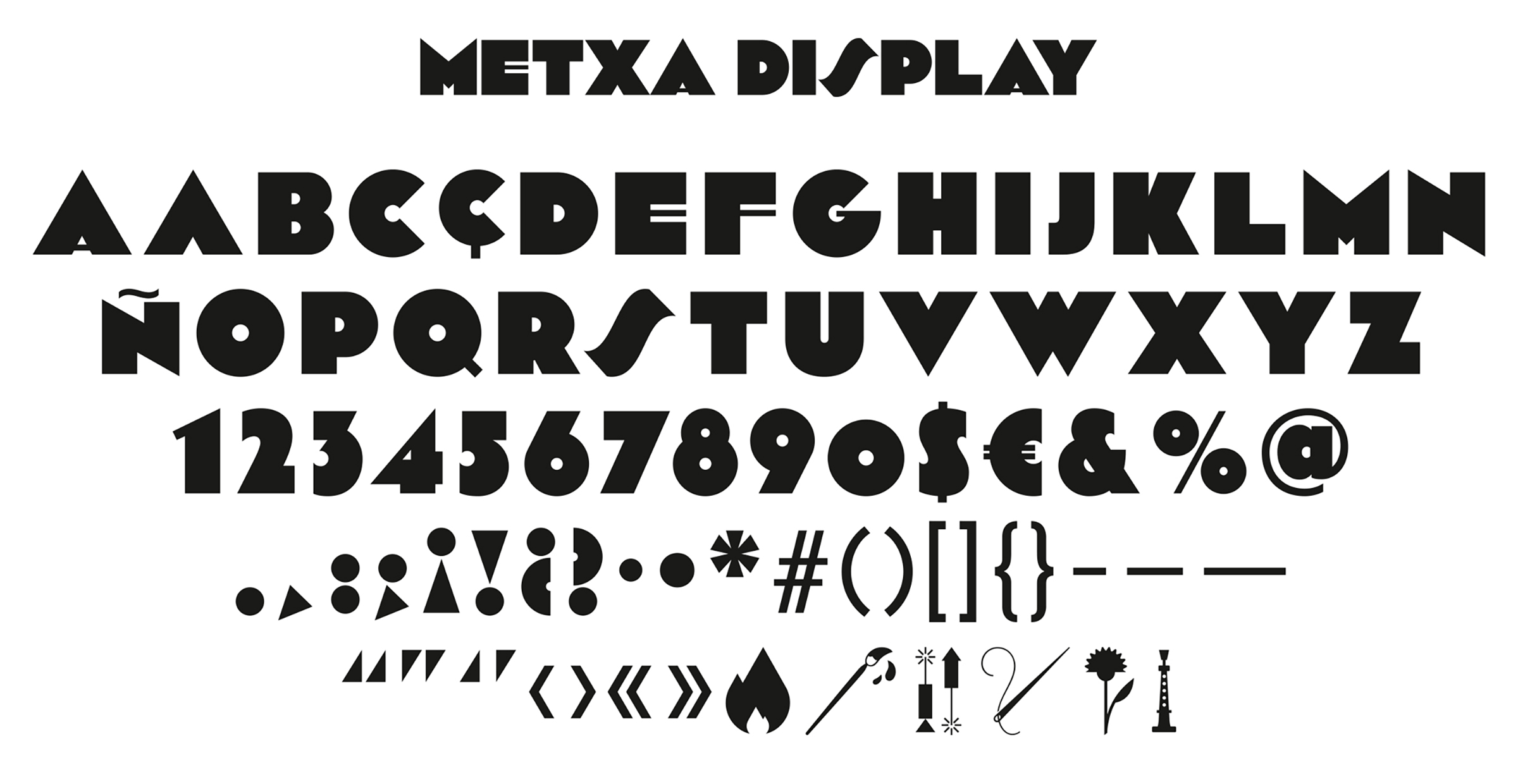
On a formal level, the campaign is also a tribute to the graphic tradition. The aesthetic looks to the past, to references of art deco and of a prolific era for the craft of poster design in València. Names like Renau, Monleón, Amérigo, Ballester or Raga opened an aesthetic and formal doors that we want to rescue and claim as our own. This exercise in graphic recovery has included the creation of a bespoke typeface inspired by the references of that time, as well as the use of a vibrant chromatic gamma and a finish that recalls the style of the classic airbrush. These resources will help make the festivity identity more popular as time goes on and more graphic adaptations are designed.

The graphic image of the Fallas 2021 is, therefore, an exercise in introspection. The moment we are living invites us to celebrate, more than the international nature of the festival, our roots and our ability as a people to give support and love to ourselves and look back to face the future with strength and optimism.

Download Metxa Display

Silver Laus Award poster design, 2022.
Bronze Laus Award external advertising, 2022.

Project done together with Diego Mir.
Photography by Josep Gil and Fase.
“Meditadora” photography by Mònica Torres.

Fase, estudio de diseño gráfico. 9 Oliveres, diseño packaging aceite.

9 Oliveres

9 Oliveres

9 Oliveres is a premium extra virgin olive oil, named for having its origin in an orchard with 9 millenary olive trees. For their new variety of organic production, its best creation so far, the brand wanted to improve how they communicate its values through a new packaging design.

Fase, estudio de diseño gráfico. 9 Oliveres, diseño packaging aceite. Vistas botella

Fase, estudio de diseño gráfico. 9 Oliveres, diseño packaging aceite. Olivo milenario

Fase, estudio de diseño gráfico. 9 Oliveres, diseño packaging aceite. Detalle

Fase, estudio de diseño gráfico. 9 Oliveres, diseño packaging aceite.

Tradition and modernity is what best defines the company and its products. This is what the new design tries to convey through two main components: on one side, we redraw the 9 with which the brand has become known, to give it a more unique and distinguishable character; on the other, we highlight the exalted character of this oil by incorporating a text that explains the particularities of the brand, and arranging it in a style reminiscent of the old epigraphs. The typography takes center stage and is clearly the protagonist in this design, simple and without artifice.

Silver ADCV Award graphic packaging, 2022.

Fase, estudio de diseño gráfico. Publicación Cuerpo y Ficción, Dilalica.

Cuerpo y Ficción

Cuerpo y Ficción

Publication design for “Cuerpo y Ficción”, an exhibition project by Dilalica, whose topic is the fictional potential of the bodies, from distancing to androcentric totality.

Cuerpo y ficción
110 pages, 17 x 24 cm.

A project by Dilalica
Curated by Cati Bestard and Marta Sesé
Artists Ariadna Guiteras, Lucía C. Pino and Cabello/Carceller.
Paper Munken Polar
Tipography Atlas Grotesk and Hercules

Fem foc o fugim?

Fem foc o fugim?

“Què fem? Fem foc o fugim?” (What do we do? Do we make fire or run away?) is a Valencian colloquial saying that is used in the face of indecision. We have appropriated of it to design this promotional poster.

Fase, estudio de diseño gráfico. Fem foc o fugim? Cartel promocional.

Fase, estudio de diseño gráfico. Fem foc o fugim? Cartel promocional. Què fem?
Fase, estudio de diseño gráfico. Fem foc o fugim? Cartel promocional.

Fase, estudio de diseño gráfico. Fem foc o fugim? Cartel promocional. Estudio

The goal was to introduce ourselves to people linked to graphic design in València, while offering a gift to clients and friends. The poster raises a question and offers two answers to the addressee to choose one of them. We used a low weight paper so that the discarded answer will be visible and thus keep the complete saying at all times.

We used typography and composition to emphasize the contrast between the two responses, as well as to reinforce the message they communicate. For “Fem foc” we chose Druk Condensed for its blunt and striking character, while for the “Fugim”, we selected italic variant of Saol Display for its ondulated shapes and exaggerated slant, which denotes movement.

Fase, estudio de diseño gráfico. Identidad exposición de arte Postcrisis.

Postcrisis

Postcrisis

Postcrisis is a project that interrelates architecture, the visual arts and contemporary thinking. Dilalica have chosen the brick – itself a signifier – to look into the interpretational and material possibilities of our built environments through original art works that make use ofthis material. Installed each artwork in a separate space in Madrid, the exhibition is presented as a tour of the city.

Fase, estudio de diseño gráfico. Identidad exposición de arte Postcrisis. Adhesivos.
Fase, estudio de diseño gráfico. Identidad exposición de arte Postcrisis. Tote bag.

Fase, estudio de diseño gráfico. Identidad exposición de arte Postcrisis. Programa, detalle.
Fase, estudio de diseño gráfico. Identidad exposición de arte Postcrisis. Hojas de sala.
Fase, estudio de diseño gráfico. Identidad exposición de arte Postcrisis. Programas.
Fase, estudio de diseño gráfico. Identidad exposición de arte Postcrisis. Programa Profesional..
Fase, estudio de diseño gráfico. Identidad exposición de arte Postcrisis. Programa Profesional, mapa.

Fase, estudio de diseño gráfico. Identidad exposición de arte Postcrisis. Catálogo.
Fase, estudio de diseño gráfico. Identidad exposición de arte Postcrisis. Catálogo, detalle.
Fase, estudio de diseño gráfico. Identidad exposición de arte Postcrisis. Programa.
Fase, estudio de diseño gráfico. Identidad exposición de arte Postcrisis. Tote bag.
Fase, estudio de diseño gráfico. Identidad exposición de arte Postcrisis. Adhesivos.

The identity is built on the concept of space / time: on the one hand, the distribution of the artworks in the city, placing them in the map; on the other, he uncertainty of the current moment, which positions the Postcrisis not as “after” but as a permanent state. It uses elements and materials that represent the nexus of the exhibition, the brick, trying that there was a variety of colors in all materials. The result synthesizes complex information through a few resources in the pursuit of a simple but powerful image that incites to discover and reflect.

Bronze Laus Award, integrated graphics, 2020.

Curated by Dilalica
Exhibition and artworks photography Galerna Foto

Agència Tributària Valenciana

Agència Tributària Valenciana

The Agència Tributària Valenciana (Valencian Tax Agency) is a step forward in the path to achieve the financial autonomy of the Generalitat Valenciana. The entity means an increase in resources through more rational, autonomous, efficient and effective financing.

Fase, estudio de diseño gráfico. Identidad Agència Tributària Valenciana. Papeleria.
Fase, estudio de diseño gráfico. Identidad Agència Tributària Valenciana. Logo.
Fase, estudio de diseño gráfico. Identidad Agència Tributària Valenciana. Papeleria.
Fase, estudio de diseño gráfico. Identidad Agència Tributària Valenciana.
Fase, estudio de diseño gráfico. Identidad Agència Tributària Valenciana. Invitación.
Fase, estudio de diseño gráfico. Identidad Agència Tributària Valenciana. Placa.
Fase, estudio de diseño gráfico. Identidad Agència Tributària Valenciana. Lápices.

Based on the ideas of progress and improvement, the initials were used as a directional symbol, which is interpreted as a continuous path forward. His abstraction as graphemes, requires the reading of the complete name and not only of its initials, which was an explicit requirement made by the client.

A graphic resource was also developed for its use in occasional pieces, in addition to a collection of covers that playing with the forms of the symbol and corporate typography, manages to increase the differential character of the communication materials of the entity.

Fase, estudio de diseño gráfico. Identidad exposición de arte Archivo Rastro. Cartel.

Archivo Rastro

Archivo Rastro

Archivo Rastro is an exhibition project based around a photographic archive that was generated by digitalizing, and cataloguing more than 3.000 negatives and slides found in the Madrid Rastro.

Fase, estudio de diseño gráfico. Identidad exposición de arte Archivo Rastro. Exposición.

Fase, estudio de diseño gráfico. Identidad exposición de arte Archivo Rastro. Exposición.
Fase, estudio de diseño gráfico. Identidad exposición de arte Archivo Rastro. Catálogo.

Fase, estudio de diseño gráfico. Identidad exposición de arte Archivo Rastro. Catálogo.
Fase, estudio de diseño gráfico. Identidad exposición de arte Archivo Rastro. Cartel - poster..
Fase, estudio de diseño gráfico. Identidad exposición de arte Archivo Rastro. Exposición.
Fase, estudio de diseño gráfico. Identidad exposición de arte Archivo Rastro. Exposición..
Fase, estudio de diseño gráfico. Identidad exposición de arte Archivo Rastro. Exposición.

Fase, estudio de diseño gráfico. Identidad exposición de arte Archivo Rastro. Exposición.

Fase, estudio de diseño gráfico. Identidad exposición de arte Archivo Rastro. Exposición.

The Archivo Rastro team requested that the identity should be used both for the archive and for the graphic image of the exhibition, in addition the images of the archive should be present, but without confusing the receiver about the exhibition purpose.

We based the identity on the concepts of latency and ordered disorder to communicate ideas such as collection, diversity or explore and discover. We collaborate in the design of the exhibition space proposing the printing of the complete archive, a numbered copy of each image, as a collectible exhibition leaflet.

Silver Laus award, integrated graphics, 2019.

Curated by Dilalica
Exhibition and artworks photography Galerna Foto

Fase, estudio de diseño gráfico. Identidad corporativa Meryl.

Meryl

Meryl

Meryl is a collection of innovative premium yarns traditionally crafted in Blanes (Spain) since 1925, that result in fabrics recognized for its unique touch. Likewise, the Meryl Lab division use technology and creativity in order to achieve original and sustainable products that are specifically designed for the requirements of each garment.

Fase, estudio de diseño gráfico. Identidad corporativa Meryl. Tarjeta.
Fase, estudio de diseño gráfico. Identidad corporativa Meryl. Hangtag Etiqueta.
Fase, estudio de diseño gráfico. Identidad corporativa Meryl. Sobres para envios.

Fase, estudio de diseño gráfico. Identidad corporativa Meryl. Hangtag etiqueta.

Fase, estudio de diseño gráfico. Identidad corporativa Meryl.
Fase, estudio de diseño gráfico. Identidad corporativa Meryl. Case Study.
Fase, estudio de diseño gráfico. Identidad corporativa Meryl. Dossier empresa.
Fase, estudio de diseño gráfico. Identidad corporativa Meryl. Dossier empresa

In addition to the redesign, we developed the new brand strategy for Meryl that consisted of achieving a reputation within the textile sector, gearing towards itself to the final market through mechanisms such as co-branding, to later be enshrined as an “ingredient brand” recognized and appreciated by the user.
The touch was chosen as a differentiating element, since it functions as an emotional attribute and is the connecting value between the product and the user experience common to all its products. We support these premises with a sober visual language, without decorative elements and related to the fashion world, trying to update elements and classical compositions. In addition to the use of high quality materials and touch references finishes in order to strengthen the main message.

Fase, estudio de diseño gráfico. Identidad corporativa La Mercería, galería de arte. Thumbnail.

La Mercería, art gallery

La Mercería, art gallery

This art gallery was born in 2018 in the heart of València with the aim of exposing emerging artists work. The gallery is in the space previously occupied by a haberdashery (Mercería in spanish), still retaining the original signs, so it was decided to keep the name of “Mercería” for its new activity.

Fase, estudio de diseño gráfico. Identidad corporativa La Mercería, galería de arte. Postales Antonio Pineda.

The identity is based on a very simple idea: to transfer the frontal view of the gallery to a graphic system. In this way the window represents the space that the gallery provides the artist to show his work, while the door is the place established for the appellation. A model that adapts itself to the format of each material, and that incorporates the work as part of the identity. The color changes for each new exhibition, thus evidencing the change and enriching the identity. In the case of corporate materials, a simplified version that softens its personality is used.

Fase, estudio de diseño gráfico. Identidad corporativa y diseño de packaging para Endor Technologies. Sérum, caja y prospecto.

Endor Technologies

Endor Technologies

Endor Technologies is a biotechnology company that conduct medical research in the areas of oncology and dermatology with a collection of dermocosmetic products. In accordance with their new market strategy, they commissioned us to adapt their brand, their packaging design and an e-commerce website that will help them to be perceived as a dermatological product aimed at the international market.

Fase, estudio de diseño gráfico. Identidad corporativa y diseño de packaging para Endor Technologies. Cajas y envases.
Fase, estudio de diseño gráfico. Identidad corporativa y diseño de packaging para Endor Technologies. Texto.
Fase, estudio de diseño gráfico. Identidad corporativa y diseño de packaging para Endor Technologies. Iconos envases.
Fase, estudio de diseño gráfico. Identidad corporativa y diseño de packaging para Endor Technologies. Cajas y envases.
Fase, estudio de diseño gráfico. Identidad corporativa y diseño de packaging para Endor Technologies. Detalles.
Fase, estudio de diseño gráfico. Identidad corporativa y diseño de packaging para Endor Technologies. Cajas.
Fase, estudio de diseño gráfico. Identidad corporativa y diseño de packaging para Endor Technologies. Prospecto.
Fase, estudio de diseño gráfico. Identidad corporativa y diseño de packaging para Endor Technologies. Serum, caja y prospecto.
Fase, estudio de diseño gráfico. Identidad corporativa y diseño de packaging para Endor Technologies. Envases.
Fase, estudio de diseño gráfico. Identidad corporativa y diseño de packaging para Endor Technologies. Cajas y envases.
Fase, estudio de diseño gráfico. Identidad corporativa y diseño de packaging para Endor Technologies. Detalles.
Fase, estudio de diseño gráfico. Identidad corporativa y diseño de packaging para Endor Technologies. Web.
Fase, estudio de diseño gráfico. Identidad corporativa y diseño de packaging para Endor Technologies. Brand guidelines.

The main objective was to enhance the technology behind the products of Endor, and thus distance them from the concept of beauty with which many cosmetic brands and products are linked.

The solution was to approach the graphic language of the pharmaceutical products, arranging a three-line grid that is born in the brand and creates a continuous path that wrap the format on which it is applied. We chose November Std, a more human and delicate industrial typeface. Technical drawings were used to reinforce the technological product message. Finally, we selected an aseptic color range based on gray tones in order to differentiate the product families.