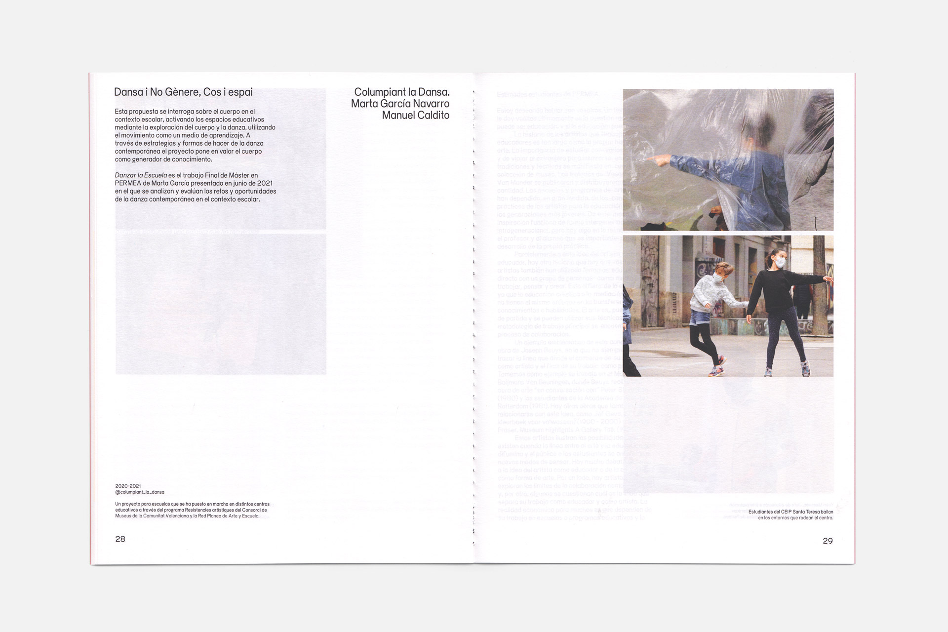
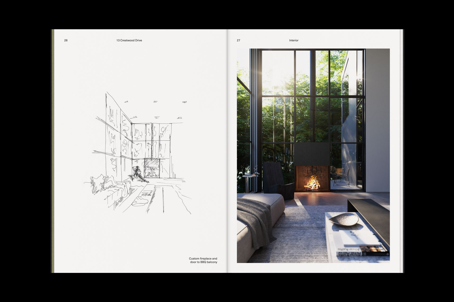
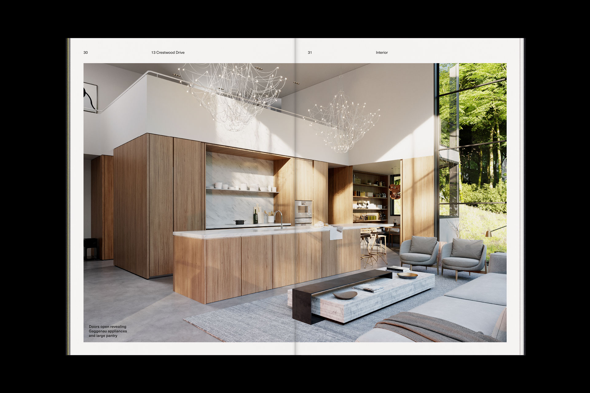
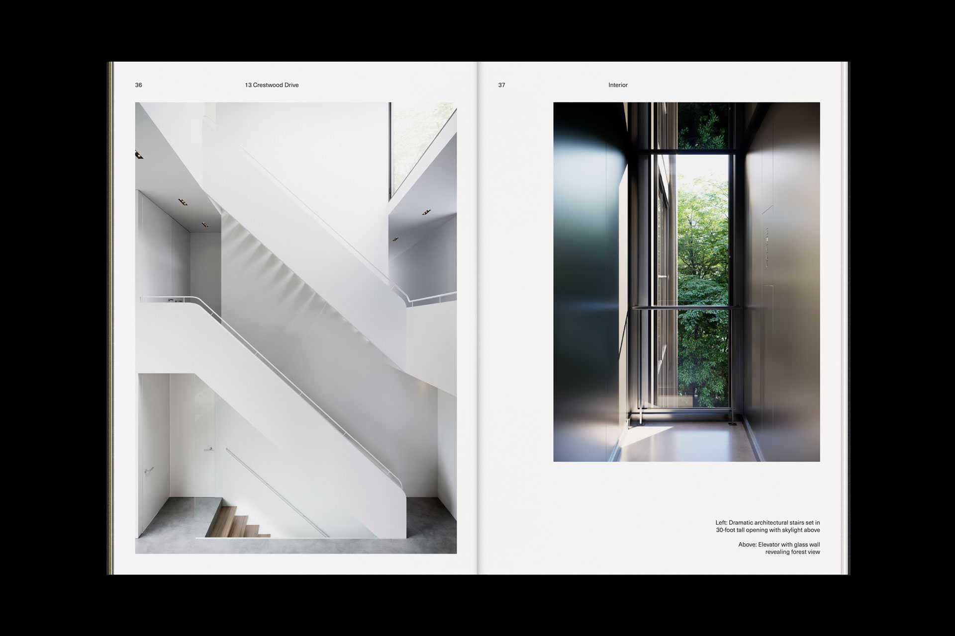
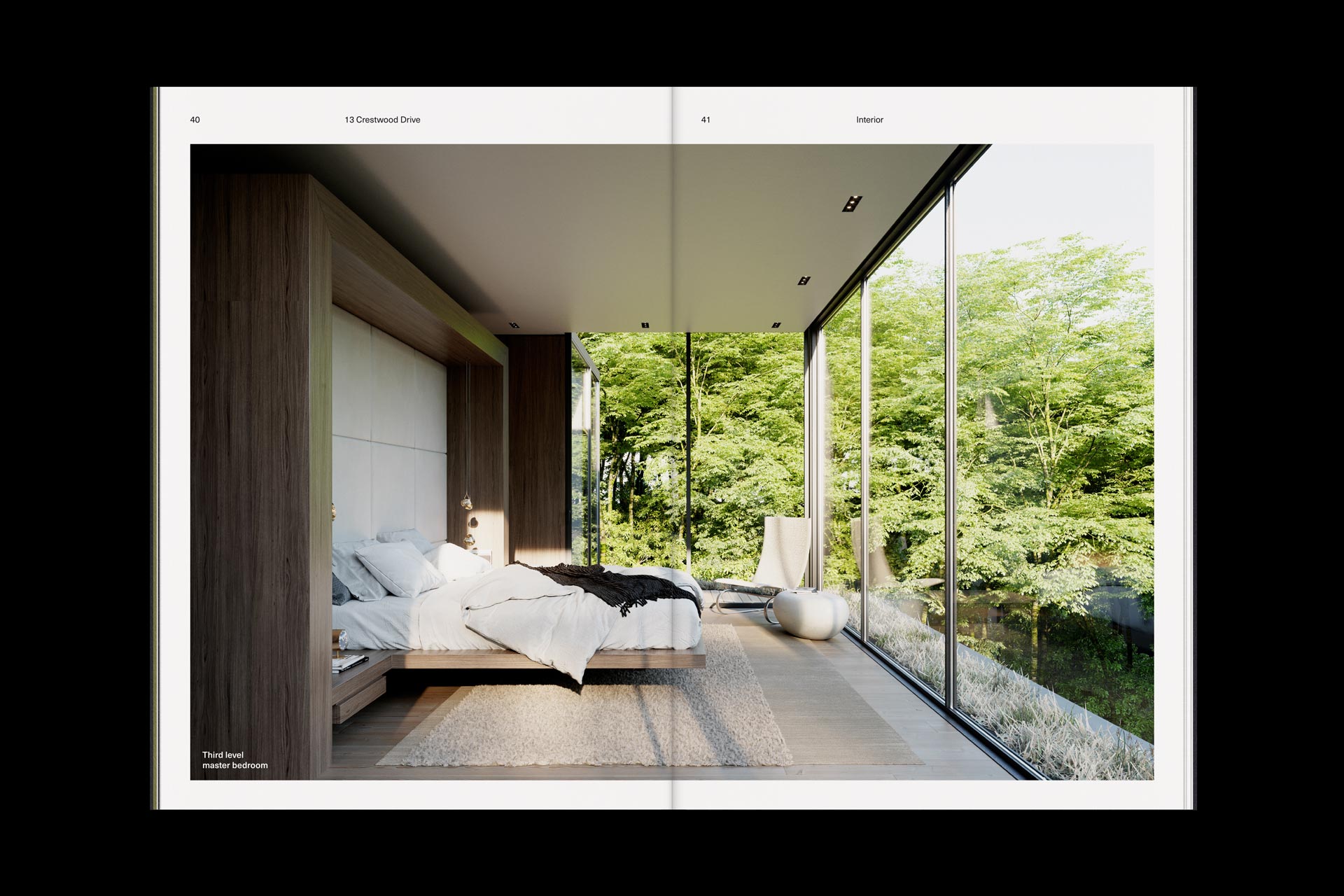
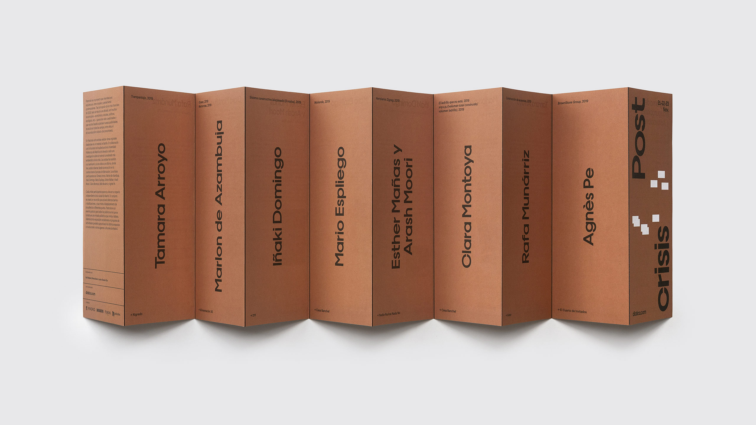
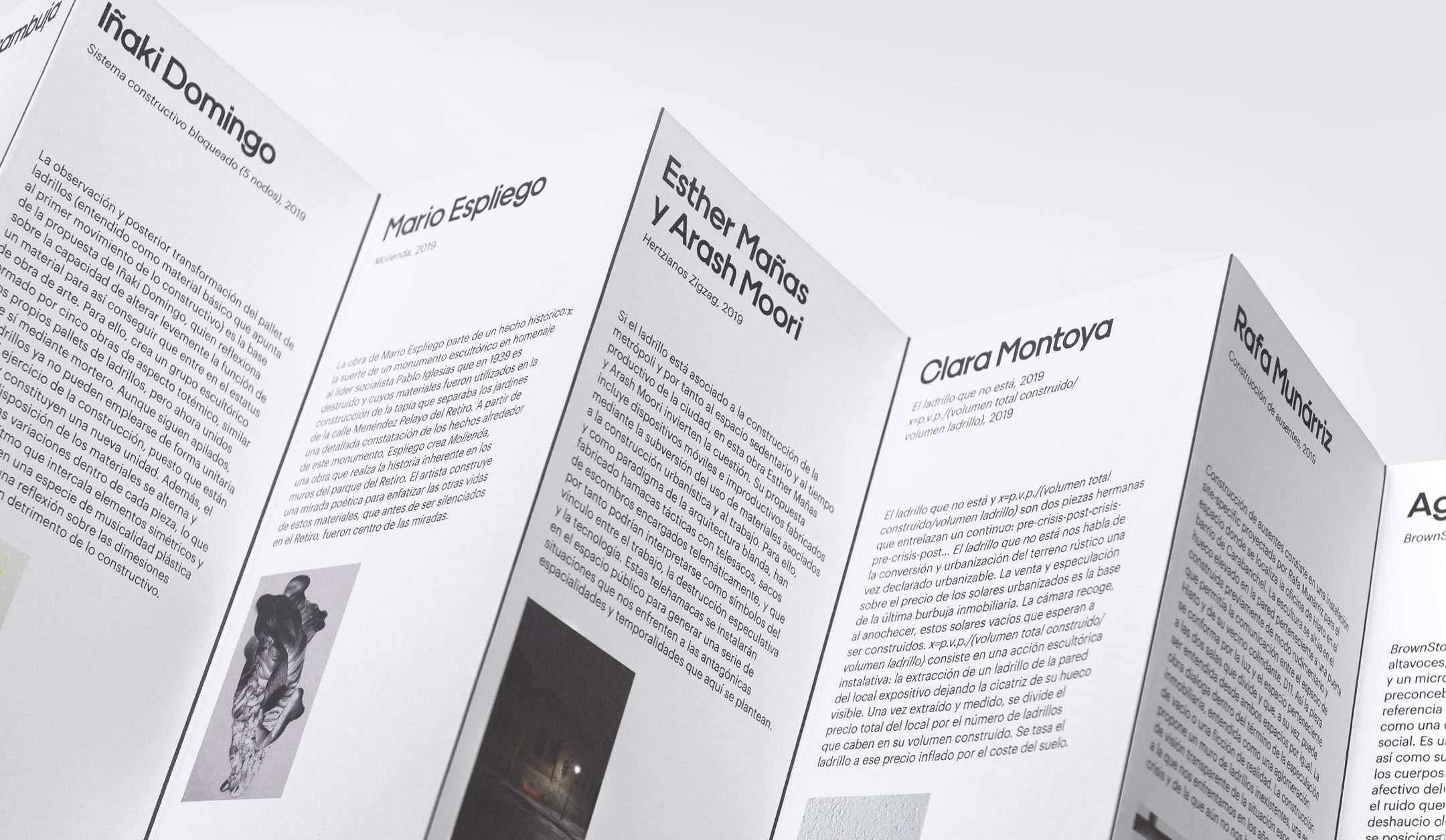
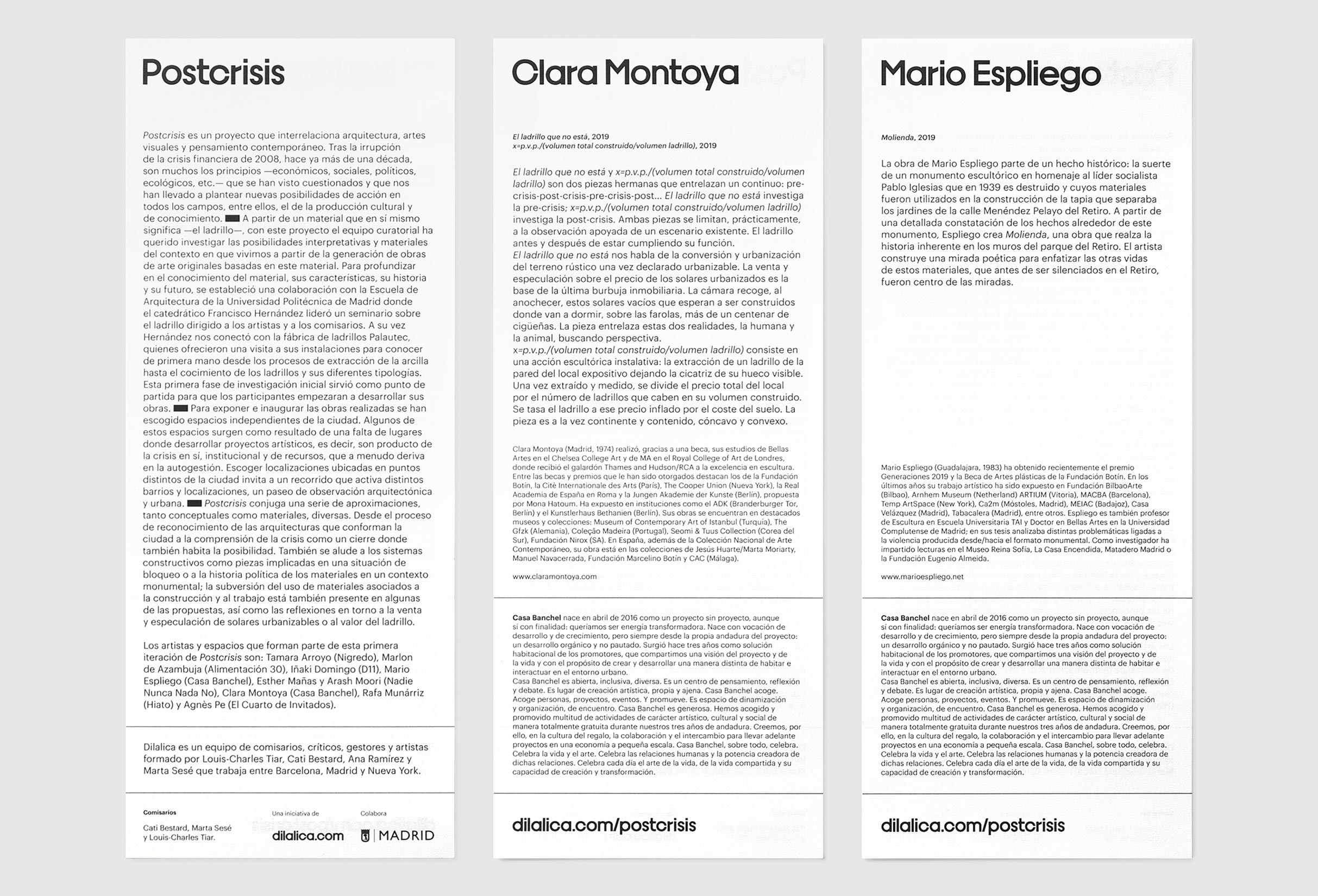
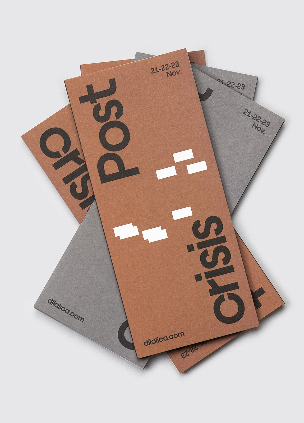
Fase, estudio de diseño gráfico. Identidad Castelló Poble 2030

Castelló Poble 2030

Castelló Poble 2030

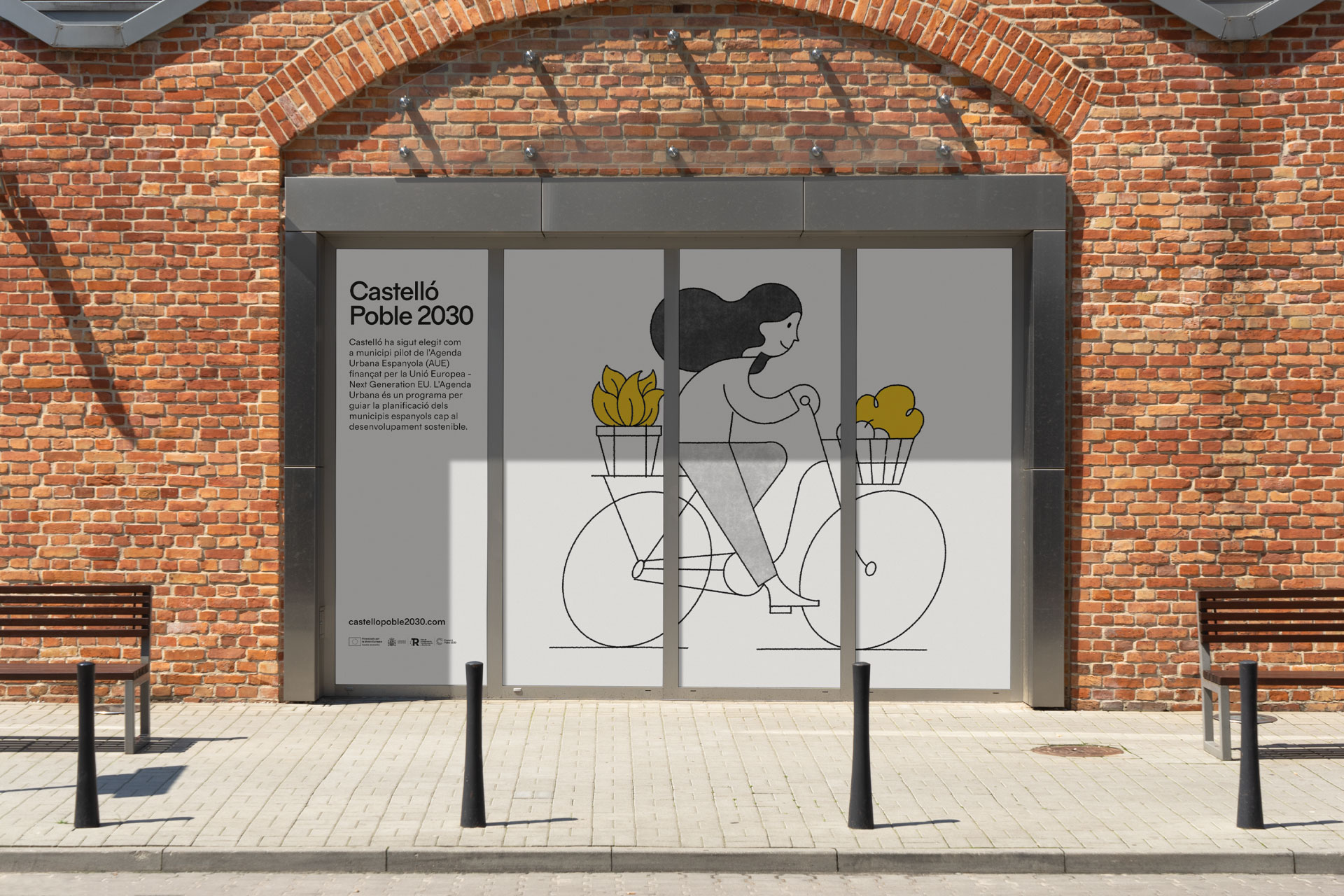
Castelló is a town with 7,000 inhabitants located in the Ribera Alta region, province of València. In 2022, it was chosen as one of the pilot municipalities for the Spanish Urban Agenda, a program designed to guide the planning of Spanish municipalities and cities towards sustainable development.

Fase, estudio de diseño gráfico. Identidad Castelló Poble 2030, ilustración pueblo abierto

Fase, estudio de diseño gráfico. Identidad Castelló Poble 2030, aplicaciones
Fase, estudio de diseño gráfico. Identidad Castelló Poble 2030, tipografías

Fase, estudio de diseño gráfico. Identidad Castelló Poble 2030, lona obras
Fase, estudio de diseño gráfico. Identidad Castelló Poble 2030, web móvil
Fase, estudio de diseño gráfico. Identidad Castelló Poble 2030, guía
Fase, estudio de diseño gráfico. Identidad Castelló Poble 2030, bandera
Fase, estudio de diseño gráfico. Identidad Castelló Poble 2030, vinilo
Fase, estudio de diseño gráfico. Identidad Castelló Poble 2030, camiseta
Fase, estudio de diseño gráfico. Identidad Castelló Poble 2030, mupi
Fase, estudio de diseño gráfico. Identidad Castelló Poble 2030, guía
Fase, estudio de diseño gráfico. Identidad Castelló Poble 2030, ilustración próximo

Fase, estudio de diseño gráfico. Identidad Castelló Poble 2030, lona obras
Fase, estudio de diseño gráfico. Identidad Castelló Poble 2030, aplicaciones
Fase, estudio de diseño gráfico. Identidad Castelló Poble 2030, web
Fase, estudio de diseño gráfico. Identidad Castelló Poble 2030, ilustración pueblo inclusivo
Fase, estudio de diseño gráfico. Identidad Castelló Poble 2030, valla

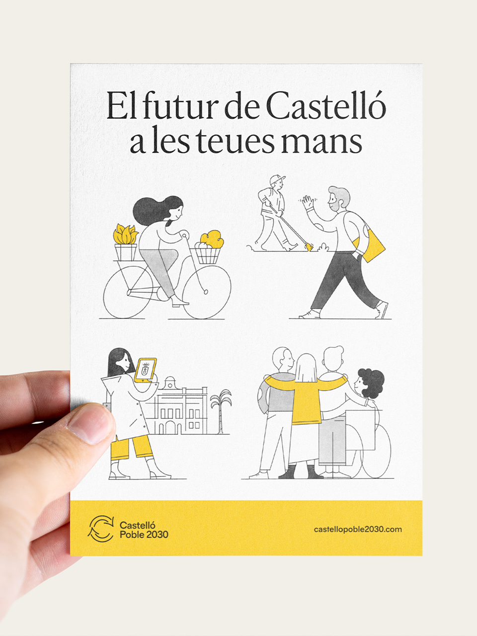
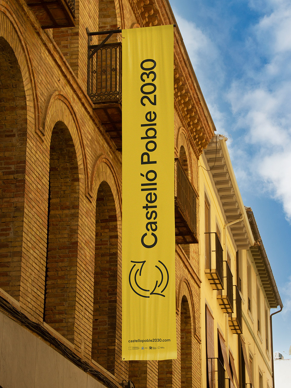
Due to the historical conflict surrounding its toponymy and the recent decision to be called “Castelló,” there was a need to propose a name for the Agenda that would encourage the use of this term and distinguish it from the capital of the province. Thus, “poble” (town) was added to reinforce its identity, and “2030” was included to link it to the program.
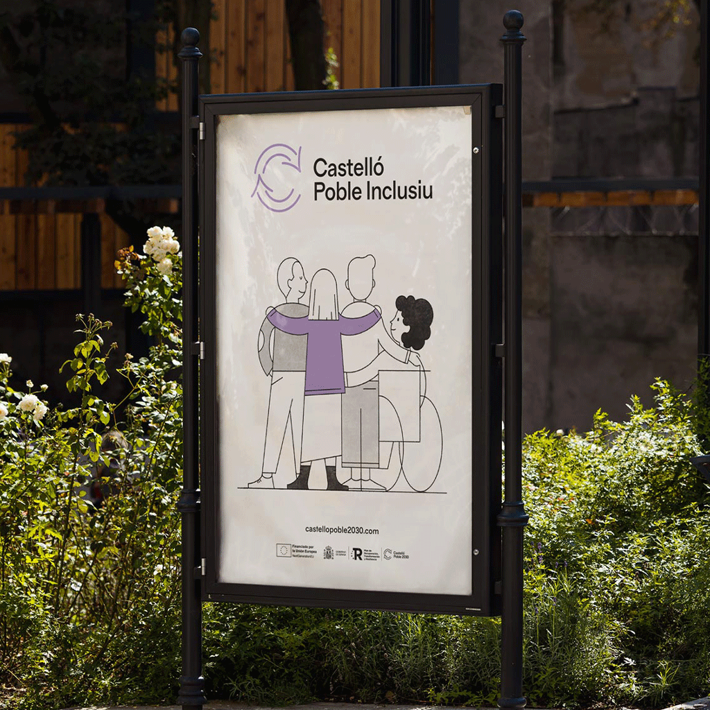
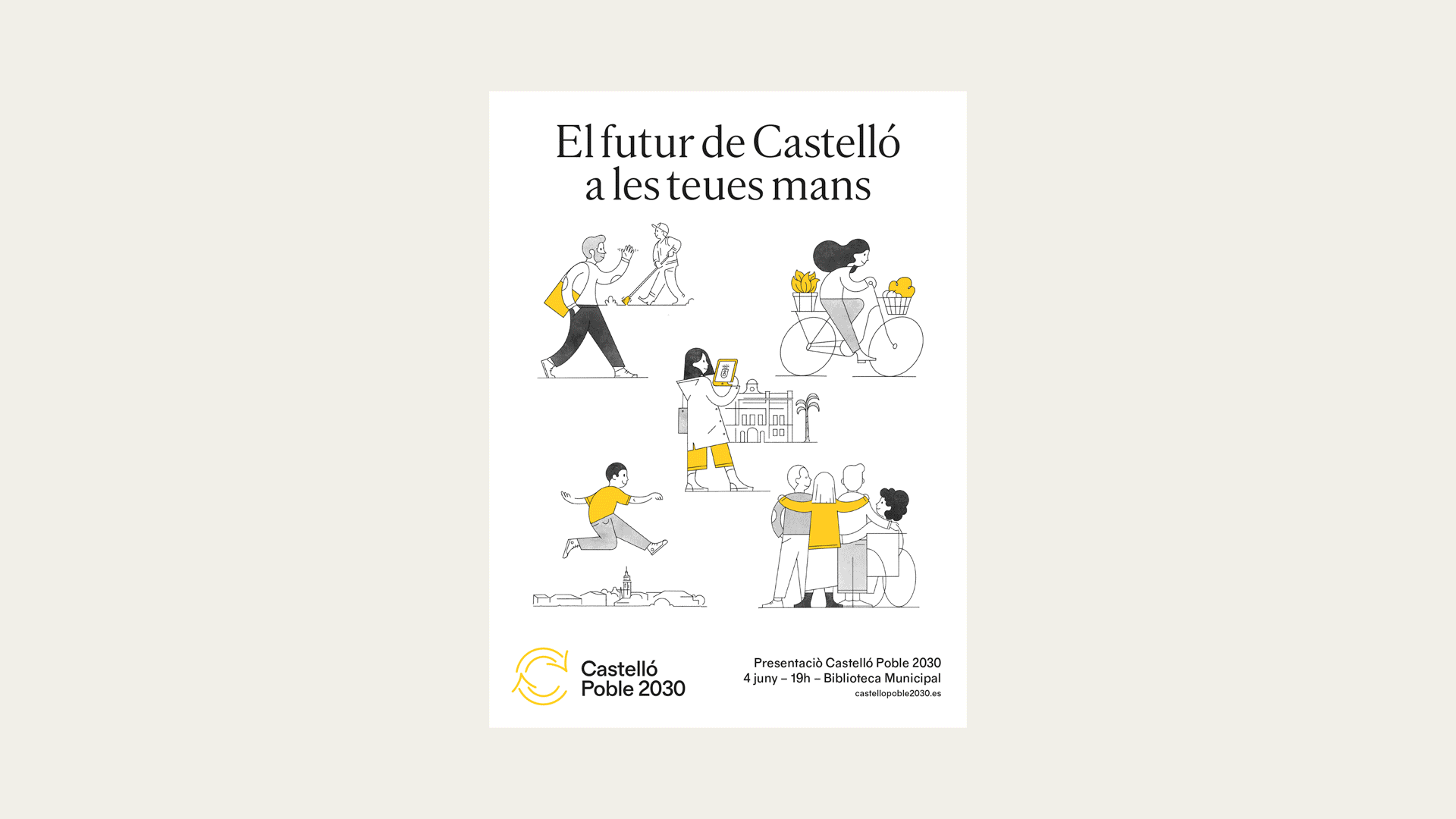
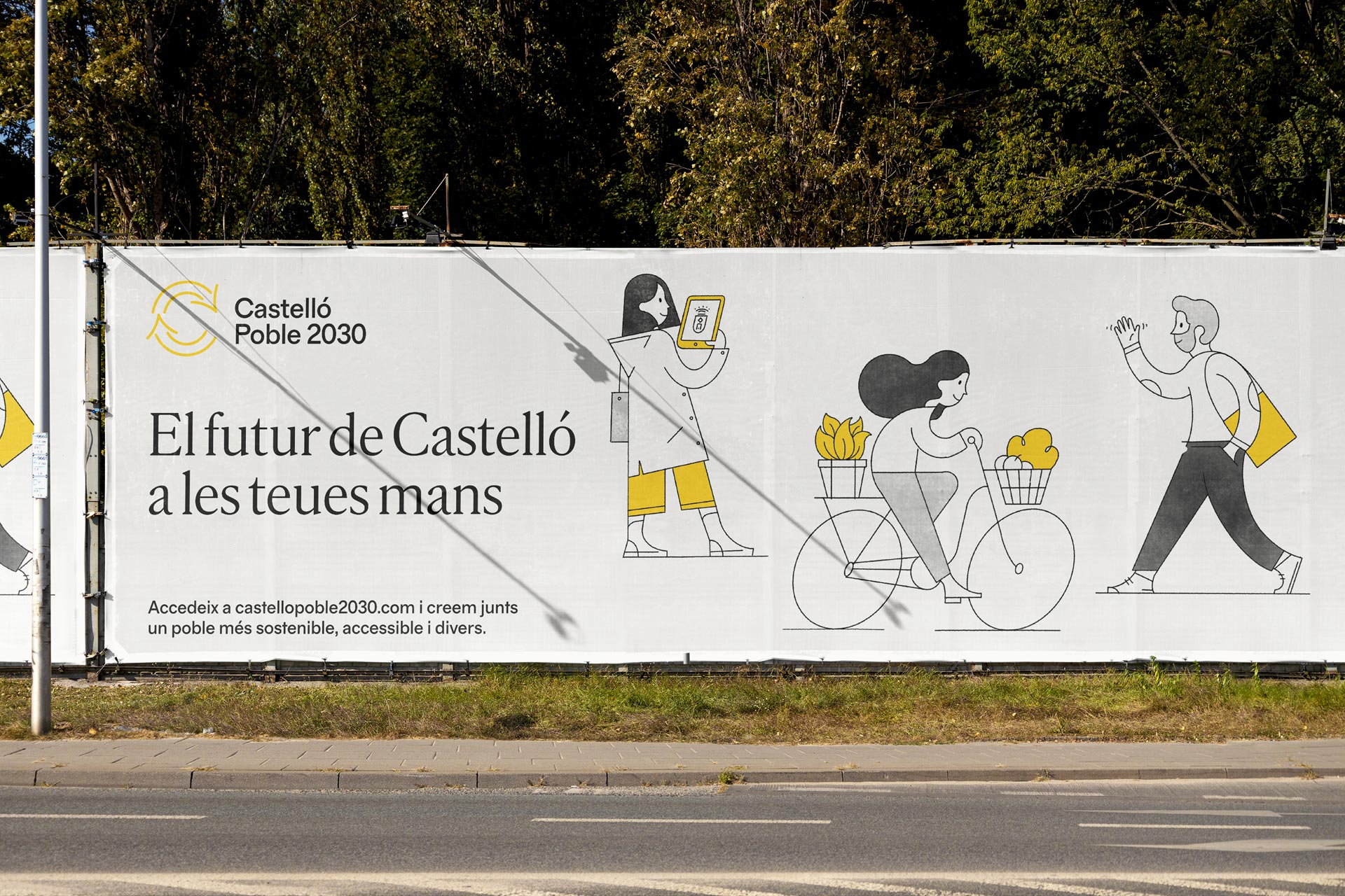
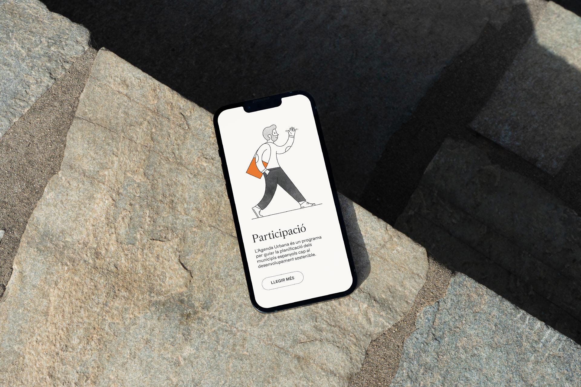
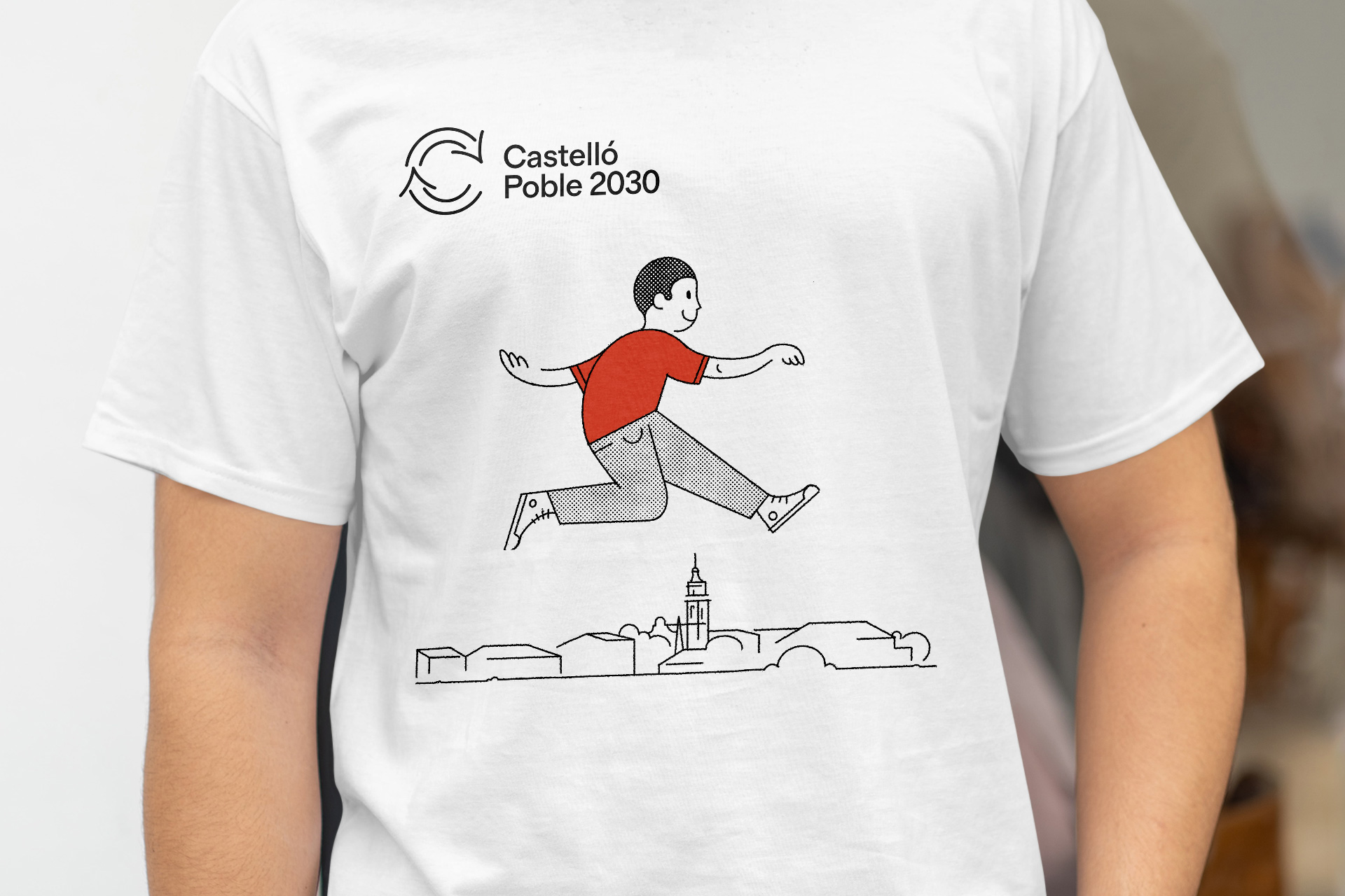
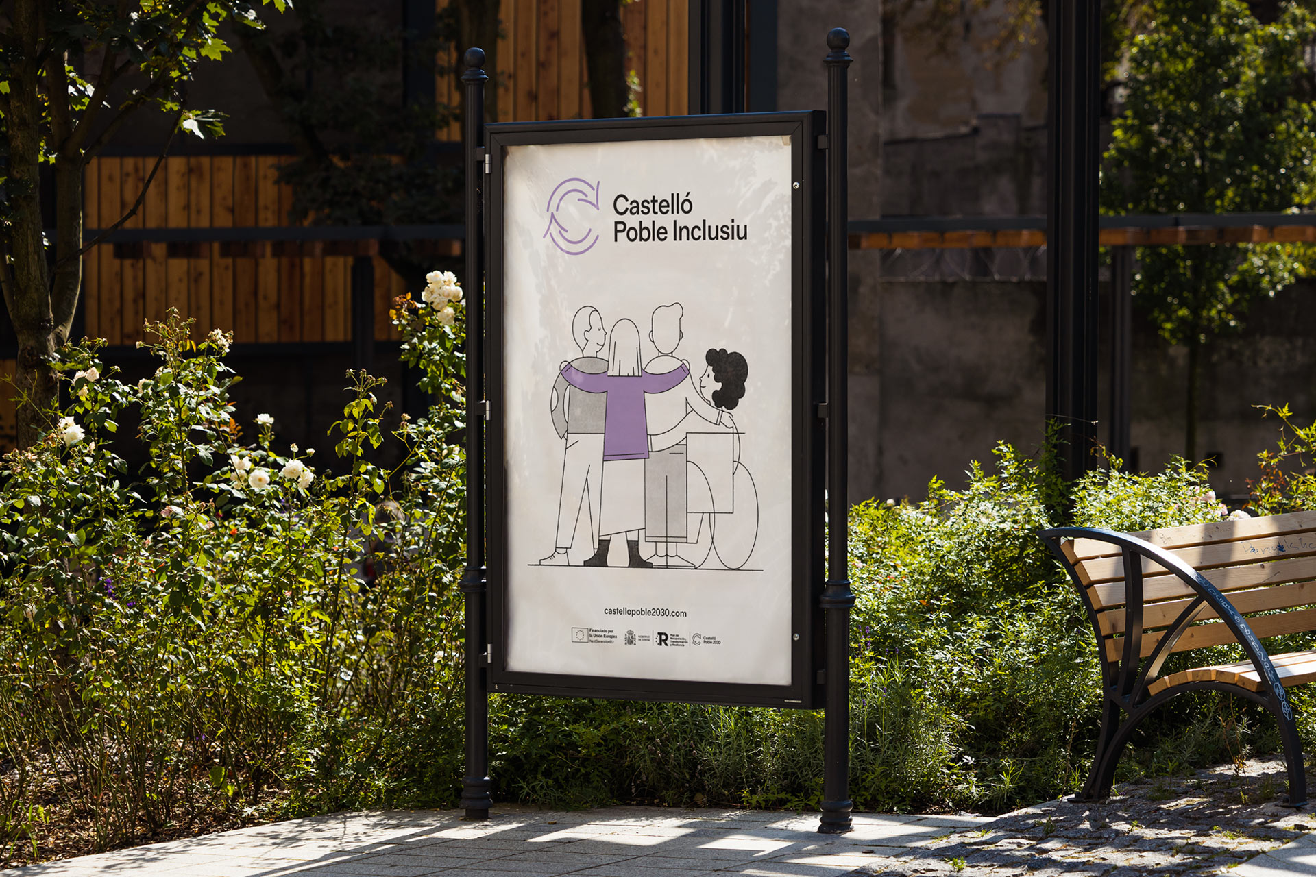
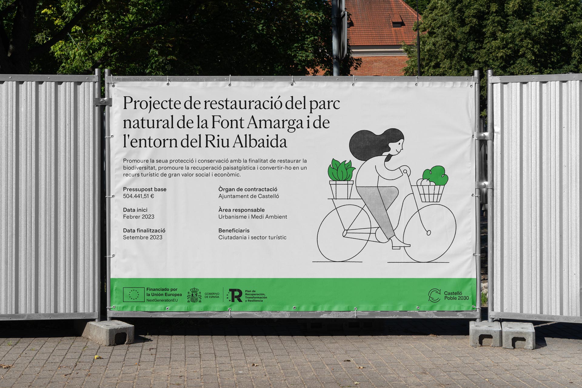
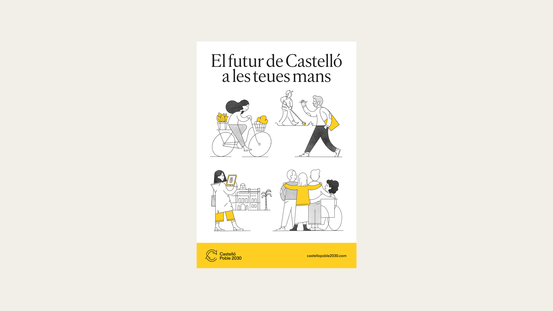
On the other hand, the multitude of concepts related to the Urban Agenda and the UN Sustainable Development Goals require simplification for effective communication. Therefore, five strategic areas have been established that align with the objectives of the Spanish Urban Agenda. This way, the chosen name allows us to replace “2030” with adjectives that define each of these areas: prosperous, healthy, nearby, inclusive, and open.

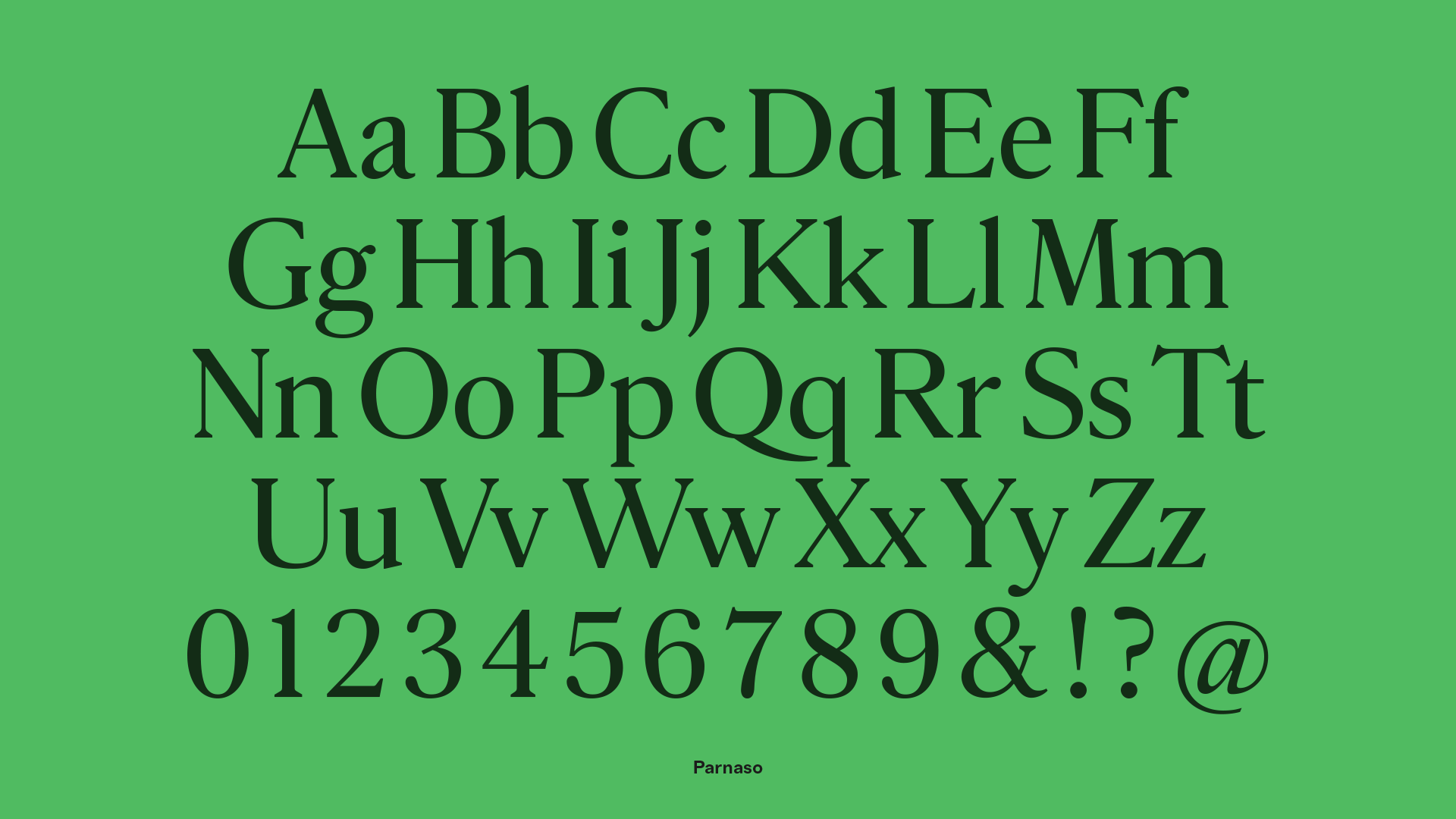
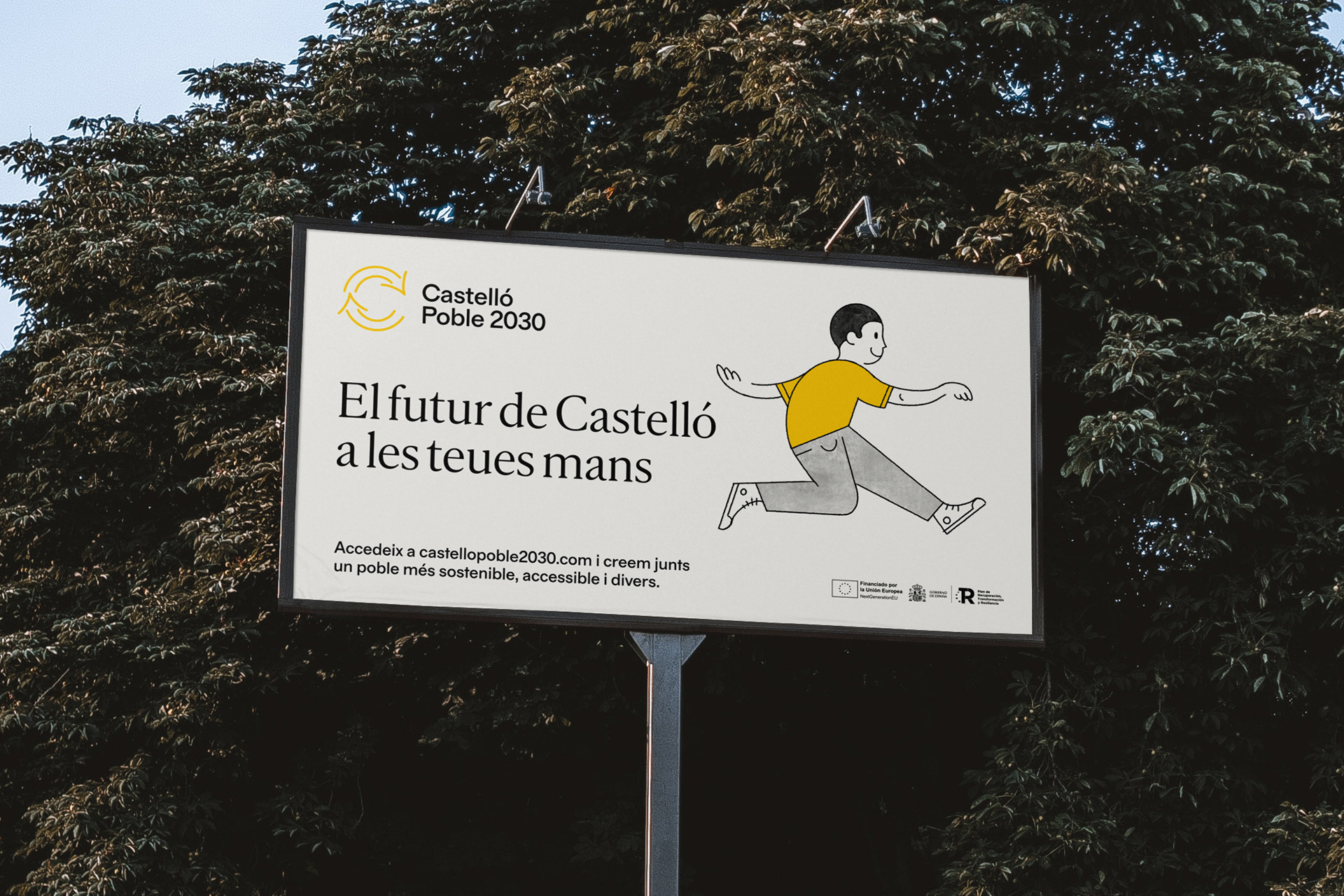
The graphic identity is led by characters representing these areas of action, each assigned a specific color in addition to yellow, which is used for generic communications. The typefaces, with simple and open forms, are familiar and work well across all types of applications and media. Finally, the logo is a straightforward identifier that combines update and recycling icons with the letter C.

Website: castellopoble2030.com

Illustrations: Josep Navarro
Web design and coding: Mui Studio

Typefaces: Feliciano Type

Fase, estudio de diseño gráfico. Identidad Permea

Permea

Permea

Permea (Experimental Program for Mediation and Education through Art) is a master’s program created by the Consorci de Museus de la Comunitat Valenciana together with the University of Valencia. It addresses in a holistic and experimental way the knowledge involved in the creation of artistic mediation projects, both in the institutional spaces of art and education as well as in other social contexts.

Fase, estudio de diseño gráfico. Identidad Permea

Fase, estudio de diseño gráfico. Identidad Permea

Fase, estudio de diseño gráfico. Identidad Permea
Fase, estudio de diseño gráfico. Identidad Permea, cartel
Fase, estudio de diseño gráfico. Identidad Permea
Fase, estudio de diseño gráfico. Identidad Permea, carteles
Fase, estudio de diseño gráfico. Identidad Permea

Fase, estudio de diseño gráfico. Identidad Permea: Guía Docente
Fase, estudio de diseño gráfico. Identidad Permea: Textos Permeables

The graphic identity had to reflect the character of the master’s degree, less childish and festive and more theoretical and intellectual. To achieve this, we proposed a contemporary graphic identity that invites students to intervene in it through images that are generated during the course and that do not require large resources in production.

The identity is structured through a single typeface, Oblong Sans, a friendly grotesque that through a subtle inverted contrast and other unusual details, manages to offer the right space for experimentation and play, while offering a contemporary image. In addition, in order to communicate the idea of dialogue, some titles are placed as if it were a conversation.

On the other hand, the identity makes use of transparency in several applications. Texts and images from a different nature are mixed with color masses seeking to enhance and take advantage of the program’s name, as well as reinforcing the ideas of exchange and transmission that work as an allegory of mediation and education.

Fase, estudio de diseño gráfico. Identidad La Unió Llauradora i Ramadera

La Unió

La Unió

La Unió Llauradora i Ramadera (The Agriculture and Livestock Union) is the largest professional farming organization in the Valencian countryside. It was born in 1976 to defend agricultural professionals and to be the interlocutor to the administrations and all the agents of the agricultural sector. Along with the renewal of the graphic identity, its name has been updated with the aim of reflecting the new, more inclusive and diverse nature of La Unió, changing “Llauradors i Ramaders” (masculine nouns) to “Llauradora i Ramadera” (adjectives).

Fase, estudio de diseño gráfico. Identidad La Unió Llauradora i Ramadera
Fase, estudio de diseño gráfico. Identidad La Unió Llauradora i Ramadera, postal
Fase, estudio de diseño gráfico. Identidad La Unió Llauradora i Ramadera, papelería
Fase, estudio de diseño gráfico. Identidad La Unió Llauradora i Ramadera, tote
Fase, estudio de diseño gráfico. Identidad La Unió Llauradora i Ramadera, portadas

Fase, estudio de diseño gráfico. Identidad La Unió Llauradora i Ramadera, varias aplicaciones

Fase, estudio de diseño gráfico. Identidad La Unió Llauradora i Ramadera, camiseta
Fase, estudio de diseño gráfico. Identidad La Unió Llauradora i Ramadera, revistas

Fase, estudio de diseño gráfico. Identidad La Unió Llauradora i Ramadera, banderas y chinos
Fase, estudio de diseño gráfico. Identidad La Unió Llauradora i Ramadera, cartel manifestación
Fase, estudio de diseño gráfico. Identidad La Unió Llauradora i Ramadera, carteles manifestación
Fase, estudio de diseño gráfico. Identidad La Unió Llauradora i Ramadera
Fase, estudio de diseño gráfico. Identidad La Unió Llauradora i Ramadera, XV Congrés

The graphic identity had to reflect the renewed character and values of the organization and try to connect with the new generations. We propose a typographic logo that joints the two words. The typeface, Original Sans links it formally to the trade union imagery. Seeking to enrich the identity and also as a functional element, we added a variant that has the full denomination and associates it to the food quality seals. The main typeface is Zoom Pro which with its imperfect geometric shapes provides freshness and spontaneity and, thanks to the variety of weights and widths, it allows the message to be modulated from some more formal to others more demanding.

We updated the green color that has represented the organization in recent years with a more powerful and recognizable hue, as well as adding a fresh and vibrant color palette. Finally, we commissioned a collection of illustrations to Luis Demano with the aim of emphasize the nature of the organization and to help with some applications and the brand architecture. They were drawn freehand with a marker, with an accessible but not childish style.

Illustrations: Luis Demano
Typography: Original sans y Zoom Pro

Fase, estudio de diseño gráfico. Identidad y packaging Be Dyverse

Be Dyverse

Be Dyverse

Be Dyverse is a cosmetics brand for young skin, born with the aim of guiding skincare towards more effective and sustainable routines. For this reason, it concentrates all the innovations of cosmetics in a reduced collection of products, which cover the key needs of the skin. Everything you need, nothing you don’t.

Fase, estudio de diseño gráfico. Identidad y packaging Be Dyverse

Our approach was to focus on a youthful and natural aesthetic that communicates a freedom and happiness feeling. The graphic identity and packaging design aims to link the use of its products with a moment of personal satisfaction, in addition to differentiating the unique proposal of the company within a saturated market.

Fase, estudio de diseño gráfico. Identidad Més Compromís

Més-Compromís

Més-Compromís

The graphic identity of Més is built looking for a balance between four adjectives that define this young and ambitious political project: solid, friendly, activist and diverse.

Bronze Laus Award poster design, 2022.

Project done together with Diego Mir.

Fase, estudio de diseño gráfico. 13 Crestwood Drive, branding.

13 Crestwood Drive

13 Crestwood Drive

13 Crestwood Drive is a luxury residential project located on the boundary line between Barrie and Oro-Medonte in Barrie’s coveted North Shore neighbourhood. The home is situated on a sloping hillside with mature hardwood trees overlooking the northern shore of Kempenfelt Bay.


We worked together with the Jorg team to find the graphic language that best suited the architectural conception of the residence. The logo makes a nod to the way in which the house adapts its form to the hillside on which it is built.

Visit the website at 13crestwood.com

Development: CLN Development
Architecture: Ancerl Studio
Renders and marketing: Jorg

Falles 2021

Falles 2021

The Fallas 2021 graphic identity, the most important celebration in València, is a tribute to the professionals that make the festival possible: a recognition and a vindication of tradition, motivated by the situation that these artisans are going through.

Fase, estudio de diseño gráfico. Fallas 2021, imagen gráfica. Cartel genérico

Fase, estudio de diseño gráfico. Fallas 2021, imagen gráfica. Inspiración
Fase, estudio de diseño gráfico. Fallas 2021, imagen gráfica. Manos monumento
Fase, estudio de diseño gráfico. Fallas 2021, imagen gráfica. Carteles Fallas 21

Given the global pandemic situation, the Fallas could not be celebrated on their usual dates and the graphic campaign could not be used as we had designed it. For this reason, the City Council asked us to make an adaptation under the slogan Tornarem (We will return), which would serve as recognition, following the concept of the campaign.

Fase, estudio de diseño gráfico. Fallas 2021, imagen gráfica. Tornarem florista
Fase, estudio de diseño gráfico. Fallas 2021, imagen gráfica. Tornarem músico
Fase, estudio de diseño gráfico. Fallas 2021, imagen gráfica. Tornarem artista fallero
Fase, estudio de diseño gráfico. Fallas 2021, imagen gráfica. Tornarem indumentarista
Fase, estudio de diseño gráfico. Fallas 2021, imagen gráfica. Tornarem pirotécnico
Fase, estudio de diseño gráfico. Fallas 2021, imagen gráfica. Tornarem genérico
Fase, estudio de diseño gráfico. Fallas 2021, imagen gráfica. Tornarem artista fallero

Thanks to the arrival of the vaccine, the responsible governments allowed to celebrate the Fallas as well as other local festivities. The Junta Central Fallera decided to convene them in the first week of September and finally, the official graphic campaign could be seen in the streets of Valencia.

Fase, estudio de diseño gráfico. Fallas 2021, imagen gráfica. Cartel florista
Fase, estudio de diseño gráfico. Fallas 2021, imagen gráfica. Cartel indumentarista


The campaign is made up of a total of six posters: five posters for five professions (fallas artist, pyrotechnic, dressmaker, musician and florist) without which we Valencians would not be able to understand our party par excellence. To these, we add a generic poster that contains the global essence of the campaign, and that extends the recognition to all those professions that, in one way or another, contribute to the celebration of everything related to the Fallas, since that we are aware that parties are made possible by an almost endless number of professionals from many different disciplines. In the posters, the hands of the artisans and artists are the protagonists. For this reason, we oversize the proportions and give those hands the character of a Fallas monument, above their “tools” and the party itself.

On a formal level, the campaign is also a tribute to the graphic tradition. The aesthetic looks to the past, to references of art deco and of a prolific era for the craft of poster design in València. Names like Renau, Monleón, Amérigo, Ballester or Raga opened an aesthetic and formal doors that we want to rescue and claim as our own. This exercise in graphic recovery has included the creation of a bespoke typeface inspired by the references of that time, as well as the use of a vibrant chromatic gamma and a finish that recalls the style of the classic airbrush. These resources will help make the festivity identity more popular as time goes on and more graphic adaptations are designed.

The graphic image of the Fallas 2021 is, therefore, an exercise in introspection. The moment we are living invites us to celebrate, more than the international nature of the festival, our roots and our ability as a people to give support and love to ourselves and look back to face the future with strength and optimism.

Download Metxa Display

Silver Laus Award poster design, 2022.
Bronze Laus Award external advertising, 2022.

Project done together with Diego Mir.
Photography by Josep Gil and Fase.
“Meditadora” photography by Mònica Torres.

Fase, estudio de diseño gráfico. Identidad exposición de arte Postcrisis.

Postcrisis

Postcrisis

Postcrisis is a project that interrelates architecture, the visual arts and contemporary thinking. Dilalica have chosen the brick – itself a signifier – to look into the interpretational and material possibilities of our built environments through original art works that make use ofthis material. Installed each artwork in a separate space in Madrid, the exhibition is presented as a tour of the city.

Fase, estudio de diseño gráfico. Identidad exposición de arte Postcrisis. Adhesivos.
Fase, estudio de diseño gráfico. Identidad exposición de arte Postcrisis. Tote bag.

Fase, estudio de diseño gráfico. Identidad exposición de arte Postcrisis. Programa, detalle.
Fase, estudio de diseño gráfico. Identidad exposición de arte Postcrisis. Hojas de sala.
Fase, estudio de diseño gráfico. Identidad exposición de arte Postcrisis. Programas.
Fase, estudio de diseño gráfico. Identidad exposición de arte Postcrisis. Programa Profesional..
Fase, estudio de diseño gráfico. Identidad exposición de arte Postcrisis. Programa Profesional, mapa.

Fase, estudio de diseño gráfico. Identidad exposición de arte Postcrisis. Catálogo.
Fase, estudio de diseño gráfico. Identidad exposición de arte Postcrisis. Catálogo, detalle.
Fase, estudio de diseño gráfico. Identidad exposición de arte Postcrisis. Programa.
Fase, estudio de diseño gráfico. Identidad exposición de arte Postcrisis. Tote bag.
Fase, estudio de diseño gráfico. Identidad exposición de arte Postcrisis. Adhesivos.

The identity is built on the concept of space / time: on the one hand, the distribution of the artworks in the city, placing them in the map; on the other, he uncertainty of the current moment, which positions the Postcrisis not as “after” but as a permanent state. It uses elements and materials that represent the nexus of the exhibition, the brick, trying that there was a variety of colors in all materials. The result synthesizes complex information through a few resources in the pursuit of a simple but powerful image that incites to discover and reflect.

Bronze Laus Award, integrated graphics, 2020.

Curated by Dilalica
Exhibition and artworks photography Galerna Foto

Agència Tributària Valenciana

Agència Tributària Valenciana

The Agència Tributària Valenciana (Valencian Tax Agency) is a step forward in the path to achieve the financial autonomy of the Generalitat Valenciana. The entity means an increase in resources through more rational, autonomous, efficient and effective financing.

Fase, estudio de diseño gráfico. Identidad Agència Tributària Valenciana. Papeleria.
Fase, estudio de diseño gráfico. Identidad Agència Tributària Valenciana. Logo.
Fase, estudio de diseño gráfico. Identidad Agència Tributària Valenciana. Papeleria.
Fase, estudio de diseño gráfico. Identidad Agència Tributària Valenciana.
Fase, estudio de diseño gráfico. Identidad Agència Tributària Valenciana. Invitación.
Fase, estudio de diseño gráfico. Identidad Agència Tributària Valenciana. Placa.
Fase, estudio de diseño gráfico. Identidad Agència Tributària Valenciana. Lápices.

Based on the ideas of progress and improvement, the initials were used as a directional symbol, which is interpreted as a continuous path forward. His abstraction as graphemes, requires the reading of the complete name and not only of its initials, which was an explicit requirement made by the client.

A graphic resource was also developed for its use in occasional pieces, in addition to a collection of covers that playing with the forms of the symbol and corporate typography, manages to increase the differential character of the communication materials of the entity.

Fase, estudio de diseño gráfico. Identidad exposición de arte Archivo Rastro. Cartel.

Archivo Rastro

Archivo Rastro

Archivo Rastro is an exhibition project based around a photographic archive that was generated by digitalizing, and cataloguing more than 3.000 negatives and slides found in the Madrid Rastro.

Fase, estudio de diseño gráfico. Identidad exposición de arte Archivo Rastro. Exposición.

Fase, estudio de diseño gráfico. Identidad exposición de arte Archivo Rastro. Exposición.
Fase, estudio de diseño gráfico. Identidad exposición de arte Archivo Rastro. Catálogo.

Fase, estudio de diseño gráfico. Identidad exposición de arte Archivo Rastro. Catálogo.
Fase, estudio de diseño gráfico. Identidad exposición de arte Archivo Rastro. Cartel - poster..
Fase, estudio de diseño gráfico. Identidad exposición de arte Archivo Rastro. Exposición.
Fase, estudio de diseño gráfico. Identidad exposición de arte Archivo Rastro. Exposición..
Fase, estudio de diseño gráfico. Identidad exposición de arte Archivo Rastro. Exposición.

Fase, estudio de diseño gráfico. Identidad exposición de arte Archivo Rastro. Exposición.

Fase, estudio de diseño gráfico. Identidad exposición de arte Archivo Rastro. Exposición.

The Archivo Rastro team requested that the identity should be used both for the archive and for the graphic image of the exhibition, in addition the images of the archive should be present, but without confusing the receiver about the exhibition purpose.

We based the identity on the concepts of latency and ordered disorder to communicate ideas such as collection, diversity or explore and discover. We collaborate in the design of the exhibition space proposing the printing of the complete archive, a numbered copy of each image, as a collectible exhibition leaflet.

Silver Laus award, integrated graphics, 2019.

Curated by Dilalica
Exhibition and artworks photography Galerna Foto